# Analytics+ April 2025 update - Release 4.7
Analytics+ offers unmatched customization options for charts, giving you a high degree of design freedom for your visualizations.
## Charts
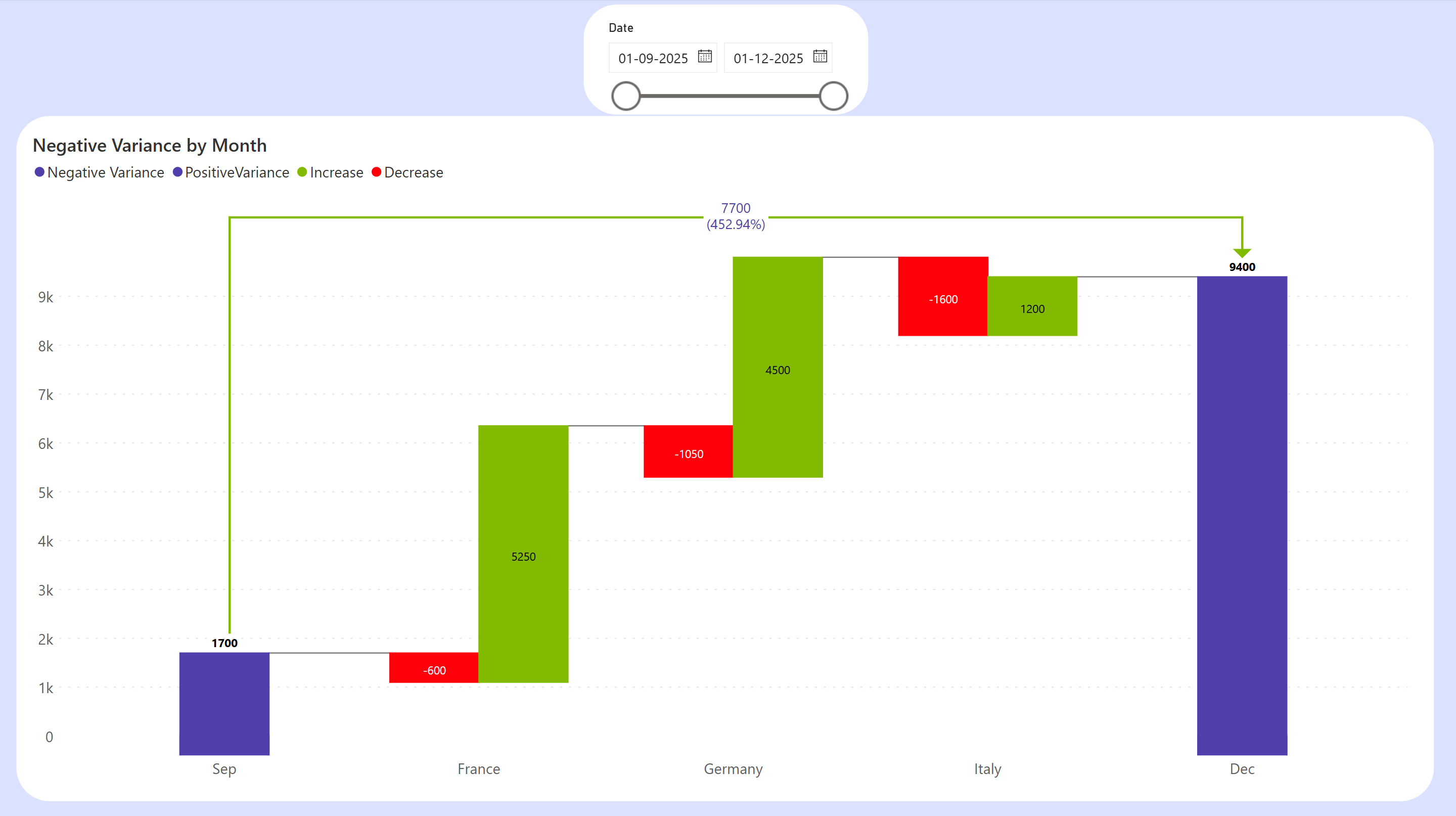
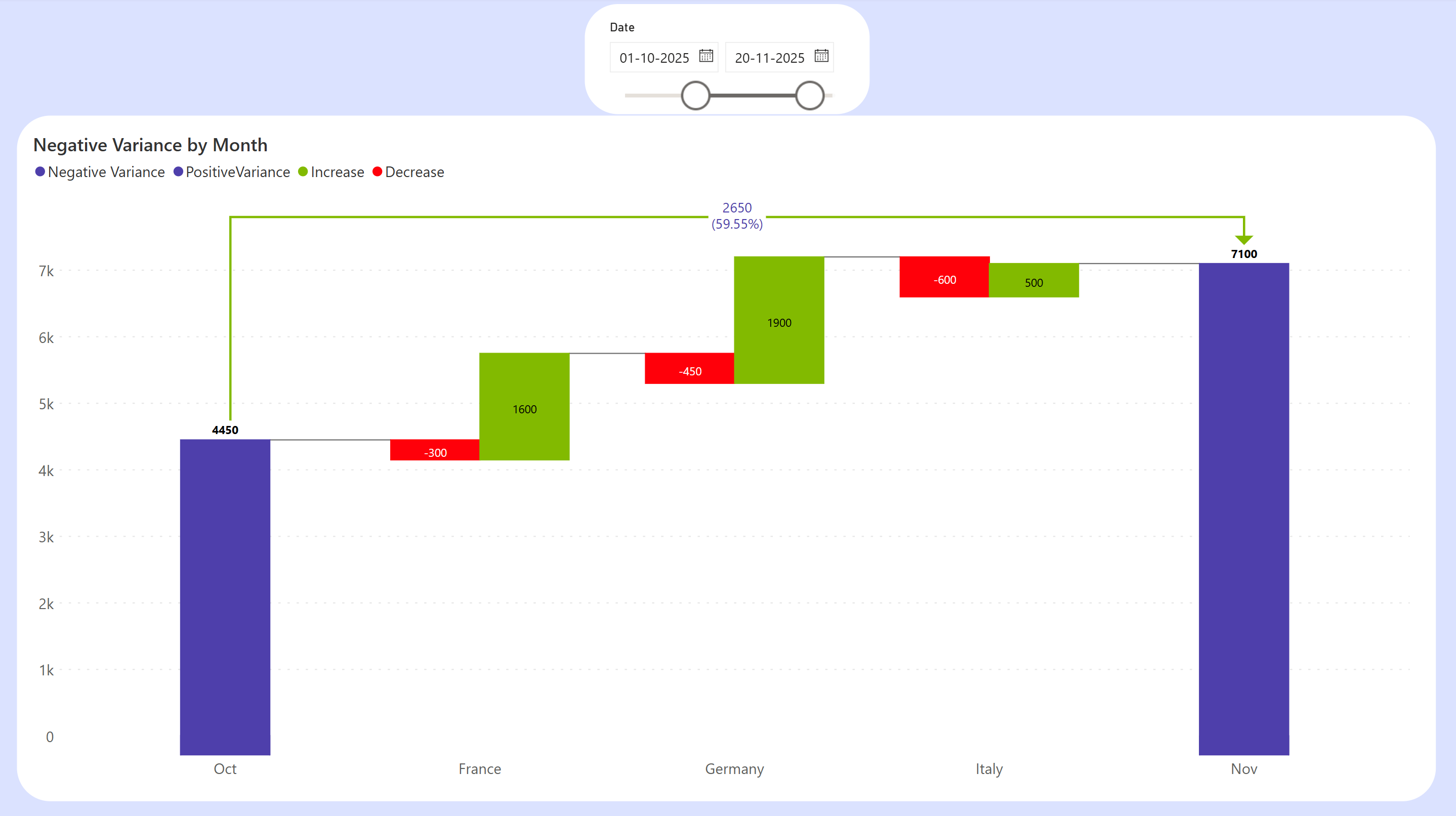
#### New chart type - cluster breakdown waterfall
Visualize positive and negative variances simultaneously at each point with the cluster breakdown waterfall.
Variances between Sep and Dec for each region
Variances between Oct and Nov
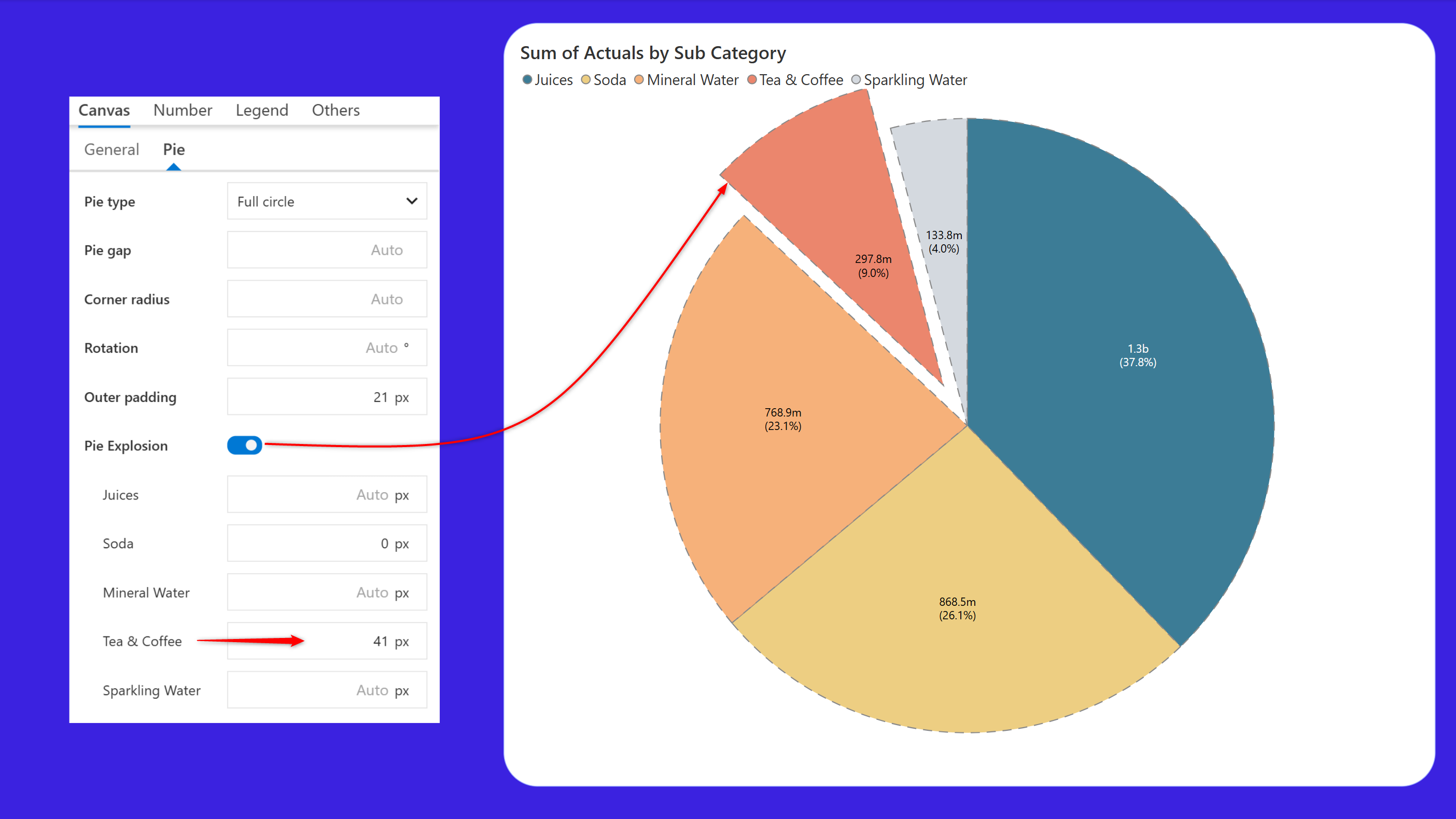
#### Pie chart customizations
Spotlight specific categories in your pie chart, like the top performing region, a critical segment or an outlier with the exploded slice option.
You can now visually enhance your pie chart by customizing the border by changing the color and style.
#### Legend enhancements
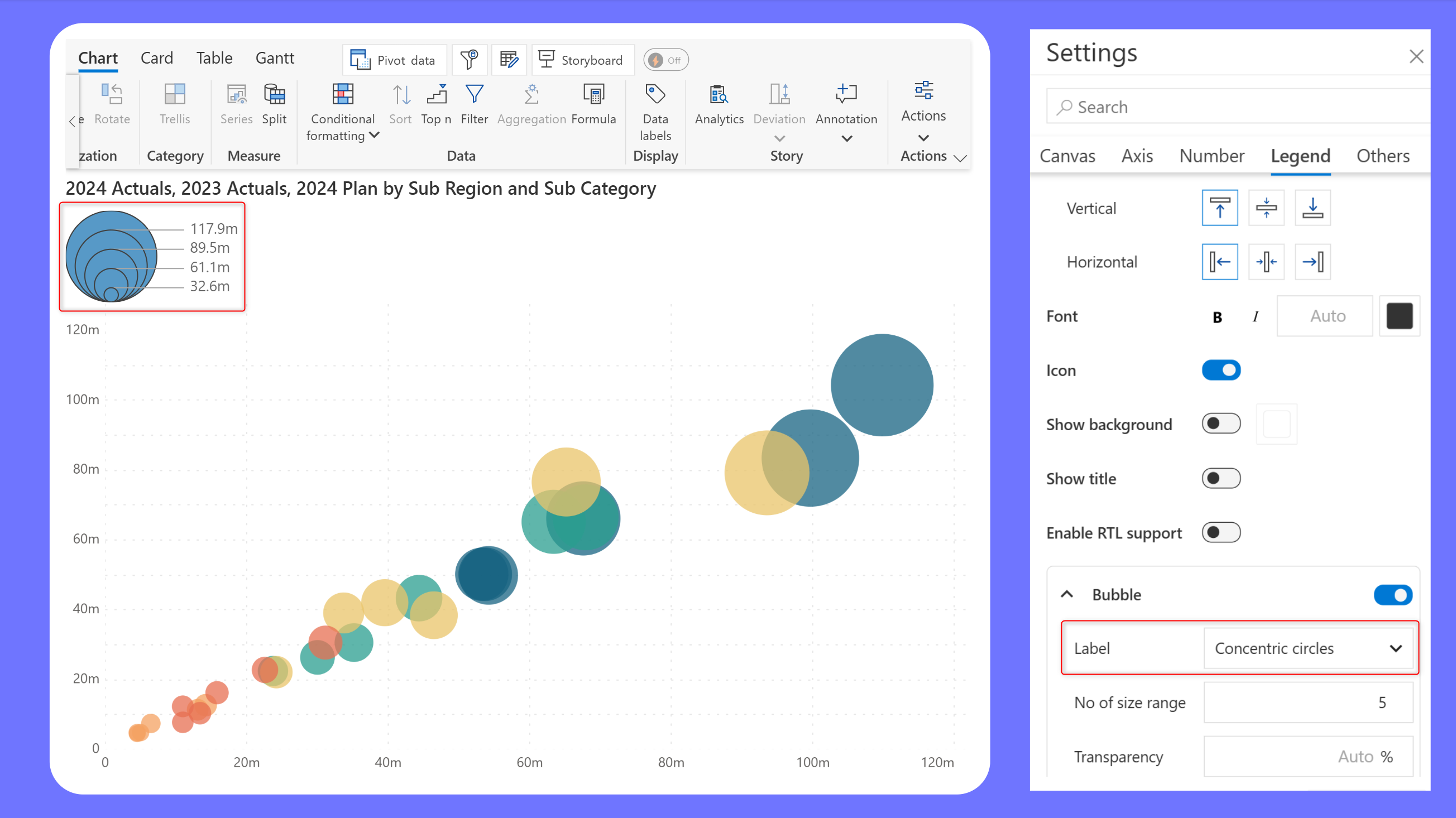
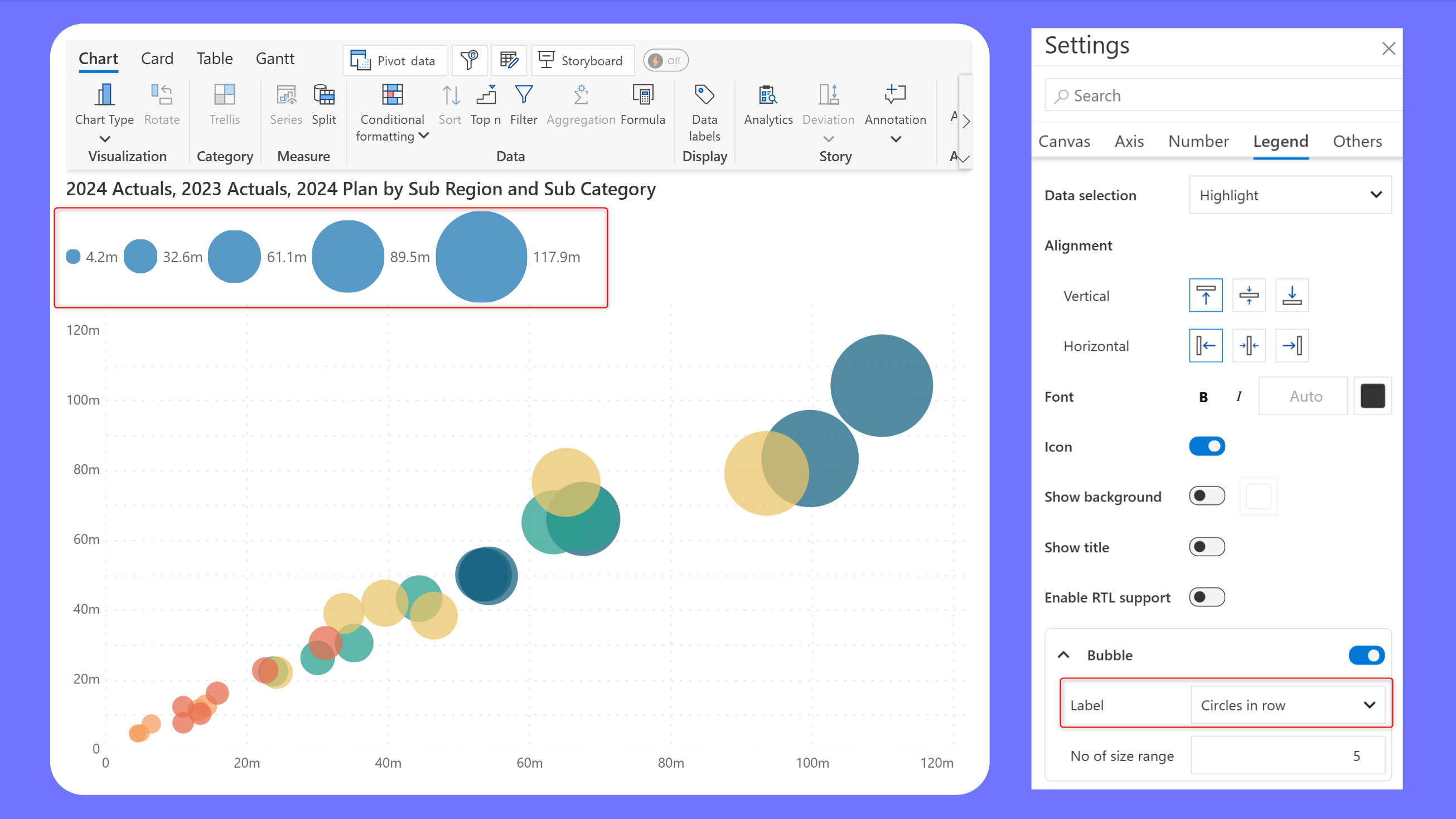
* Size-based legend for bubble charts
Bubble charts are ideal for comparing variables like revenue or population based on the magnitude of the value. Analytics+ supports size-based legends in the latest release, making it straightforward to associate the value to the size of the bubble. You can choose to display the legend as concentric circles or in a row.
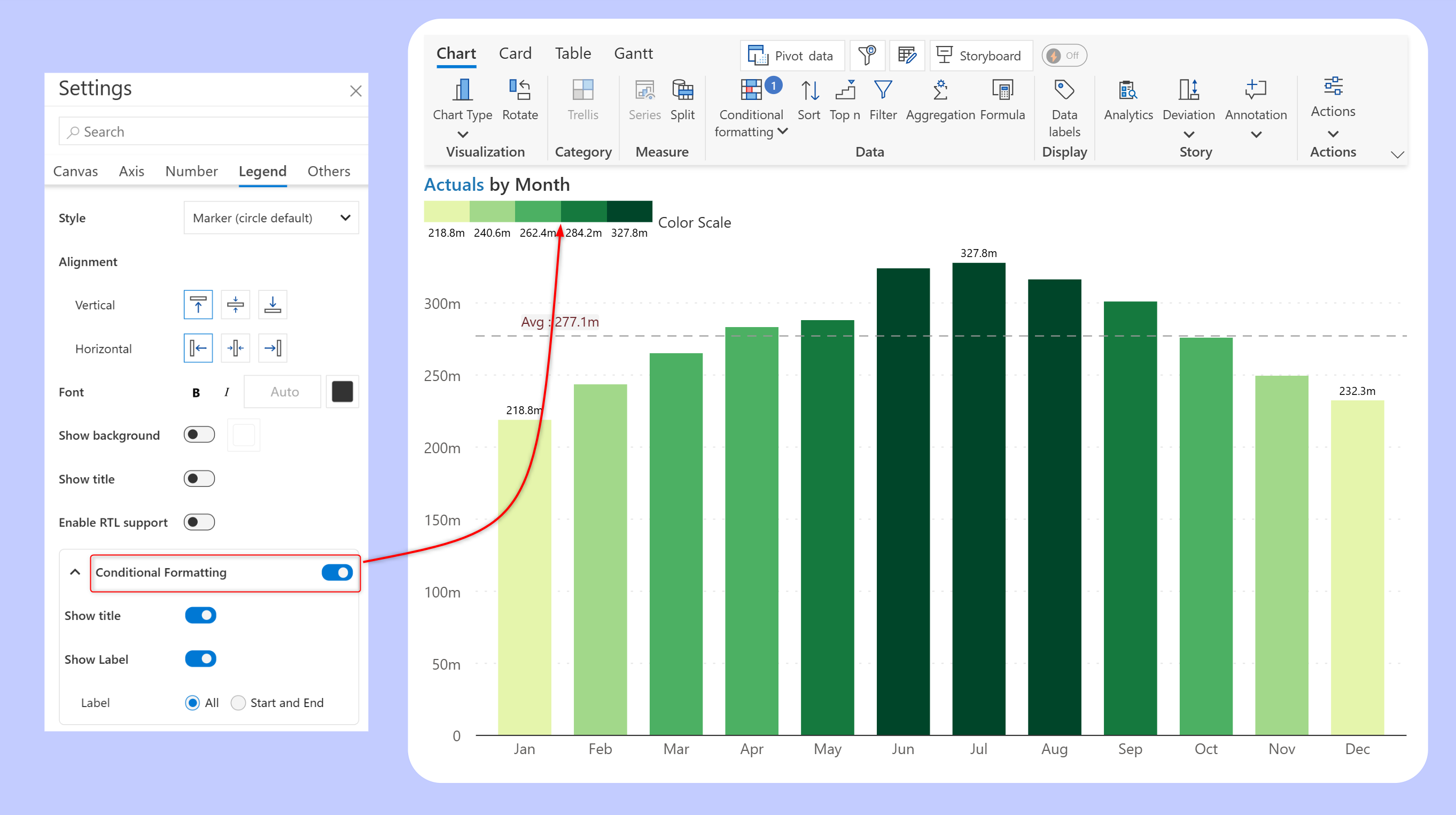
* Legend support for color scales
Color scales enable users scan the chart and quickly identify high and low values. For example, in a color-scaled bar chart you can visualize the values and the trend in parallel. We have added legend support for color scales in the latest version, helping viewers correlate the color shades with the value range.
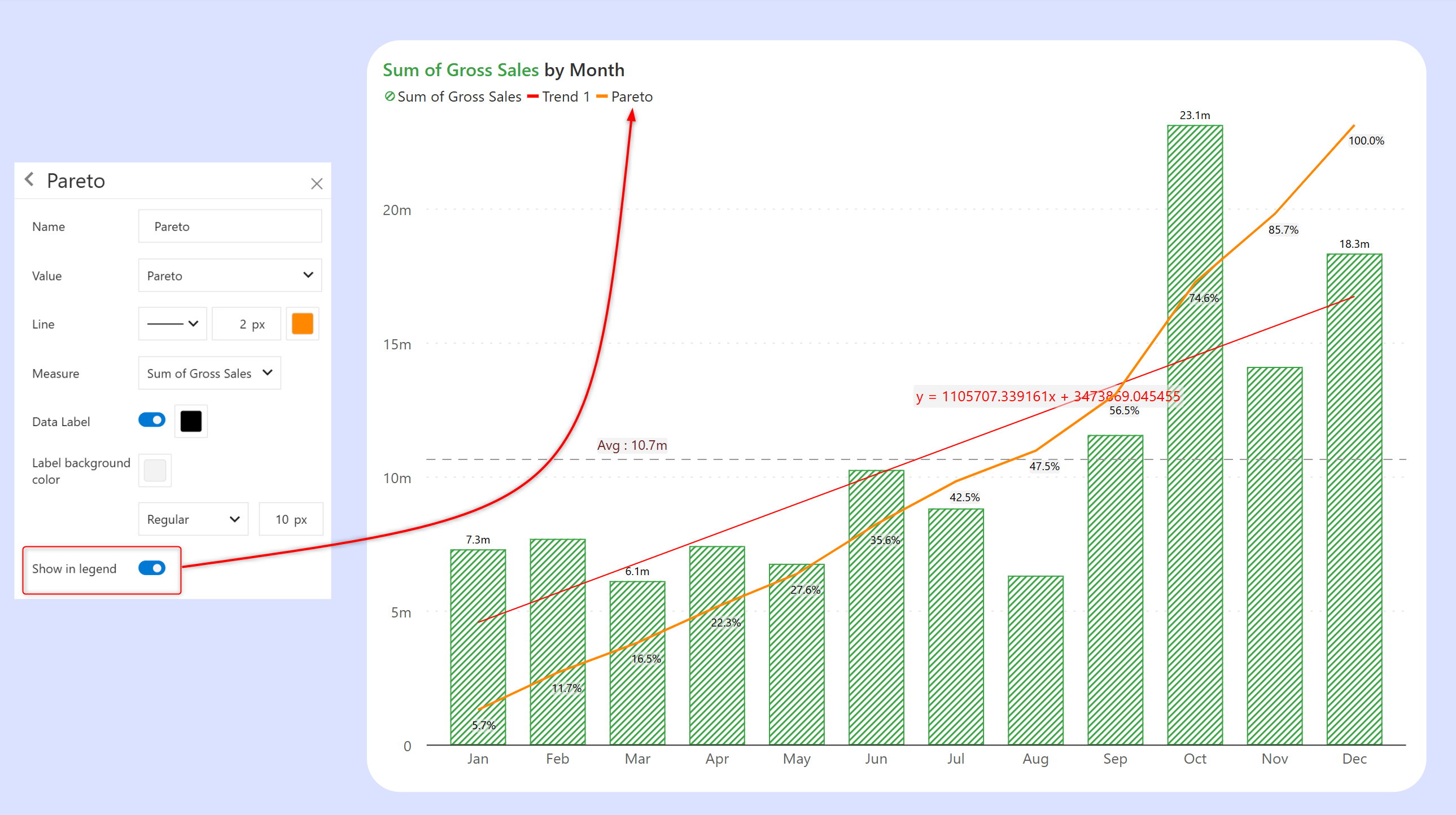
* Legend support for analytics in single-measure charts
Enhance storytelling capabilities in your charts by enabling the legend for trend lines or additional series like Pareto lines.
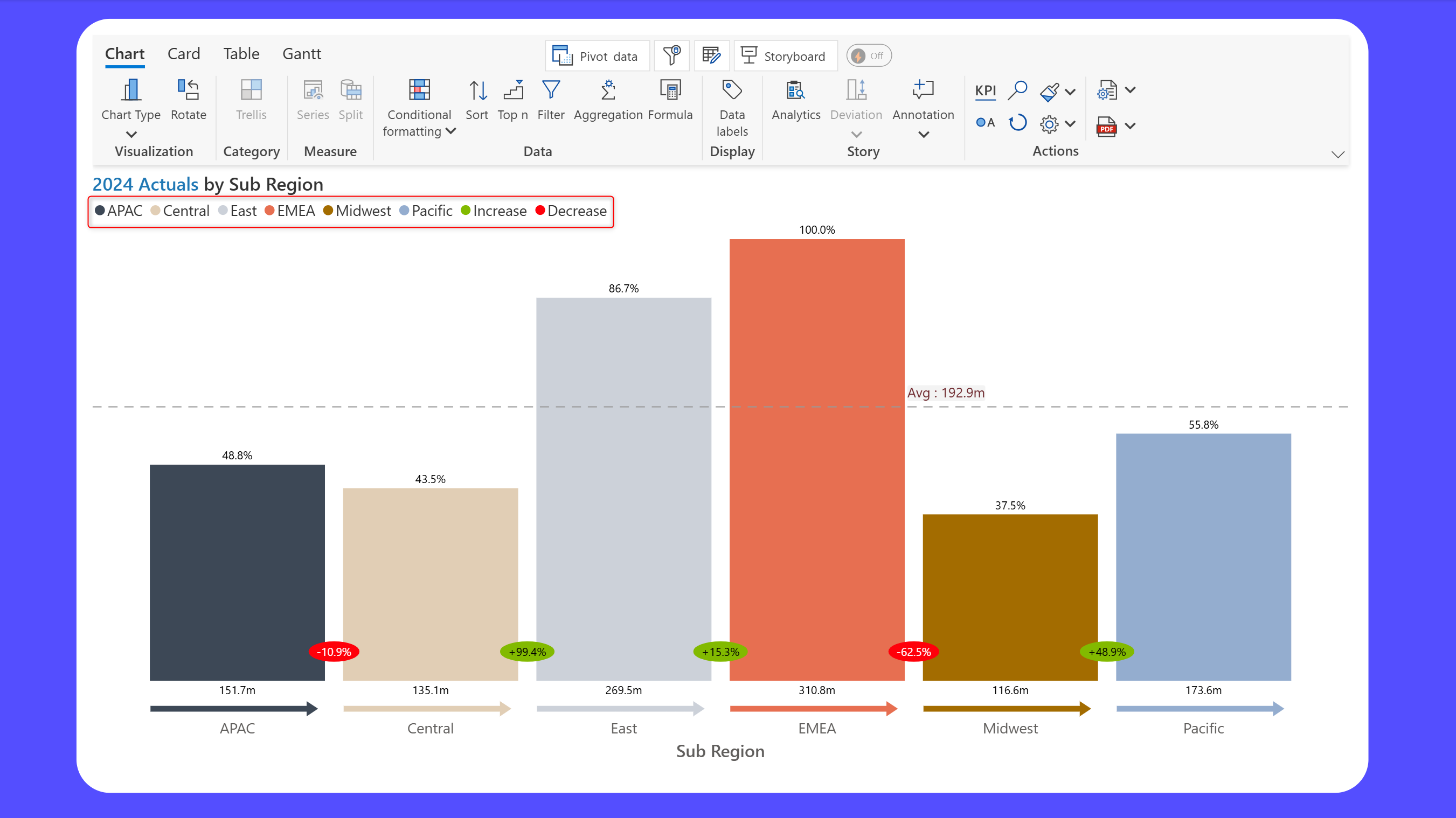
* Legend support for the executive funnel
Make your executive funnel charts more readable by enabling the legend. Map the colors for the categories as well as increase/decrease.
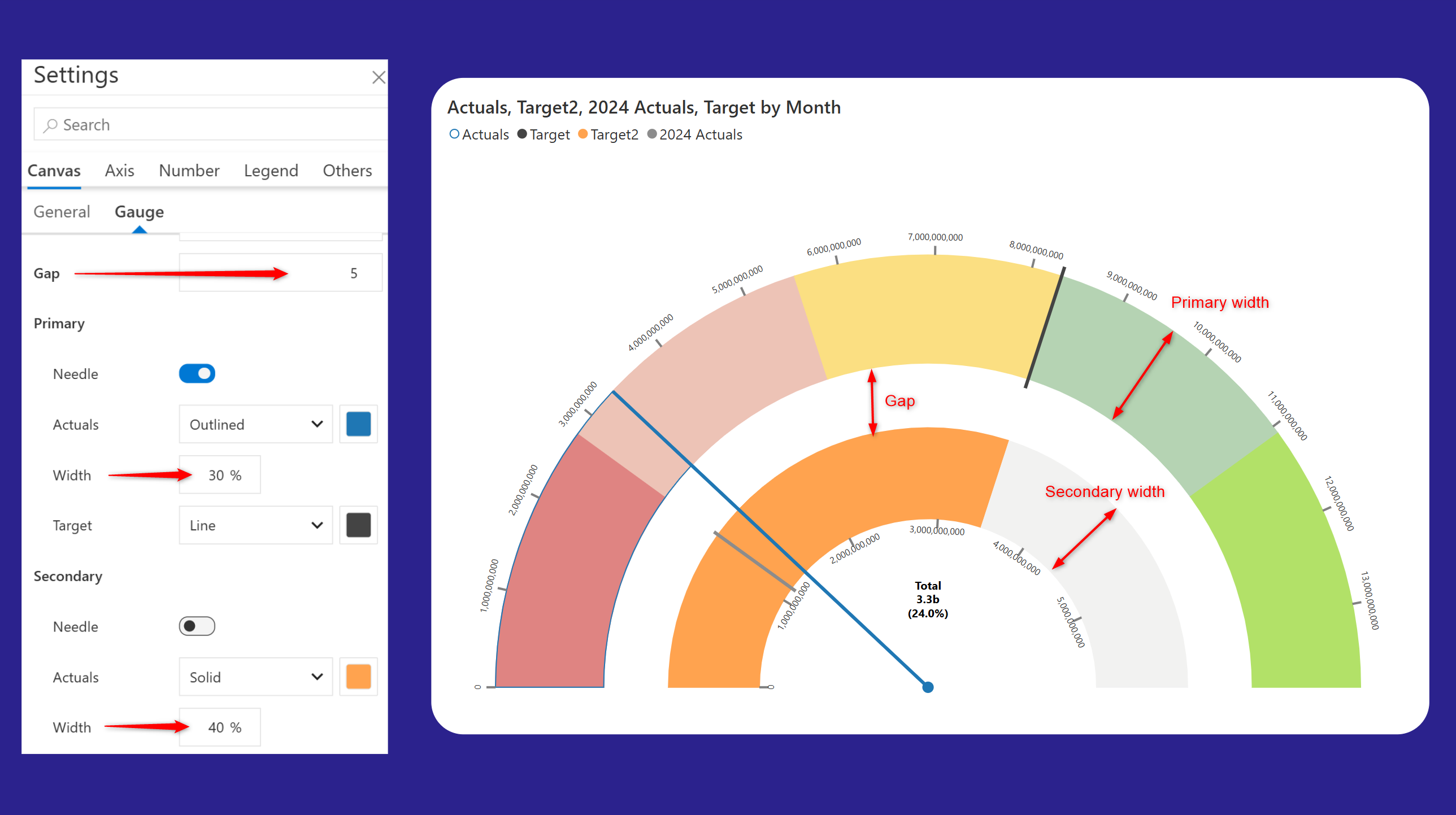
#### Gauge enhancements
The latest version of Analytics+ provides additional control over setting the chart width, gap between primary and secondary gauges, and axis ticks. Position the axis ticks either inside or outside the chart. The font size for data labels can be increased to up to 40px, and you can choose to display the data label value, percentage, or both.
{% hint style="info" %}
Up to 10 comparison bands are supported in the latest version of Analytics+
{% endhint %}
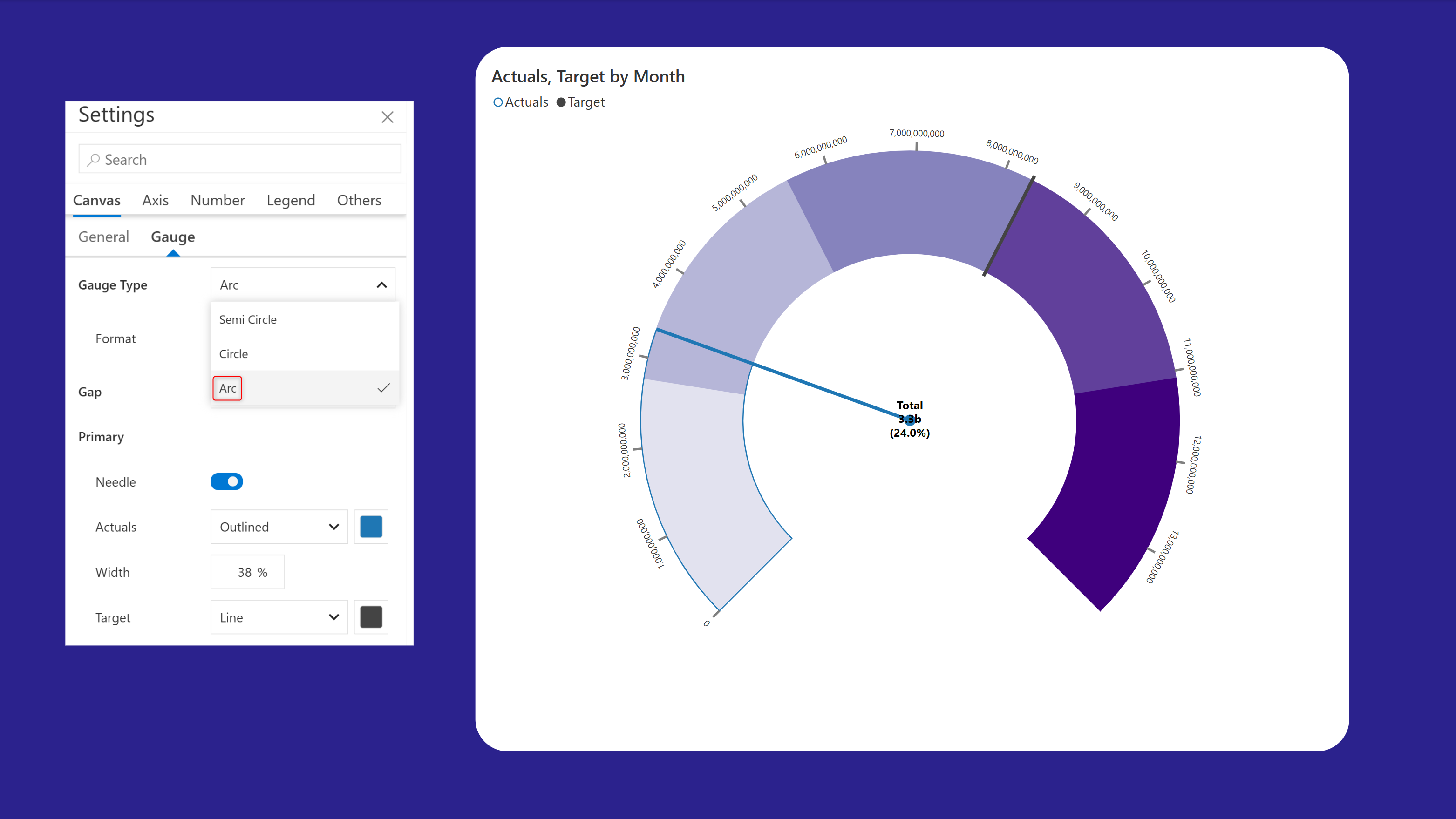
The latest version includes support for arc angular gauges. Arc gauges are visually minimal and ideal for compact KPI dashboards.
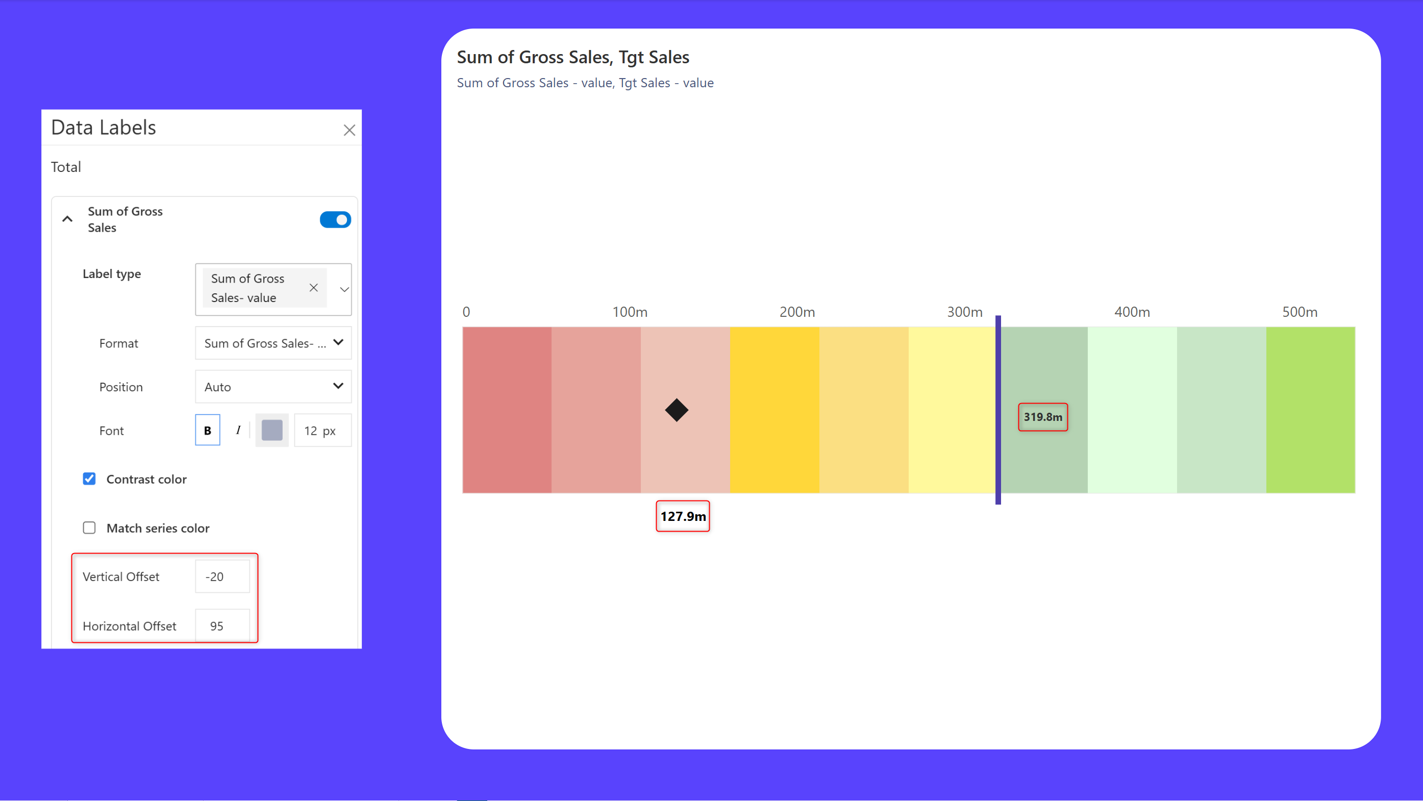
#### Data labels offsets for linear gauges
Place your data labels in a specific position in your linear gauge with the horizontal and vertical offset options. Notice how we've positioned the actuals label outside the gauge and the target label inside.
{% hint style="info" %}
You can now customize the target and actual markers with the on-object interaction menu.
{% endhint %}
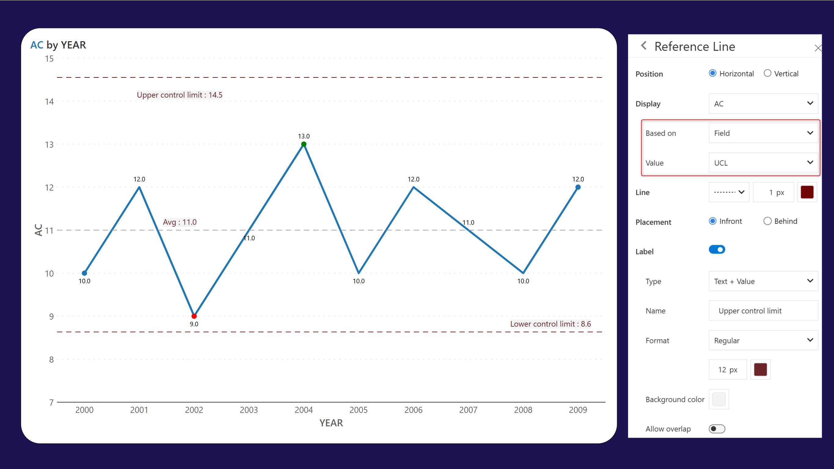
#### Analytics - data-driven reference lines and bands
Leverage the new "Field" option in analytics to use advanced storytelling tools like data-driven reference lines and bands. Plot reference lines and reference bands using input measures to visualize data over time, detect trends, and identify potential concerns.
To plot data-driven reference lines, choose "Field" from the Based on dropdown and select the measure from the **Value** dropdown.
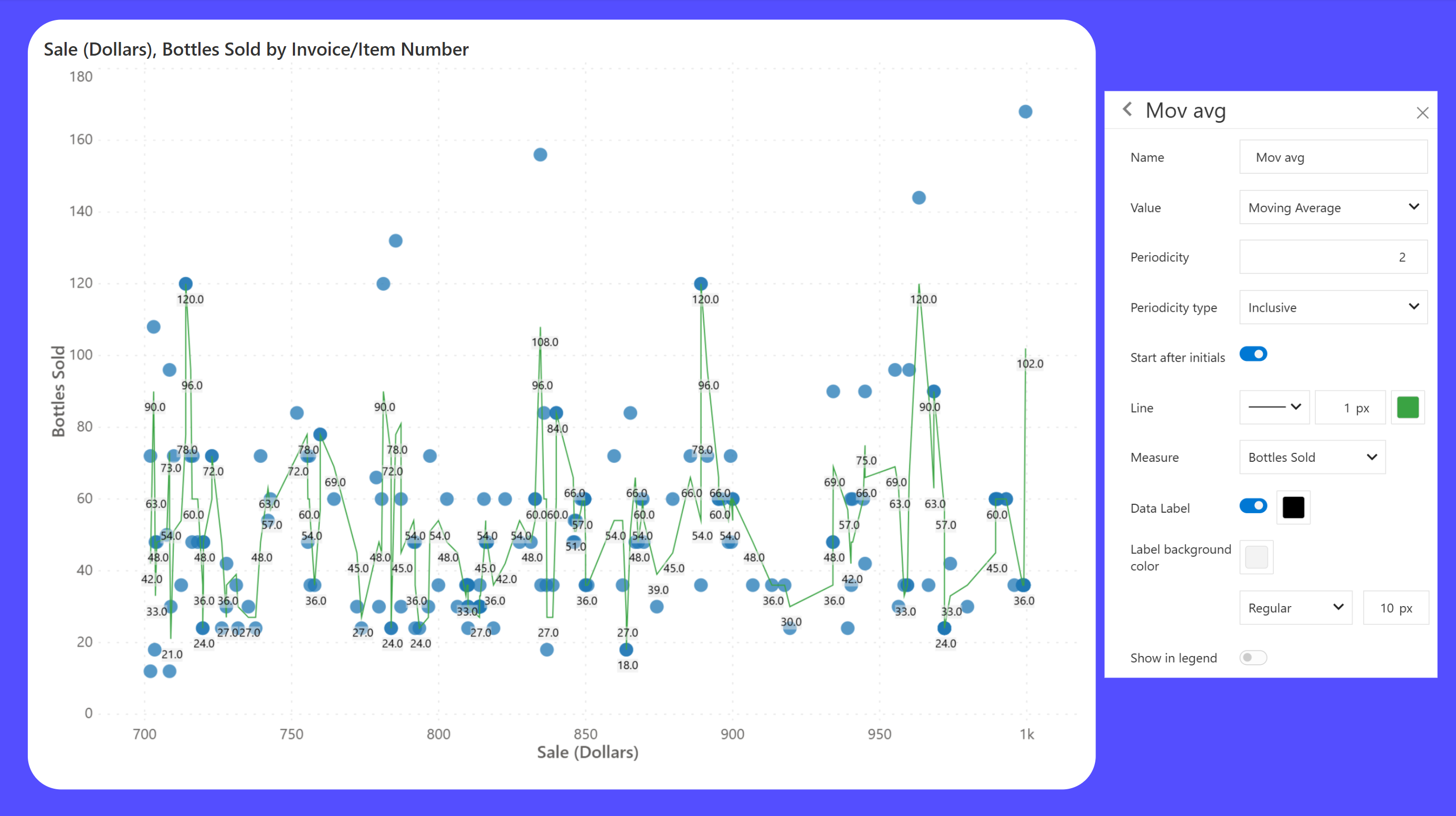
#### Moving average for scatter plots
Moving average lines reveal the underlying patterns in scatter plots, especially when the original data is noisy or irregular.
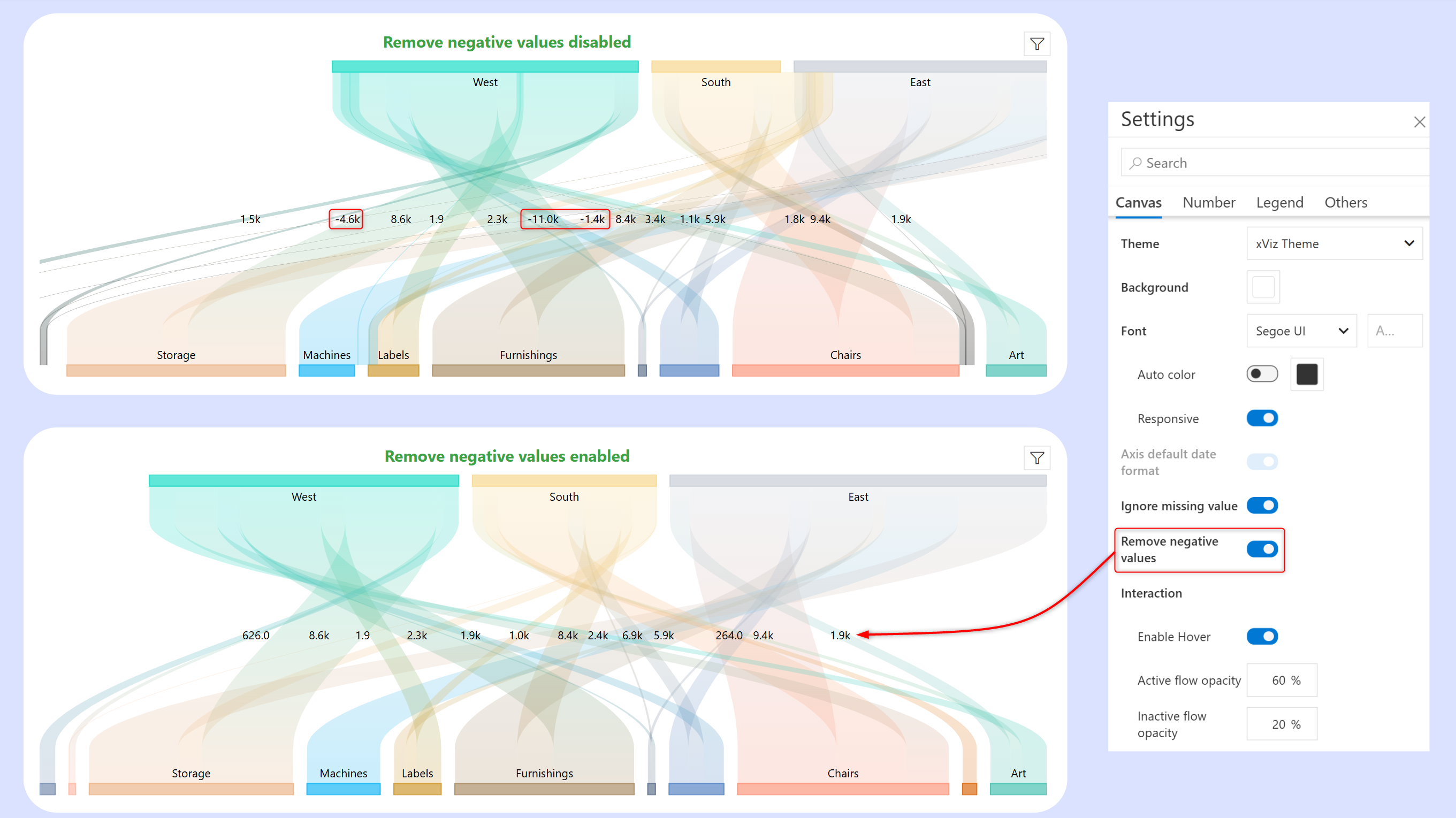
#### Sankey charts - exclude negative values
Skip negative values in Sankey visualizations by enabling the **Ignore negative values** toggle. Notice how the negative values highlighted in the upper chart are suppressed in the lower chart when this option is enabled.
## Cards
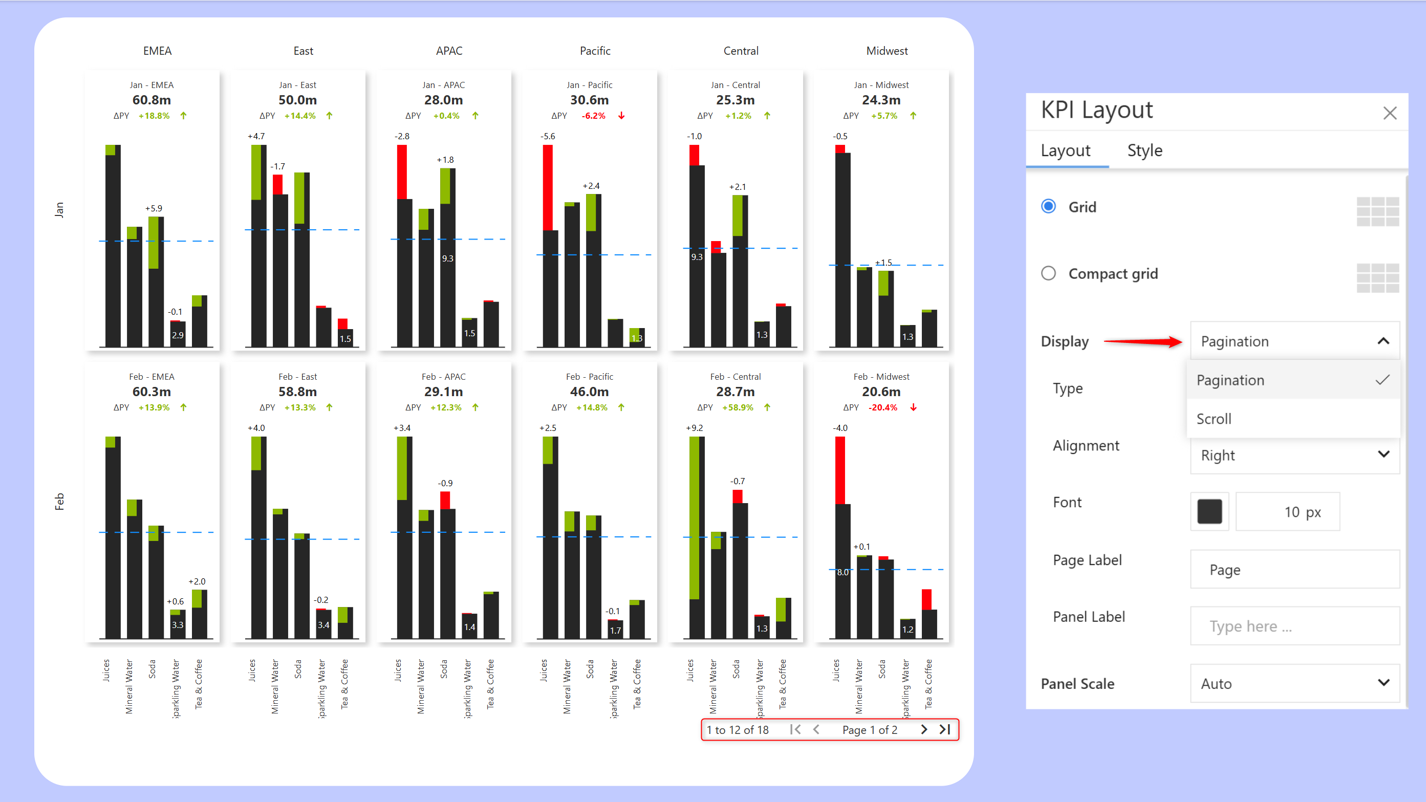
#### Pagination for KPI dashboards
When you have a large number of KPI categories in your trellis, report users may find it tedious to scroll through the entire dataset. If scrolling is not your first preference, you can use the new pagination option in Trellis settings to browse your dashboard
## Tables
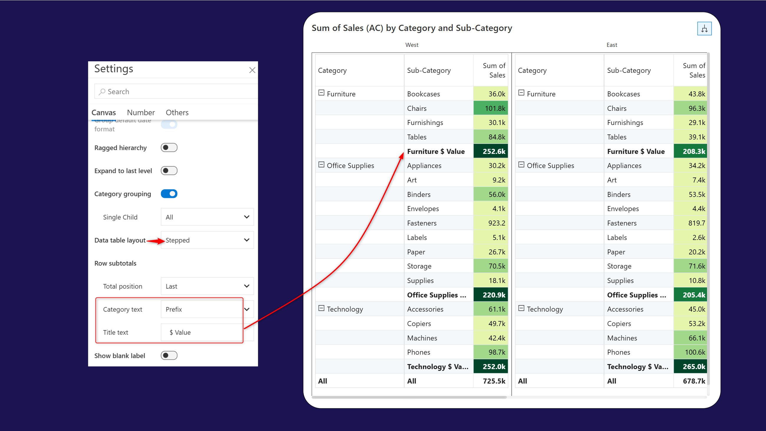
#### New layout type - stepped
Analytics+ inherently provides advanced support for hierarchical data. The new stepped layout groups the child categories under the parent rows and makes it easier for report viewers to identify parent-child relationships.
Additionally, you can customize the sub-total row by adding the parent category as a prefix/suffix, and enter a custom row header name in the **Total text** textbox.
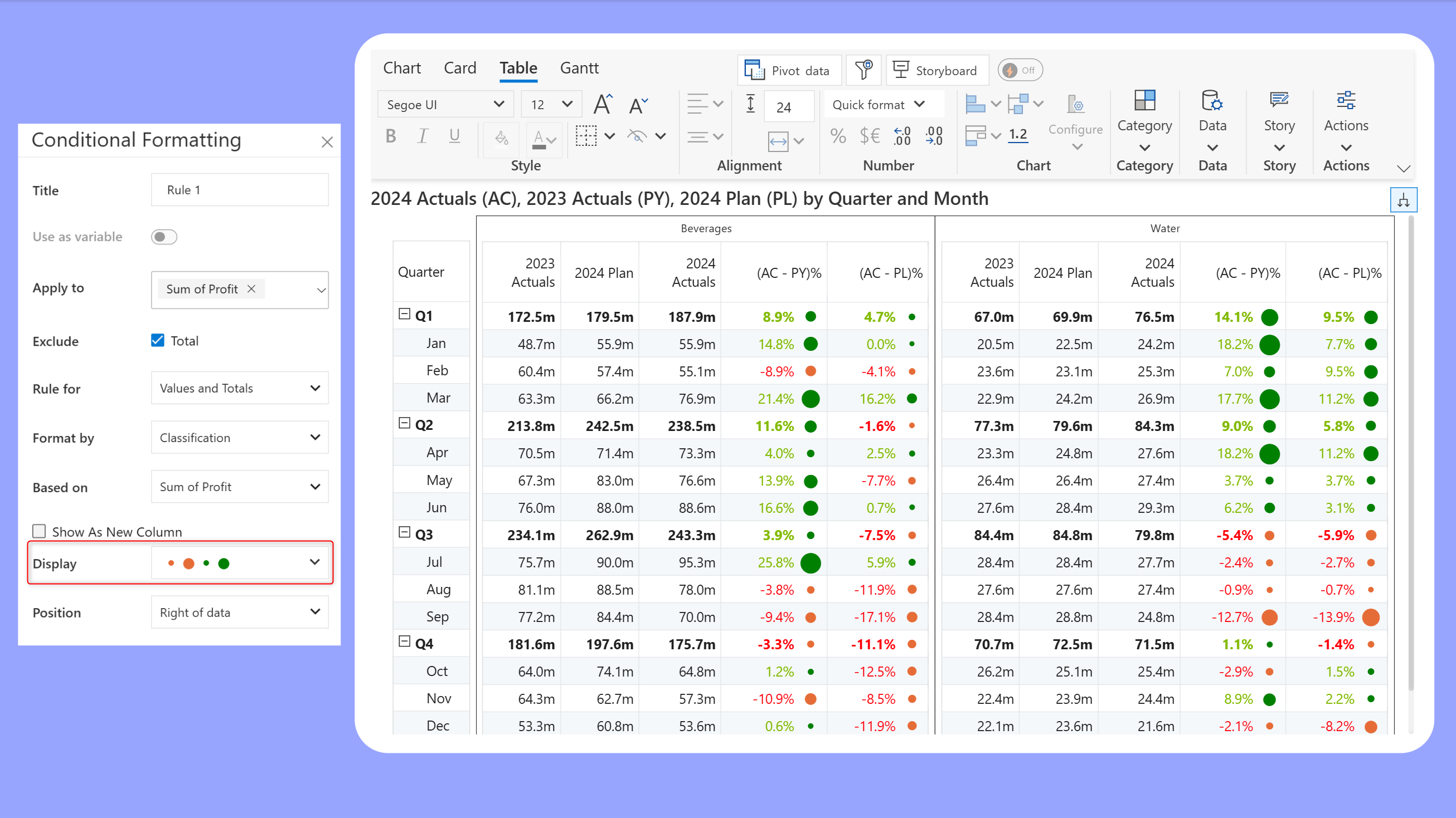
#### Conditional formatting - action dots
Action dots help users quickly gauge the magnitude of the measure and spot deviations. Choose the **Format by** > Classification option to use action dots in your tables.
## Storyboard
#### Comments enhancements
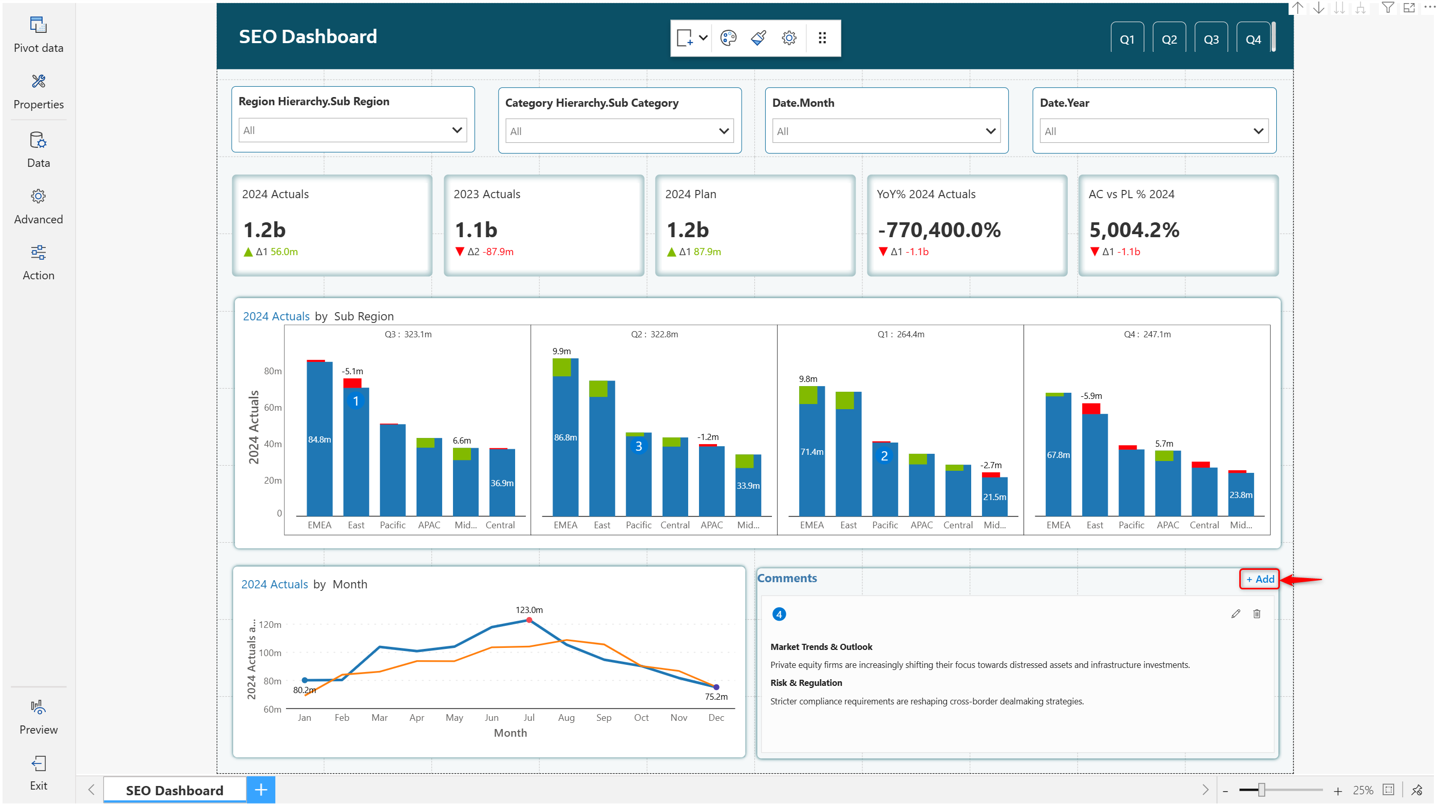
Analytics+ allows users to collaborate and add their inputs and perspectives to dashboards. When the comments panel is enabled, users can add dashboard-level comments with the new 'Add comment' button.
---
# Agent Instructions: Querying This Documentation
If you need additional information that is not directly available in this page, you can query the documentation dynamically by asking a question.
Perform an HTTP GET request on the current page URL with the `ask` query parameter:
```
GET https://docs.inforiver.com/analytics+/release-notes/analytics+-april-2025-update-release-4.7.md?ask=
```
The question should be specific, self-contained, and written in natural language.
The response will contain a direct answer to the question and relevant excerpts and sources from the documentation.
Use this mechanism when the answer is not explicitly present in the current page, you need clarification or additional context, or you want to retrieve related documentation sections.