One-click options
With a single click, you can apply a variety of conditional formatting to the Premium Table. Options include semantic formatting, color scales, segmentation, icons, ratings, data bars, and many more.
One major advantage of the one-click setting is that you do not have to create rules from scratch. Once you've created a quick rule, you can choose to modify it in more detail if your report calls for it.
1. Quick Rule
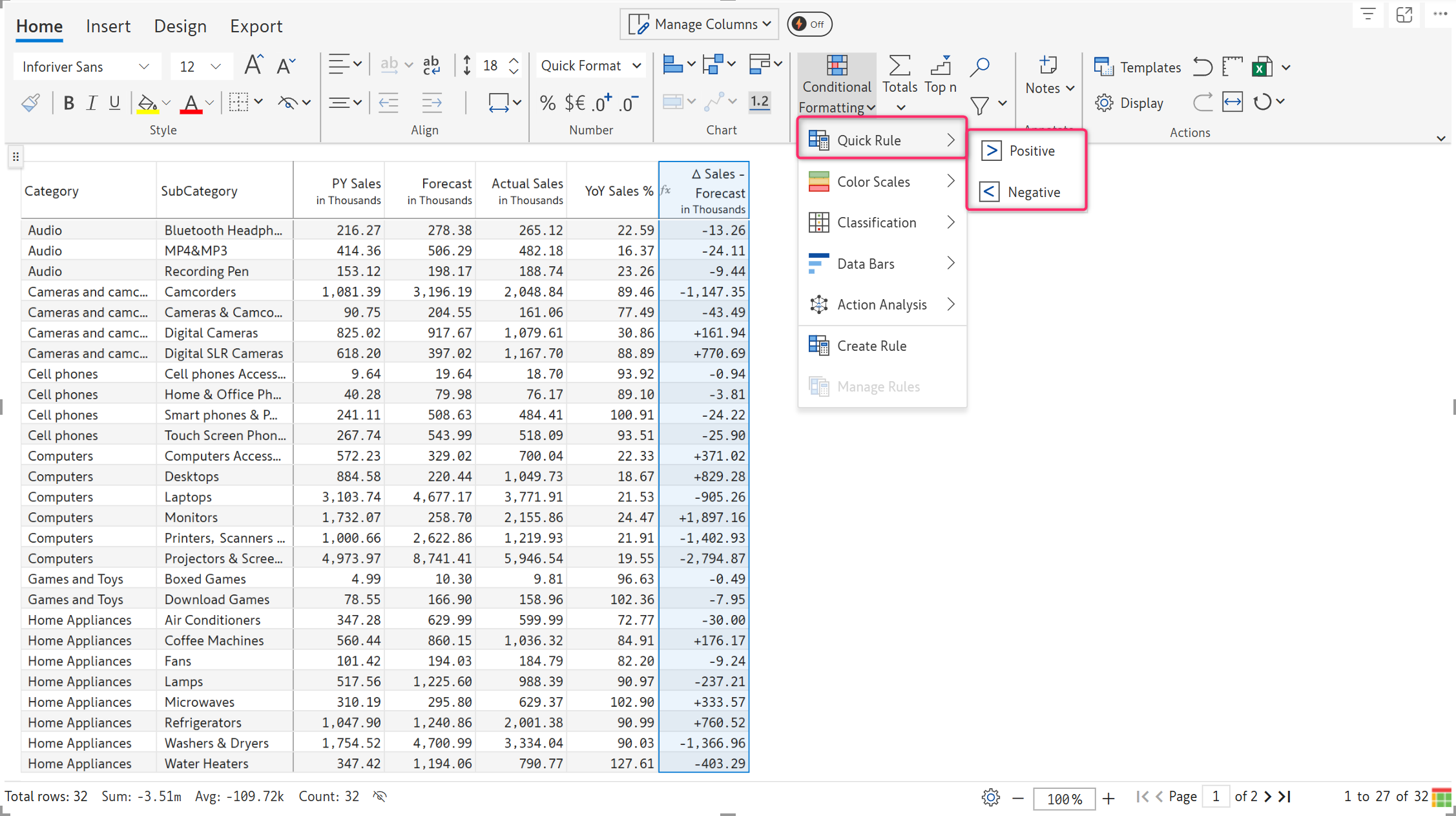
The Quick Rule option allows you to highlight the positive and negative values in the visual with just a single click. Under 'Quick Rule,' there are two options: Positive and Negative.

Select a column. You can highlight values greater than or equal to zero in green by clicking on the Positive option.

The conditional formatting side panel appears, allowing you to further customize the formatting. If you don't want to make any more changes, just close it.

Similarly, you can highlight values less than or equal to zero in red by selecting the Negative option.

2. Color scales
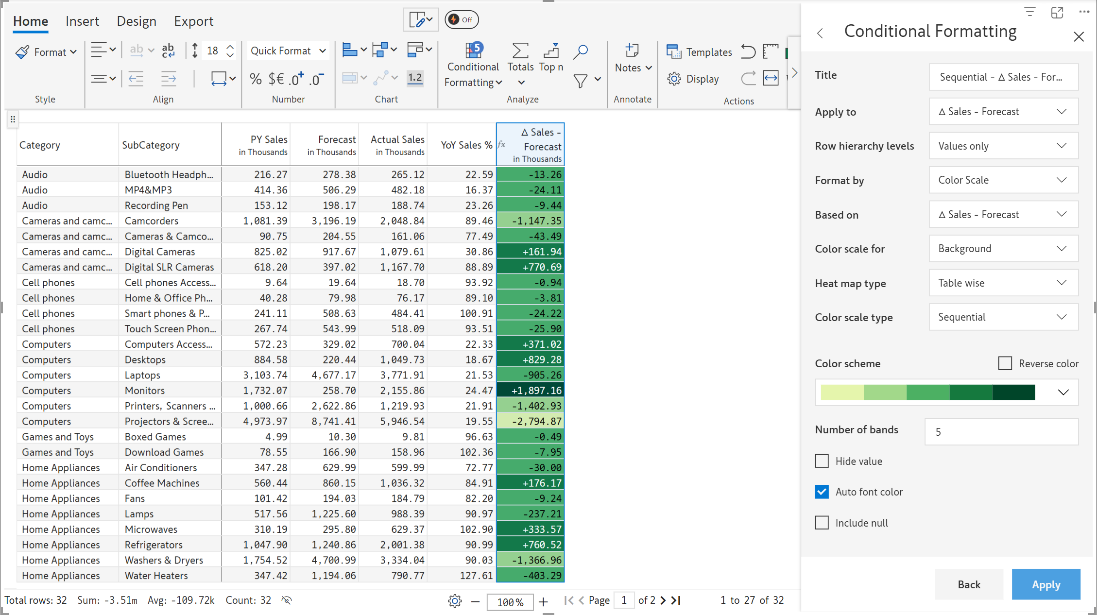
A wide variety of color scales, such as sequential, qualitative, diverging, continuous, and continuous-diverging can be applied with a single click.
Choose any column or cell and click on Conditional Formatting > Color Scales. Choose any of the color scales shown.

A sample heatmap using the sequential color scale is shown below. Notice that the font colors are automatically adjusted to be in contrast with their backgrounds for enhanced readability.

To learn more about customizing color scales, visit this section.
3. Classification
You can classify the data with icons/ratings and even deliver ABC segmentations with a single click. When you click on 'Classification', you will see the following options:

Let's look at an example for all three categories—text, icon set, and rating.
3.1. Text: Text-based classification is commonly used to categorize performance. A sample report with ABC classification is shown in the below image.

3.2. Icons: You can deliver conditional formatting using icons in a few clicks. Here is an example where items that contribute the most to sales are highlighted.

3.3. Ratings: Another way to categorize is with ratings, like the star ratings that are frequently seen in the product reviews sections of e-commerce websites.

To learn more about customizing classifications, visit this section.
4. Data bars
Data bars can be used to insert colored bars inside a cell to show how a given cell value compares to others.
On clicking 'Data bars', you can see the following options. Select one of the options.

Data bars are added, as shown in the image, making it easy to identify the highest and lowest values at a glance and providing us with a perspective.

To learn more about customizing data bars, visit this section.
5. Action Analysis
The data can also be formatted and represented using action analysis. Under this option, we have the following options, as shown in the image below:

a) Action dot
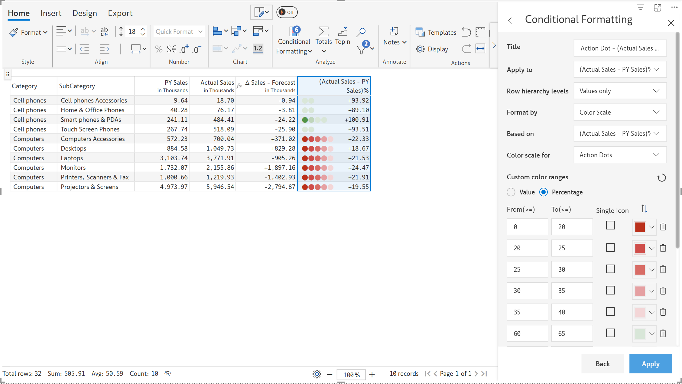
Action dots represent the degree to which the cell values deviate from the desired range/value in the measure. Adding them to the cells helps you assess how the quantities compare to the middle value or any desired value in the measure.
Select any measure to which you want to add them. Click Conditional Formatting > Action Analysis > Action Dot.

By default, the Premium Table provides custom color ranges based on values or percentages. Below is a sample report with action dots applied to the sales variance measure.

The color scale indicates a positive or negative deviation, and the number of dots represents the magnitude of the difference, with which you can focus on the values that diverge the most.
b) Action Color
Action colors are a variation of action dots in which the degree of divergence of cell values from the target value is expressed by color gradients. The color scale denotes a positive or negative deviation, while the gradient intensity indicates the magnitude of the deviation.
Select any measure to which you want to add them. Click Conditional Formatting > Action Analysis > Action Color.

The action colors are applied to the data as below.

6. Bubble charts
Under action analysis, you can use bubble charts to gauge the magnitude of a measure instantly and for quick comparative analysis.

6.1. Bubble charts: Use bubble charts in the table to quickly visualize the data points and their relative magnitude based on bubble size.

6.2. Bubble Only: Use this option to display only the bubble chart and hide the data point values. You can use this for a clear and concise data presentation.

You can use the side panel to customize your rules.
In the next section, we'll look at the advanced options.
Last updated