Color scale & Data bars
Another commonly used type of conditional formatting is the Color Scale, which applies a gradient fill to a range of cells based on their values.
This is a useful way to quickly visualize and compare values in a table. Color scales can be applied to the background, font color, or data bars. It can also be applied row-wise, column-wise, or table-wise.
Refer to create rule to get started. Once the rule is created and you can see the conditional formatting side panel, follow the steps below.
Select Color scale in the Format by dropdown.

Let's go with the default options. Click Apply. The color scale is applied to the cell background color of the measure selected in the Apply to field.

Let's explore the configuration options for color scales.
1. Based on
Let's apply formatting for 2021 Actuals based on the absolute variance between AC and PL. Select 2021 Actuals - 2021 Plan from the Based on dropdown. Click Apply.

Let's hide the 2021 Plan column and show only the variance column. Click on Manage Columns and check/uncheck the checkboxes as highlighted.

Notice how, International – EMEA – Tea & Coffee is displayed in a darker shade due to a higher positive variance, while United States – East – Juices is prominently highlighted because of a substantial negative variance.

2. Color scale for
Now, let's apply a color scale to the font. Select Font in the Color scale for dropdown. Click Apply.

You can see that the font for 2021 Actuals is formatted sequentially based on the variance.

3. Heat map type
Notice that the formatting is applied column-wise. That is, the maximum and minimum values in a column are formatted using the darkest and lightest gradients.

The image below shows table-wise formatting. Notice that similar values are formatted using the same gradient throughout the table.

4. Color scale type
Inforiver Table supports different types of color scales such as Sequential, Diverging, Qualitative, Continuous, etc. You can click on the Color scale type dropdown to view the entire list.
Let's apply a Diverging color scale. Select from the dropdown and click Apply.

You can see that the backgrounds are formatted using the Diverging scale.

Below is an example where the Continuous-Range scale is used.

5 Colors
5.1. Color scheme
For color scales of types Sequential, Diverging, Diverging-color safe, Qualitative, and Qualitative-color safe, there are several default color schemes to choose from. You can click on the Color scheme dropdown and choose the desired color scheme.

5.2. Min/max/center
For color scales of types Continuous-Range, Continuous-Diverging Range, Continuous, and Continuous-Diverging, you can define the min/max colors, and the center color when applicable.

5.3. Custom color scale
The Custom color scale type can be used to define custom color ranges based on value or percentage. On selecting the custom option, you can see the fields highlighted in the image below. You can define the values/percentages for the ranges, add or delete ranges, define colors, and reverse the order. Changes can also be reset to default.

5.4. Reverse color
Color scales can be reversed for cases where the minimum and maximum values need to be denoted with the highest and lowest gradients. To achieve this, check the Reverse color checkbox.

5.5. Number of bands
By default, the number of bands is defined as 5. But it can be increased or decreased using the Number of bands field. The color scheme field also gets updated to show the gradients.

5.6. Hide value
You can choose to show only the color scale and hide the values. To do this, check the Hide value checkbox.

5.7. Auto font color
When you apply background conditional formatting in Inforiver, the font colors are automatically adjusted to be in contrast with their backgrounds to enhance readability. It can be turned off if not required by unchecking the Auto font color checkbox.

5.8. Include null
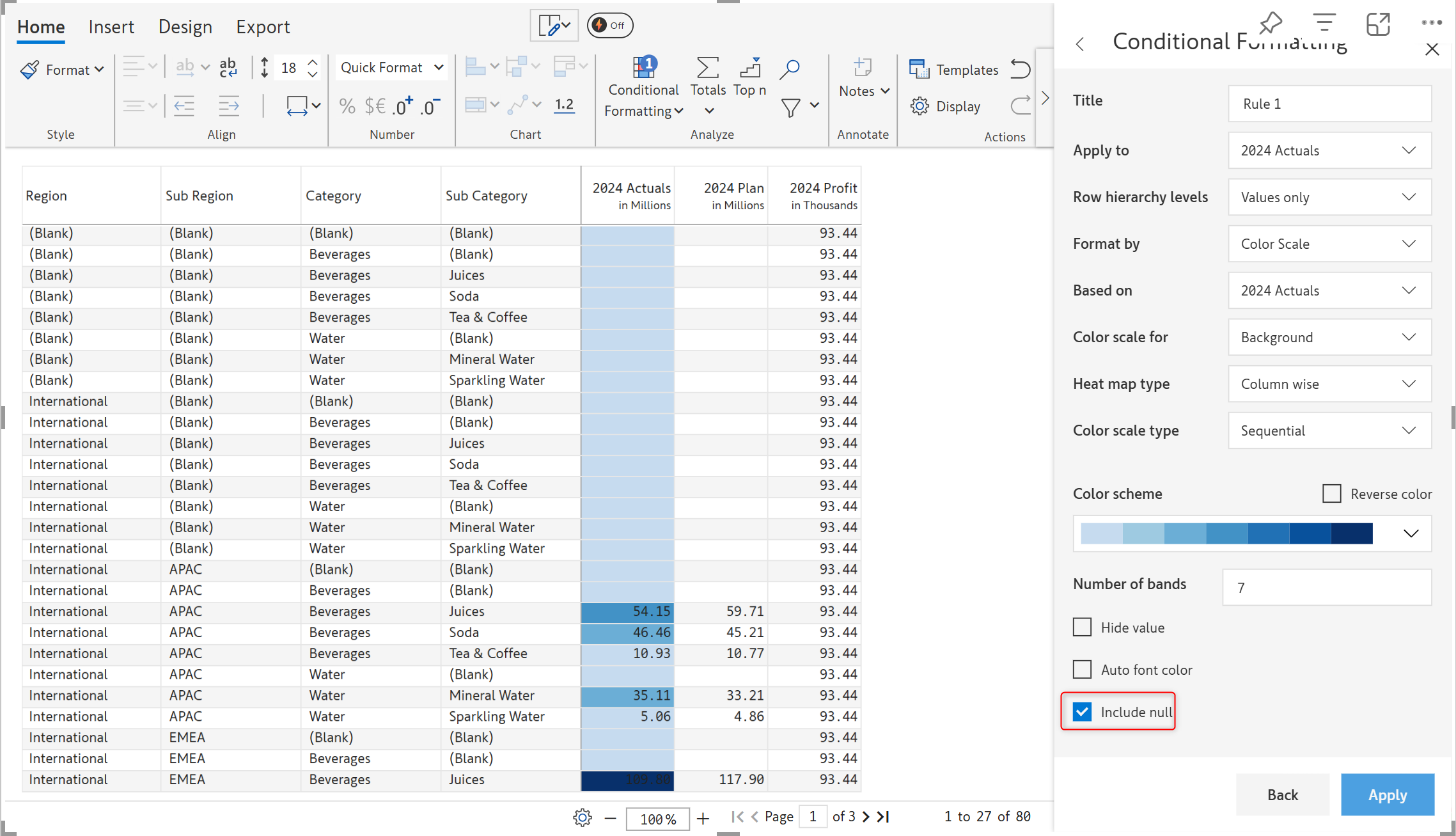
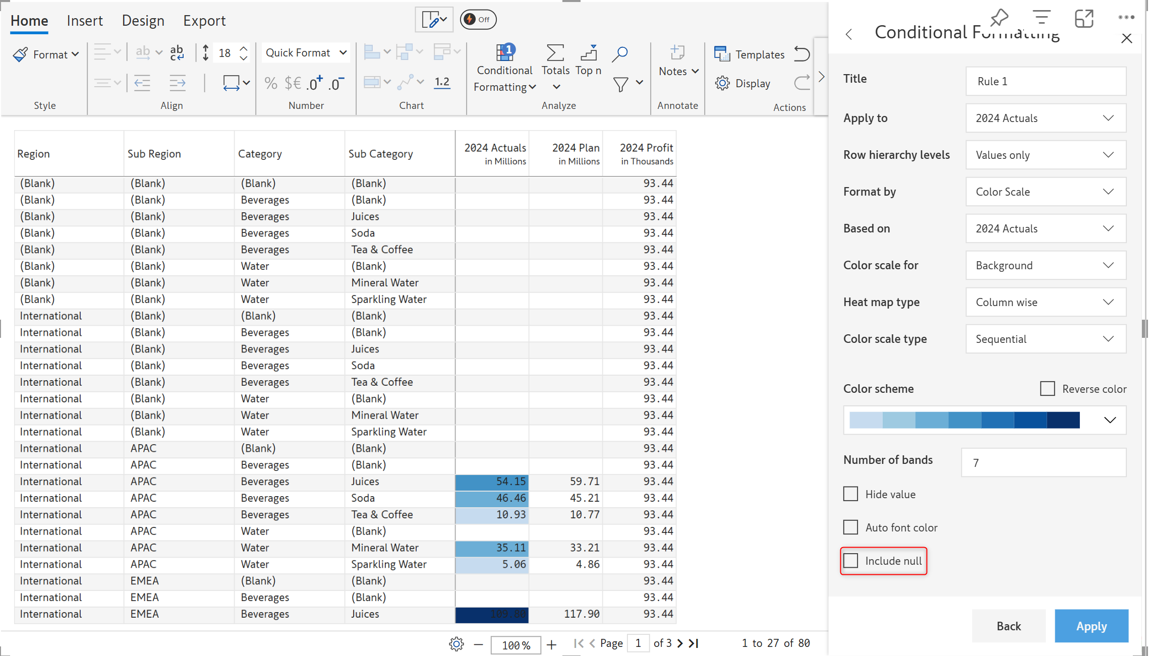
In cases where there are null values in your table, you can choose whether to include or exclude them from conditional formatting. In the image below, the 2024 Actuals measure has null values. To apply conditional formatting for these cells as well, check the Include null checkbox.


Data bars
In the previous section, we covered color scales for fonts and backgrounds. In this section, we'll look at data bars. Note that you can either create a new rule as shown here or edit the data bars inserted using the one-click option explained here.
STEP 1: Select Data bars in the Color scale for dropdown.

STEP 2: In the side panel, you can see the customization options available.

STEP 3: Let's go with the default settings. Click Apply. The data bar gets added as shown in the below image.

STEP 4: Let's now look at each of the customization options. Check the Hide value checkbox and click Apply. You can now see only the data bars and the values are hidden.

STEP 5: By default, the data bars are applied to all the values (values and totals if selected in the row hierarchy levels). If you only want to use data bars for a particular range of values, you can enter a minimum and maximum value as shown in the below image. Data bars are enabled only for values between 8m and 20m in this case.

STEP 6: Data bars can be aligned left or right using the Alignment field. Right alignment is shown in this example.

STEP 7: Note that when there are positive and negative values in the column for which you want to use data bars, the options differ as shown in the below image. You can choose to hide the values and select colors for positive and negative values.

Last updated
Was this helpful?