> For the complete documentation index, see [llms.txt](https://docs.inforiver.com/llms.txt). Markdown versions of documentation pages are available by appending `.md` to page URLs; this page is available as [Markdown](https://docs.inforiver.com/~/changes/mS6jwvARNLHpKqBa4cT9/working-with-inforiver/6.-working-with-charts/sparkline-charts.md).

# Sparkline charts

A sparkline is typically used to show trends in a series of values over time, such as stock prices or website traffic. Sparklines are often used in dashboards and other data visualizations to provide a  quick and condensed view of a data series.

Inforiver provides *line, area, baseline, column*s, and *win-loss* sparkline charts.

## 1. Adding the chart

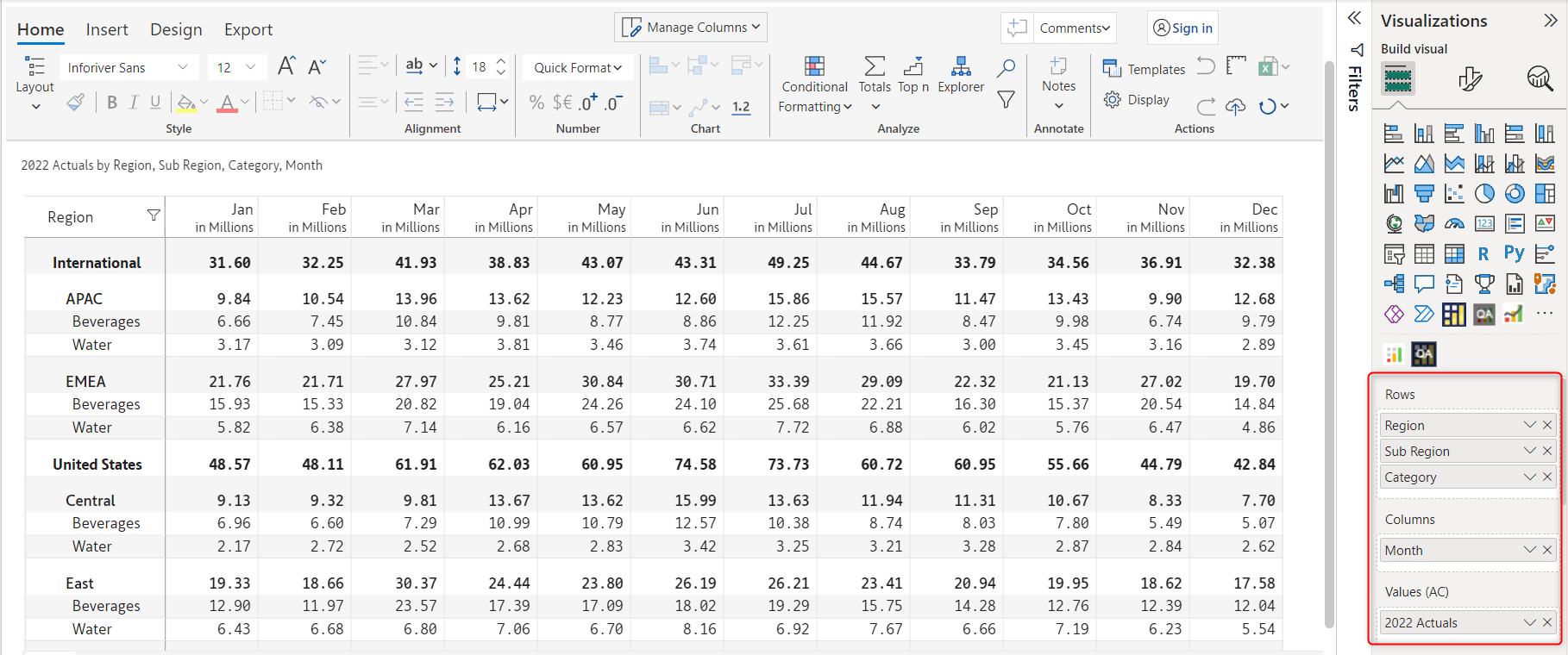
In this example, we have 12 months of data across regions and categories and we want to visualize using a column sparkline chart.

a) To insert a sparkline chart, you need to add a time dimension in the column field. Note that we have added 'Month' in the 'Columns' field in the Visualization pane.&#x20;

<figure><img src="https://3062809325-files.gitbook.io/~/files/v0/b/gitbook-x-prod.appspot.com/o/spaces%2FEbkCXCUXmtUq5tcnUtZE%2Fuploads%2FLnZqh2qBYG1wjfFUqB3z%2Fsparkline-select.png?alt=media&amp;token=f17fc073-7dae-46a2-bdc0-f9c60cfc192b" alt=""><figcaption><p>Data mapping</p></figcaption></figure>

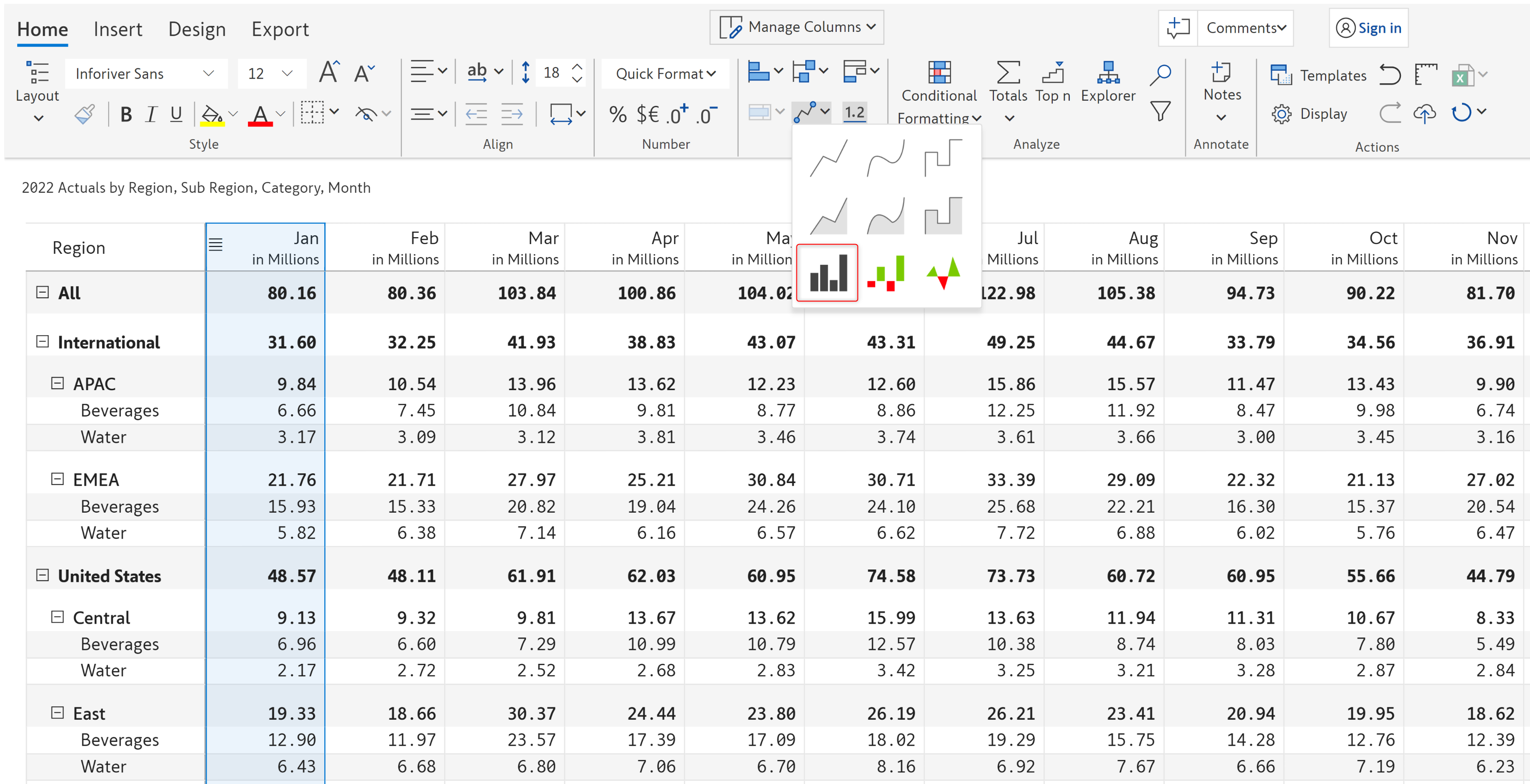
b) Select a column for which you want to insert the sparkline chart. In the following image, the 2022 Actuals for the month Jan has been selected.&#x20;

The sparkline chart option gets enabled. From the 'Sparkline chart' drop-down, select the 'Column sparkline chart'.&#x20;

<figure><img src="https://3062809325-files.gitbook.io/~/files/v0/b/gitbook-x-prod.appspot.com/o/spaces%2FEbkCXCUXmtUq5tcnUtZE%2Fuploads%2FHqaj8g15jTIUuhHoeIld%2Fsparkline-column-chart-type-selection.png?alt=media&amp;token=bb53649b-f22f-4571-9a08-b60d2914a57b" alt=""><figcaption><p>Column and chart type selection</p></figcaption></figure>

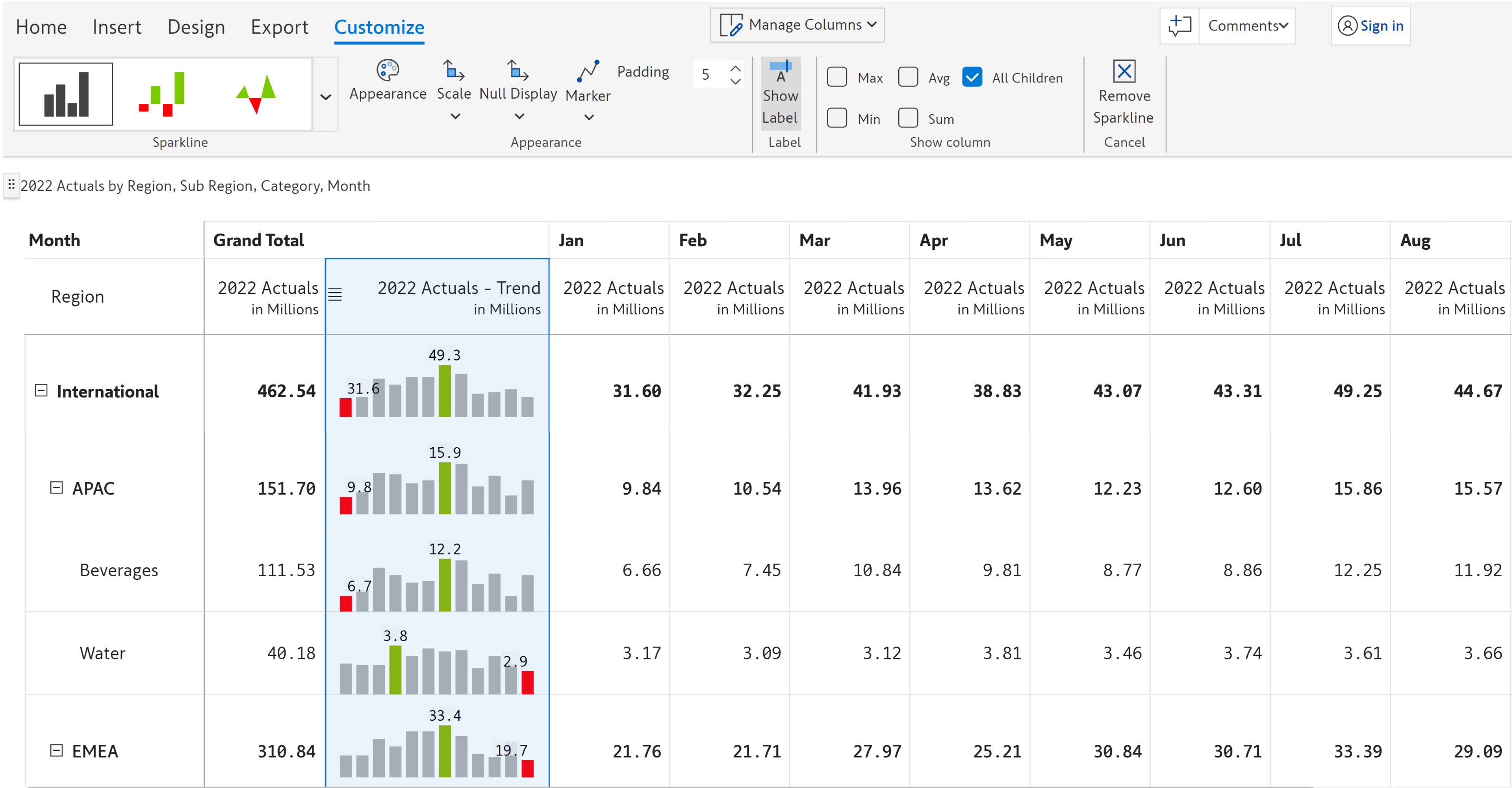
c) The spark column appears incorporating data for all the months. You can see the *minimum* and *maximum* values for each row in *red* and *green*. You can see the 'Customize' tab in the toolbar and the following [customization options](#2.-customization-options).

<figure><img src="https://3062809325-files.gitbook.io/~/files/v0/b/gitbook-x-prod.appspot.com/o/spaces%2FEbkCXCUXmtUq5tcnUtZE%2Fuploads%2Fxx7BqBYgMA0vtj8qTy0H%2Fsparkline-cistomization-option.png?alt=media&amp;token=2f6d9adf-270a-4cc3-9752-6e9f10e97788" alt=""><figcaption><p>Sparkline customization options</p></figcaption></figure>

{% hint style="info" %}
You can select a **subset of the columns** using Shift/Ctrl + Click if you do not want to visualize all the periods as a sparkline.
{% endhint %}

## 2. Customization options

The following options are available for customizing a sparkline chart.

{% hint style="info" %}
Depending on the type of sparkline chart chosen, some of these options may or may not be available.
{% endhint %}

### **i) Sparkline**&#x20;

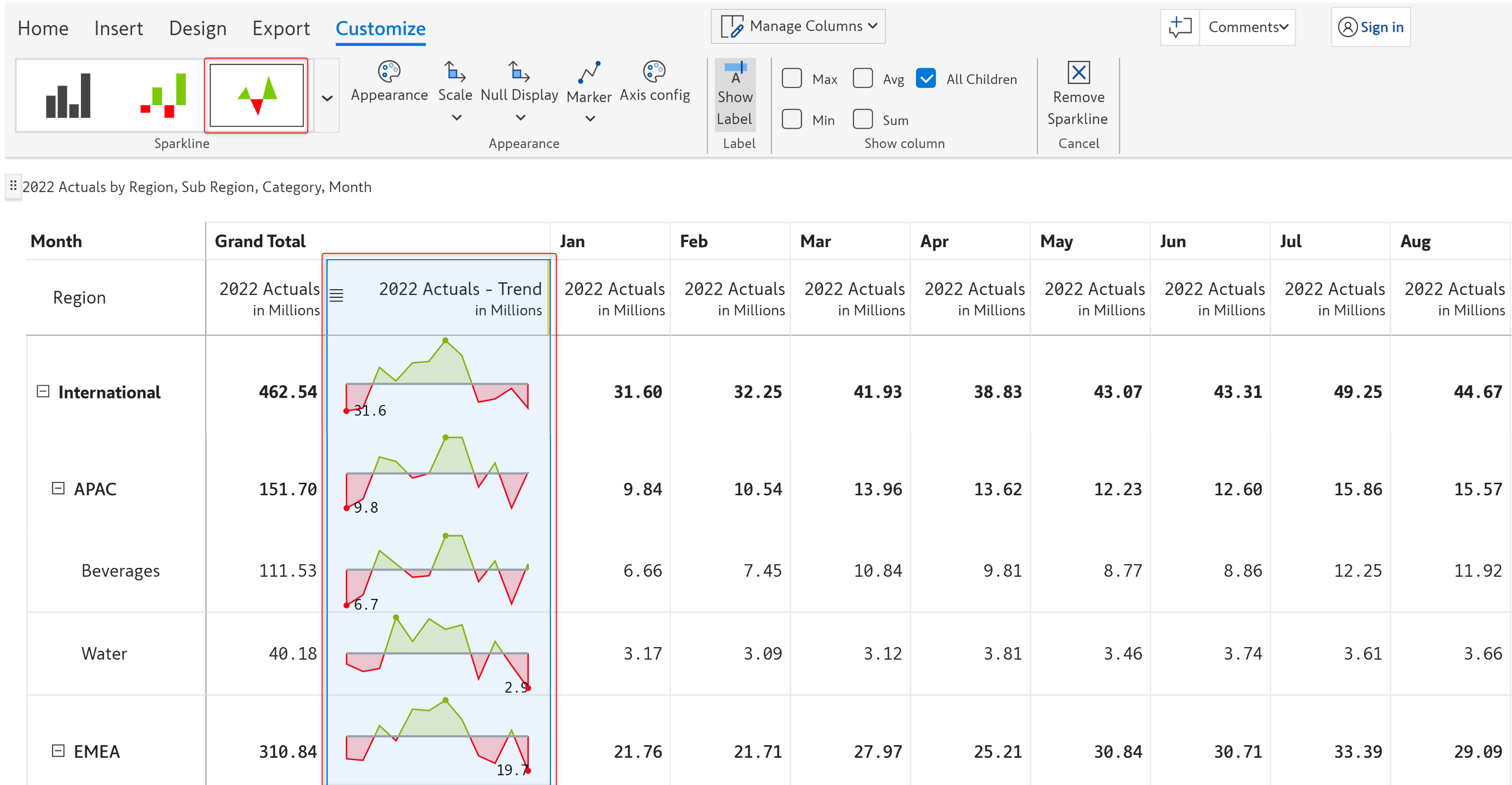
You can change your current sparkline chart type by clicking on the drop-down arrow in the 'Sparkline' section. In the image below, we have changed the chart type from '*Column sparkline*' to '*Baseline*'.

<figure><img src="https://3062809325-files.gitbook.io/~/files/v0/b/gitbook-x-prod.appspot.com/o/spaces%2FEbkCXCUXmtUq5tcnUtZE%2Fuploads%2FwtqUsALwsQLbsprejesS%2Fsparkline-chart-type.png?alt=media&amp;token=cb1d7c43-8f2c-4f7b-a695-83bd0d9658fd" alt=""><figcaption><p>Sparkline chart type options</p></figcaption></figure>

### **ii) Marker**&#x20;

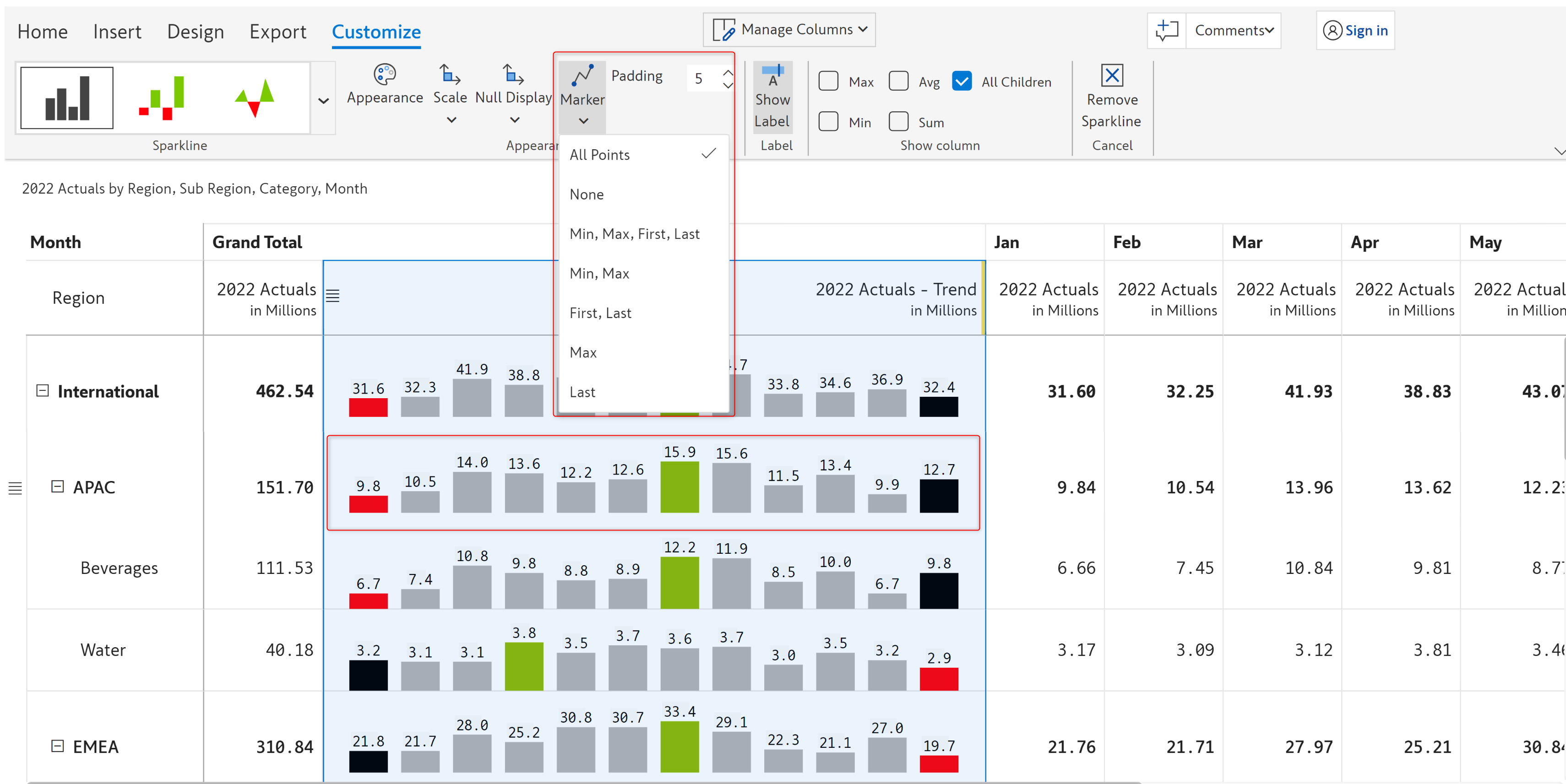
From the 'Marker' drop-down, you can select the type of marker points you want to insert in your chart. Adding marker points in your chart helps you to analyze and understand the data better. You can insert marker for:

* **All points** - All the points in the chart
* **None** - No points at all
* **Min, Max, First, Last** - Only for the minimum, maximum, first, and last values in the chart
* **Min, Max** - Only for the minimum and maximum values
* **First, Last** - Only for the first and last values
* **Max** - Only for the maximum value
* **Last** - Only for the last value

<figure><img src="https://3062809325-files.gitbook.io/~/files/v0/b/gitbook-x-prod.appspot.com/o/spaces%2FEbkCXCUXmtUq5tcnUtZE%2Fuploads%2F1V3hGkifMh4NgIMuX6hX%2Fsparkline-marker-type.png?alt=media&amp;token=428ffe65-548c-407f-aaa1-224262eae11e" alt=""><figcaption><p>Sparkline marker type</p></figcaption></figure>

### **iii) Scale bands**&#x20;

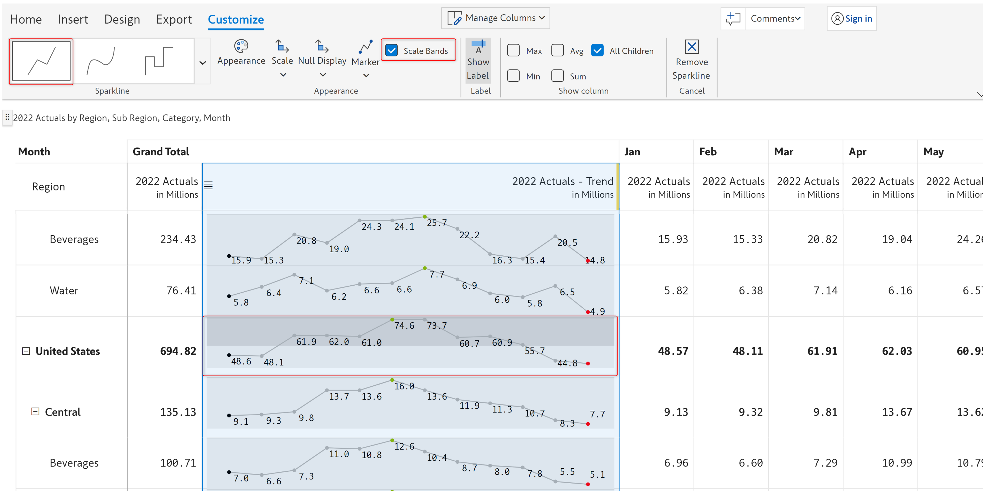
'Scale bands' visually display information about the overall distribution of values. If the distribution of values falls in the *first quartile (0-25%)*, then it is represented by a *lighter shade of gray*. However, if the value distribution falls in the *last quartile (75-100%)*, then it is represented by a *darker shade of gray*.&#x20;

{% hint style="info" %}
The scale bands option is available only if you select any of the standard sparkline chart types (*Line Linear, Line Spline,* or *Line Stepped*).
{% endhint %}

<figure><img src="https://3062809325-files.gitbook.io/~/files/v0/b/gitbook-x-prod.appspot.com/o/spaces%2FEbkCXCUXmtUq5tcnUtZE%2Fuploads%2FHnwi4YxcFWLdNT28ZXM2%2Fsparkline-scale-band.png?alt=media&amp;token=850d875c-89f0-4550-b665-8b4ecd8659c8" alt=""><figcaption><p>Sparkline scale band</p></figcaption></figure>

### **iv) Show column**&#x20;

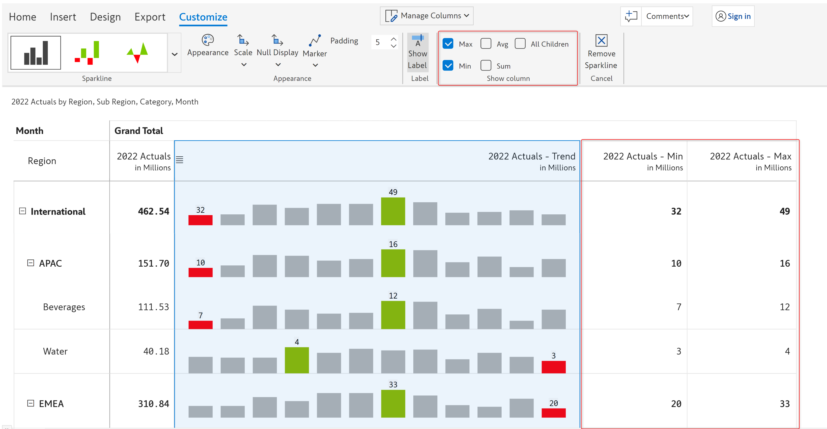
From the 'Show column' section, you can choose whether to show the *Min, Max, Avg,* or *Sum* columns or *All children (enabled by default).* In the below image, the *Avg* and *Min* columns are enabled in the Show Column option, and the report shows the Min and Average columns.

<figure><img src="https://3062809325-files.gitbook.io/~/files/v0/b/gitbook-x-prod.appspot.com/o/spaces%2FEbkCXCUXmtUq5tcnUtZE%2Fuploads%2FEbecF7kHjhrPFRPGuJZd%2Fsparkline-show-column.png?alt=media&amp;token=8153e813-5b25-4e77-a255-27942c1edaa5" alt=""><figcaption><p>Sparkline show column</p></figcaption></figure>

### **v) Axis config**&#x20;

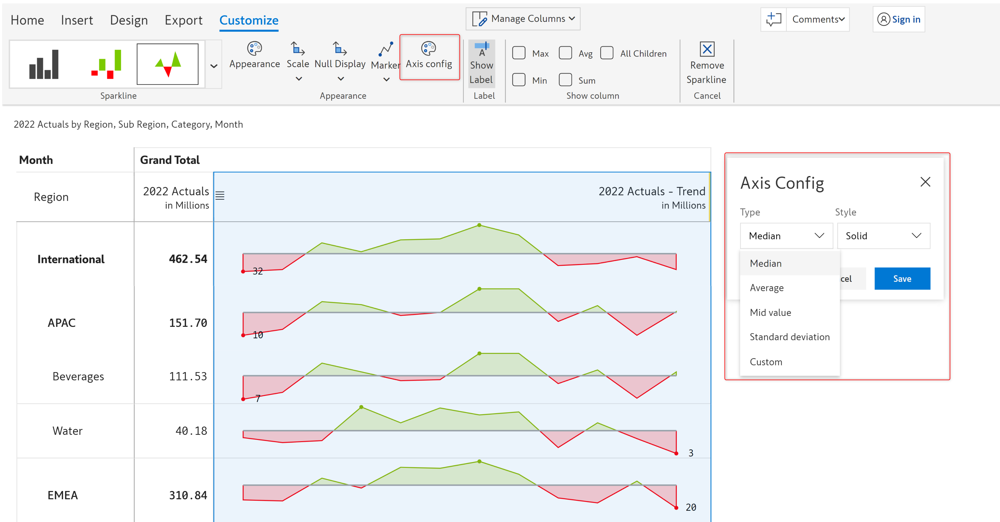
You can configure the *type* and *style* of the axis line from the 'Axis config' option. Clicking on the 'Axis Config' option will open up the Axis config modal, in which you can choose the type and style of the axis.

{% hint style="info" %}
The axis config option is available only for the *baseline* chart.
{% endhint %}

<figure><img src="https://3062809325-files.gitbook.io/~/files/v0/b/gitbook-x-prod.appspot.com/o/spaces%2FEbkCXCUXmtUq5tcnUtZE%2Fuploads%2FOskeveDkRLBthS6xUMr7%2Fsparkline-axis-config.png?alt=media&amp;token=ae56e195-ac91-4353-bc39-28300ba1a666" alt=""><figcaption></figcaption></figure>

**Type** - An axis in a chart basically serves as a reference making it easy to interpret other data values with respect to it. Depending on the axis type you choose, the axis will get displayed at the

* **Median** - Median value of the data set
* **Average** - Average value of the data set
* **Mid value** - Mid value of the data set
* **Standard deviation** - Standard deviation of the data set
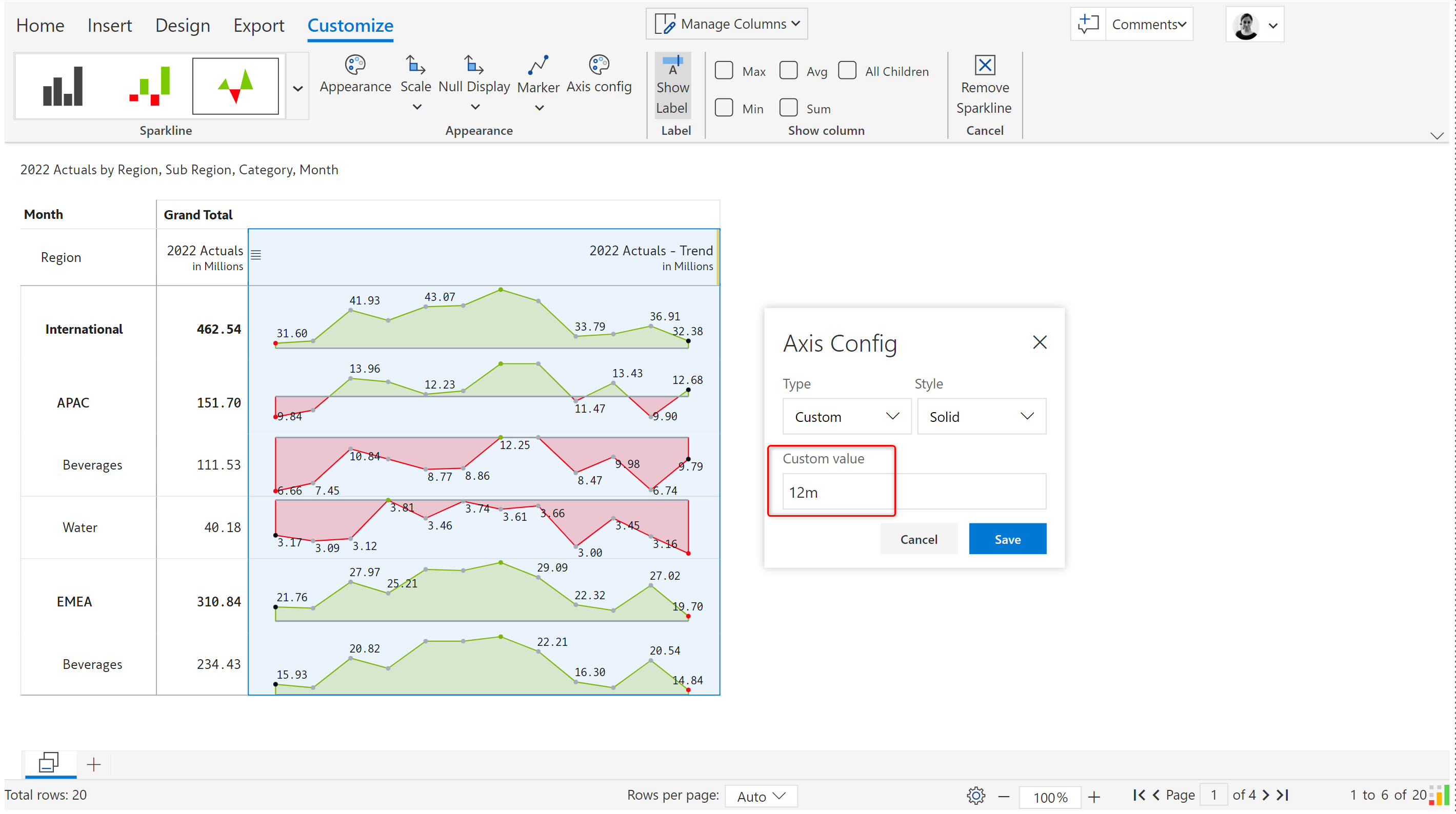
* **Custom** - When the custom option is chosen, you can define a custom value for the axis as shown below.

<figure><img src="https://3062809325-files.gitbook.io/~/files/v0/b/gitbook-x-prod.appspot.com/o/spaces%2FEbkCXCUXmtUq5tcnUtZE%2Fuploads%2F2RYzNjMRhdtLrnS2Vftu%2FCustom%20axis.png?alt=media&amp;token=fad601d1-7047-4901-a894-bf668c293809" alt=""><figcaption><p>Custom axis configuration</p></figcaption></figure>

**Style** - This option lets you configure how the axis line of the chart should look like. You can select any of the following styles for the axis line - *Solid, Dotted, Dashed, Long dashed* and *Double solid.*

### **vi) Null display**&#x20;

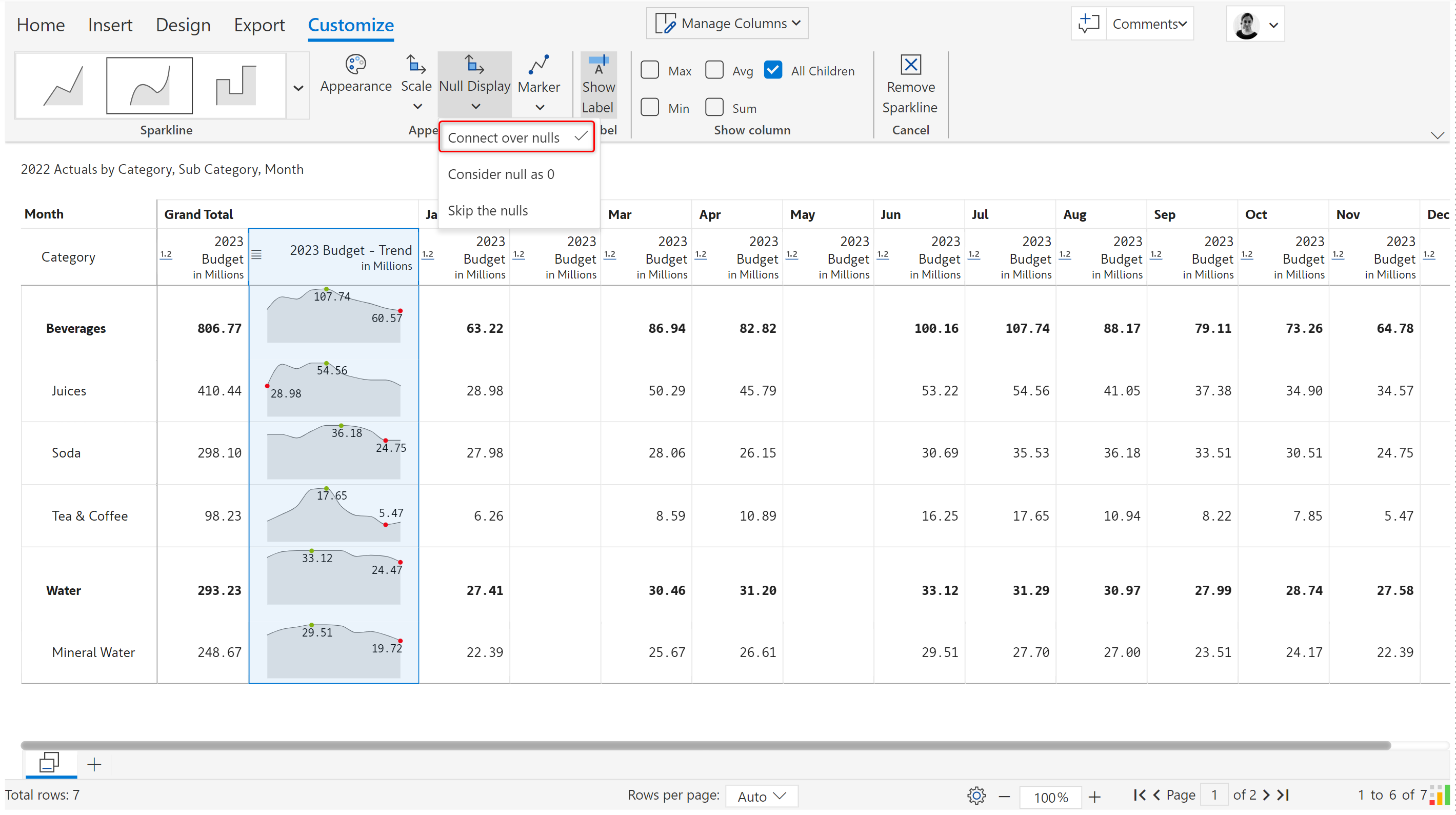
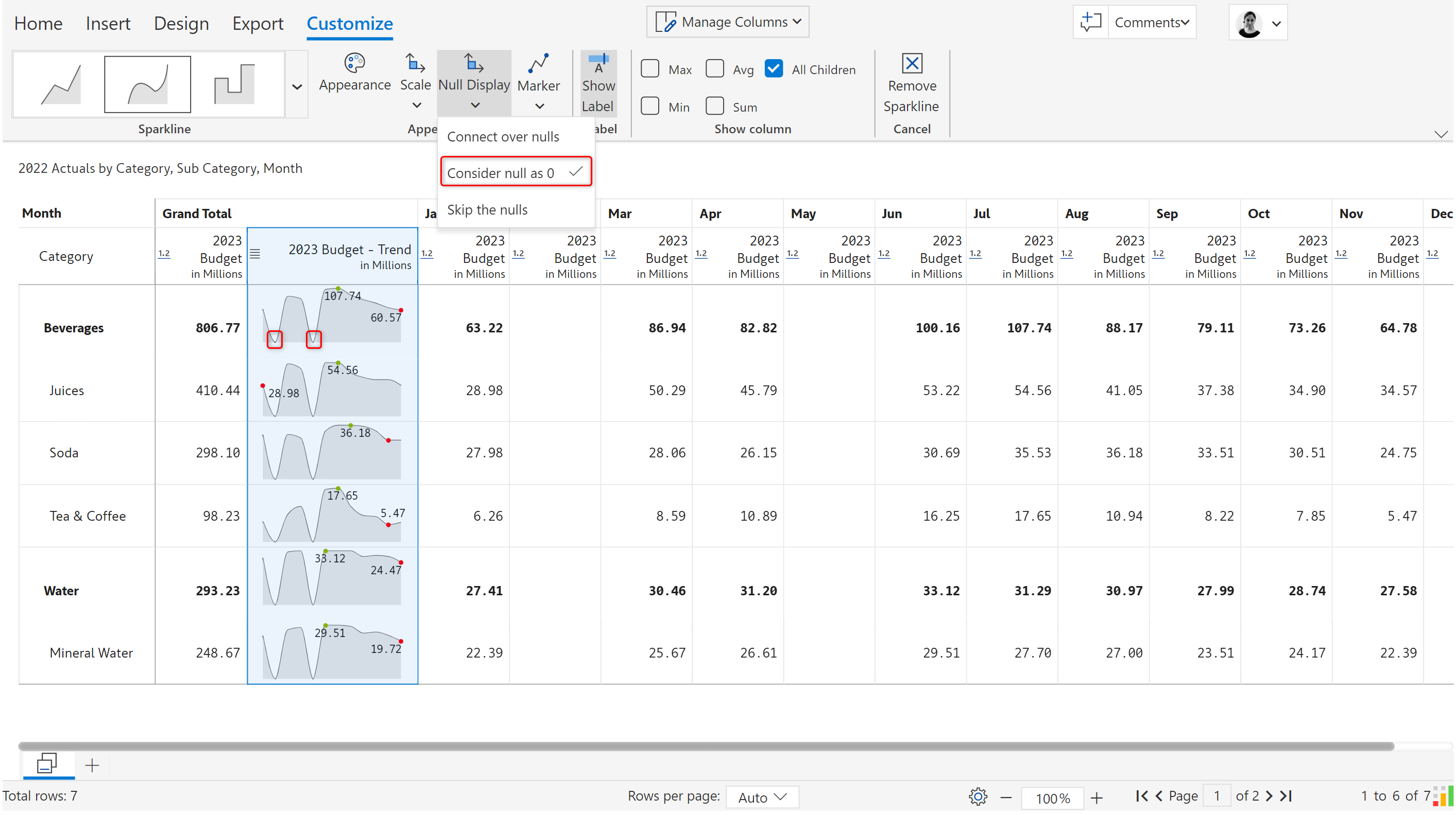
Using the 'Null display' option, you can configure how you want to connect the null values in your dataset. In this example, the 2023 Budget for Feb and May are blank.&#x20;

* **Connect over nulls** - If you select this option, then all the null data points in the dataset will be connected over by lines.&#x20;

<figure><img src="https://3062809325-files.gitbook.io/~/files/v0/b/gitbook-x-prod.appspot.com/o/spaces%2FEbkCXCUXmtUq5tcnUtZE%2Fuploads%2FxqIwtJyNEI4uPzEhFqCN%2FConnect%20over%20null.png?alt=media&amp;token=c40f2a0e-35ca-42c5-9550-bbef64f847b9" alt=""><figcaption><p>Connect over nulls</p></figcaption></figure>

* **Consider null as 0** - All the null values in the dataset will be considered '*0' (Zero)*

<figure><img src="https://3062809325-files.gitbook.io/~/files/v0/b/gitbook-x-prod.appspot.com/o/spaces%2FEbkCXCUXmtUq5tcnUtZE%2Fuploads%2FVtiopxPHX0fEgIGvbN8P%2FConsider%20null%20as%200.png?alt=media&amp;token=450441a3-2054-4ec3-bf30-587230e9ce29" alt=""><figcaption><p>Consider null as 0</p></figcaption></figure>

* **Skip the nulls** - All the null values will be skipped

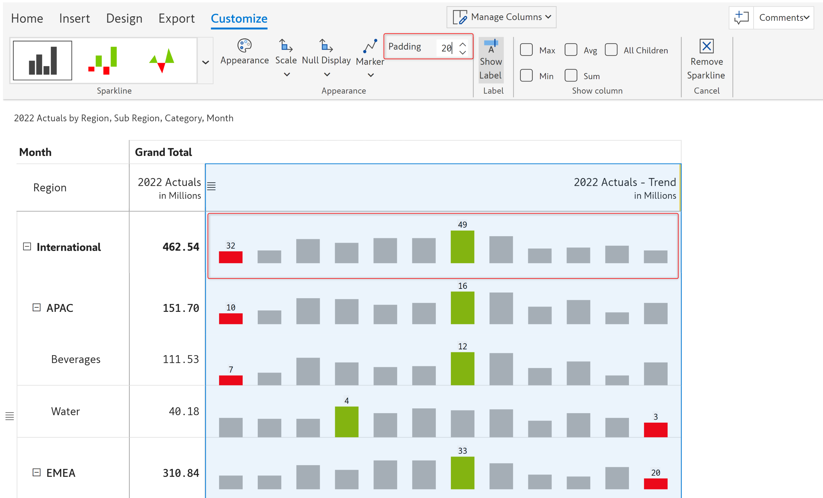
### **vii) Padding**&#x20;

Using the 'Padding' option, you can change the padding/spacing between the bars. The default padding value is 5.

{% hint style="info" %}
The padding option is available only for the *Column* and *Win/Loss* Sparklines.
{% endhint %}

<figure><img src="https://3062809325-files.gitbook.io/~/files/v0/b/gitbook-x-prod.appspot.com/o/spaces%2FEbkCXCUXmtUq5tcnUtZE%2Fuploads%2FeJsm0h3HgwqBJGzCp2LL%2Fsparkline-padding.png?alt=media&amp;token=07399259-a6ad-480d-83db-741c46e35436" alt=""><figcaption><p>Sparkline padding option</p></figcaption></figure>

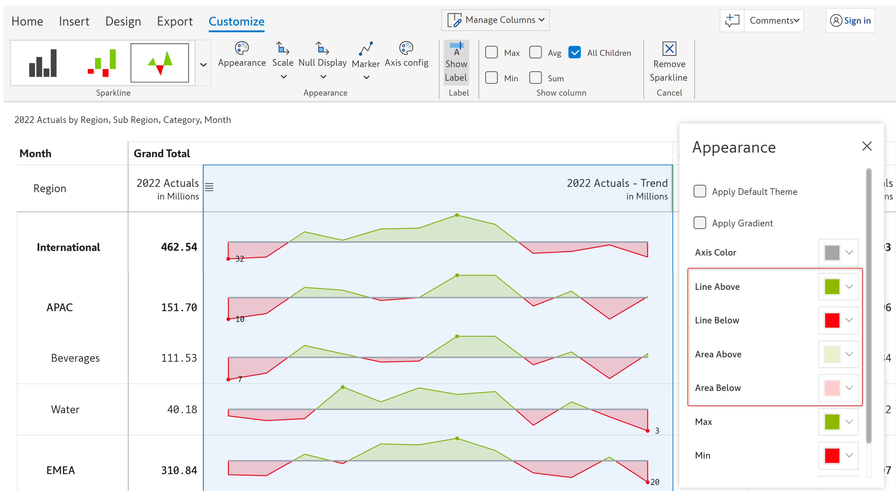
### viii) Appearance

This option lets you change the appearance of the sparkline charts. Clicking on this option will open up an 'Appearance' model in which you can configure the following properties:

<figure><img src="https://3062809325-files.gitbook.io/~/files/v0/b/gitbook-x-prod.appspot.com/o/spaces%2FEbkCXCUXmtUq5tcnUtZE%2Fuploads%2FXa7ksi8Iy98OKEgYDFLJ%2Fsparkline-appearance.png?alt=media&amp;token=a6c6b3af-9994-4e3c-a2e8-02f7de1fca9b" alt=""><figcaption><p>Sparkline appearance option</p></figcaption></figure>

**a) Apply default theme** - Enabling this option will apply default power BI themes and colors to your sparkline charts

<figure><img src="https://3062809325-files.gitbook.io/~/files/v0/b/gitbook-x-prod.appspot.com/o/spaces%2FEbkCXCUXmtUq5tcnUtZE%2Fuploads%2F3H8HzaJuF0oO05d1RZ7k%2Fsparkline-default-theme.png?alt=media&amp;token=cf8f7cb9-da32-4aa8-9042-9badfddbd9de" alt=""><figcaption><p>Sparklinee default theme</p></figcaption></figure>

**b) Stroke width** - With this option, you can configure the width of the stroke of your sparkline charts. The default is 1.

<figure><img src="https://3062809325-files.gitbook.io/~/files/v0/b/gitbook-x-prod.appspot.com/o/spaces%2FEbkCXCUXmtUq5tcnUtZE%2Fuploads%2FVbVRqyKmvzxdnWVd2kyy%2Fsparkline-stroke-width.png?alt=media&amp;token=0c368947-8c5e-4ad3-b72e-9a0a5ba119b4" alt=""><figcaption><p>Sparkline stroke width</p></figcaption></figure>

**c) Base color** - Using this option you can configure the base color of the strokes of the sparkline charts

**d) Max** - This option lets you set the color of the maximum point in the chart

**e) Min** - This option lets you configure the color of the minimum point in the chart

**f) Label** - This option lets you configure the color of the data label in the chart

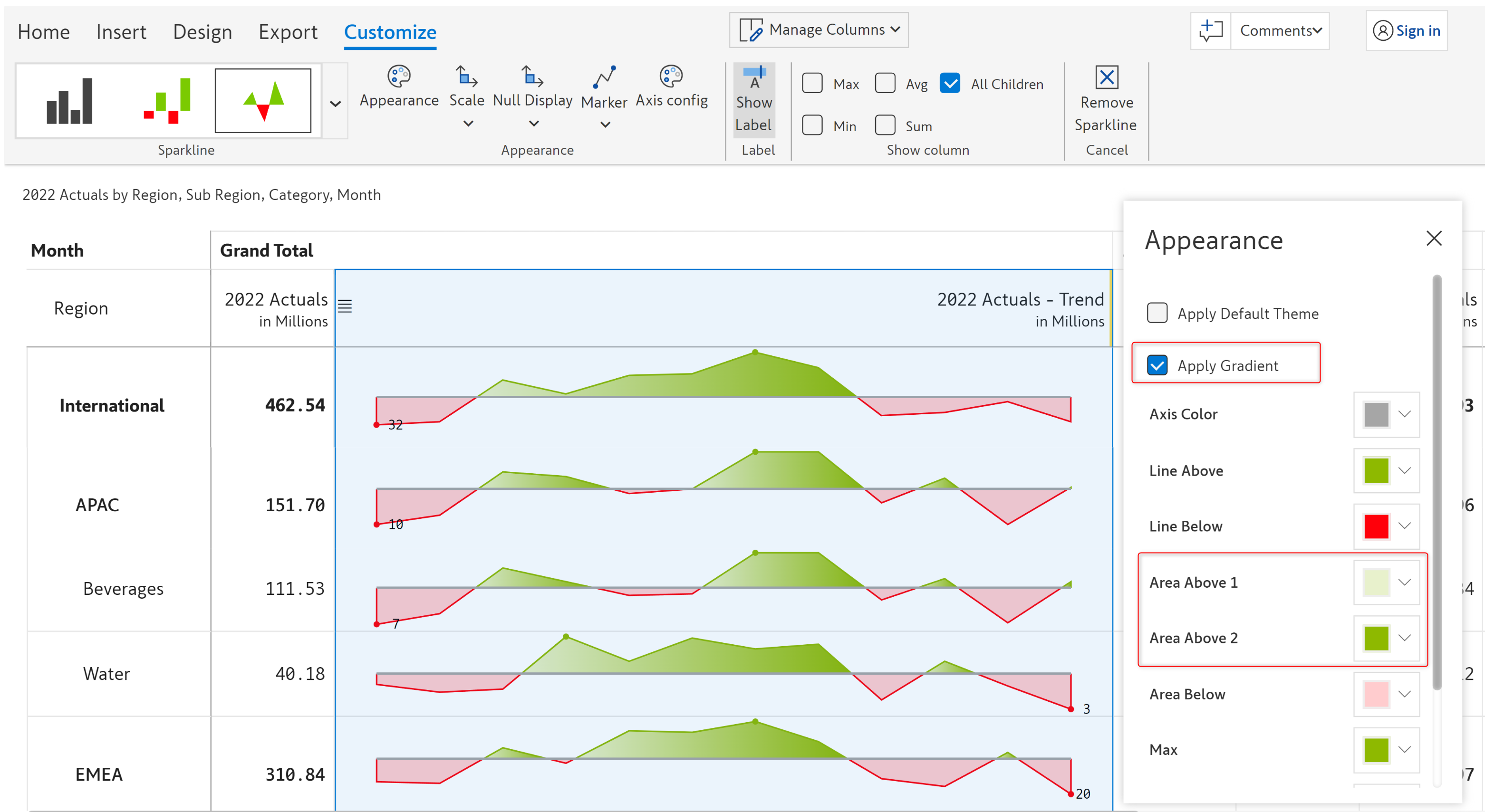
**g) Apply gradient** - With this option, you can enable or disable the gradient coloring. If you enable this option, two additional options become available. The 'Area above 1' and 'Area above 2' using which you can set the starting and ending colors for the area above the axis.

<figure><img src="https://3062809325-files.gitbook.io/~/files/v0/b/gitbook-x-prod.appspot.com/o/spaces%2FEbkCXCUXmtUq5tcnUtZE%2Fuploads%2FKnJz5E3itbYDFWV8q2kD%2Fsparkline-gradient.png?alt=media&amp;token=22b734b5-7992-42e8-aa26-d3b860c6a5c6" alt=""><figcaption><p>Sparkline apply gradient</p></figcaption></figure>

**h) Line above** - With this option, you can set the color of the line above the axis

**i) Line below** - With this option, you can set the color of the line below the axis

**j) Area above** - With this option you can customize the color of the area above the axis

**k) Area below** - With this option you can customize the color of the area below the axis

<figure><img src="https://3062809325-files.gitbook.io/~/files/v0/b/gitbook-x-prod.appspot.com/o/spaces%2FEbkCXCUXmtUq5tcnUtZE%2Fuploads%2FWY45imbijgNRcQDqOTcK%2Fsparkline-color-options.png?alt=media&amp;token=492f79bf-06bd-4c8f-9221-734145a74b6d" alt=""><figcaption><p>Sparkline color options</p></figcaption></figure>

**l) Axis color** - This option lets you customize the color of the axis line

**m) Positive color** - Using this option you can customize the positive color of the bar

**n) Negative color** - Using this option you can customize the negative color of the bar

<figure><img src="https://3062809325-files.gitbook.io/~/files/v0/b/gitbook-x-prod.appspot.com/o/spaces%2FEbkCXCUXmtUq5tcnUtZE%2Fuploads%2Fq7c9LJMwmoW6VDmD1y3y%2Fsparkline-axis-color.png?alt=media&amp;token=0c875461-462e-447a-b81b-3dde40cf1c81" alt=""><figcaption><p>Variance color option</p></figcaption></figure>

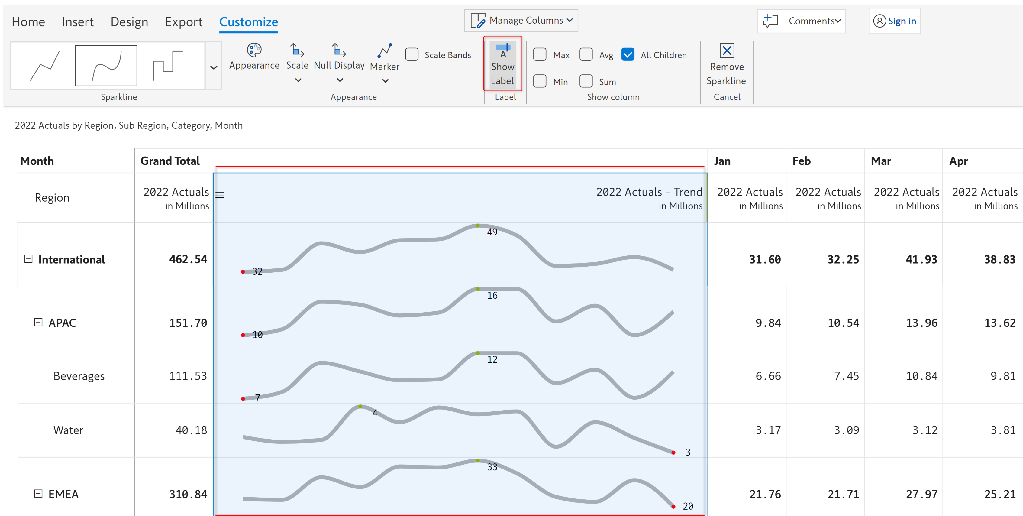
### viii) Show label&#x20;

You can configure whether to show or hide data labels using this option. Data labels are shown by default. Clicking on this option once will hide the data labels and clicking again will show the labels.

<figure><img src="https://3062809325-files.gitbook.io/~/files/v0/b/gitbook-x-prod.appspot.com/o/spaces%2FEbkCXCUXmtUq5tcnUtZE%2Fuploads%2FzjQNbsHMNiqNHnaevOmF%2Fsparkline-show-llabel.png?alt=media&amp;token=3e313663-2f67-4c5e-8d83-53fda8ece7dc" alt=""><figcaption><p>Sparkline show label</p></figcaption></figure>

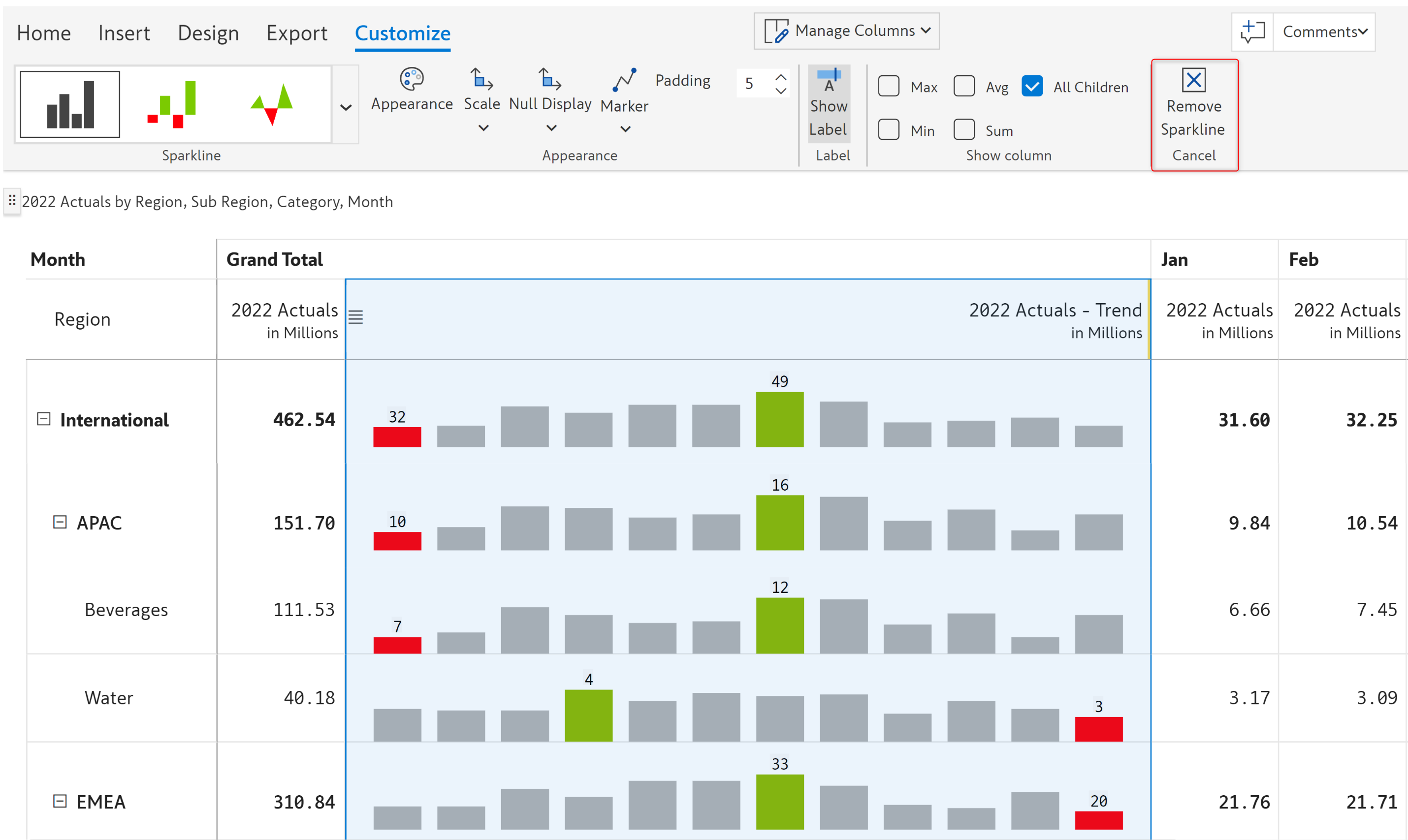
### **ix) Remove sparkline**&#x20;

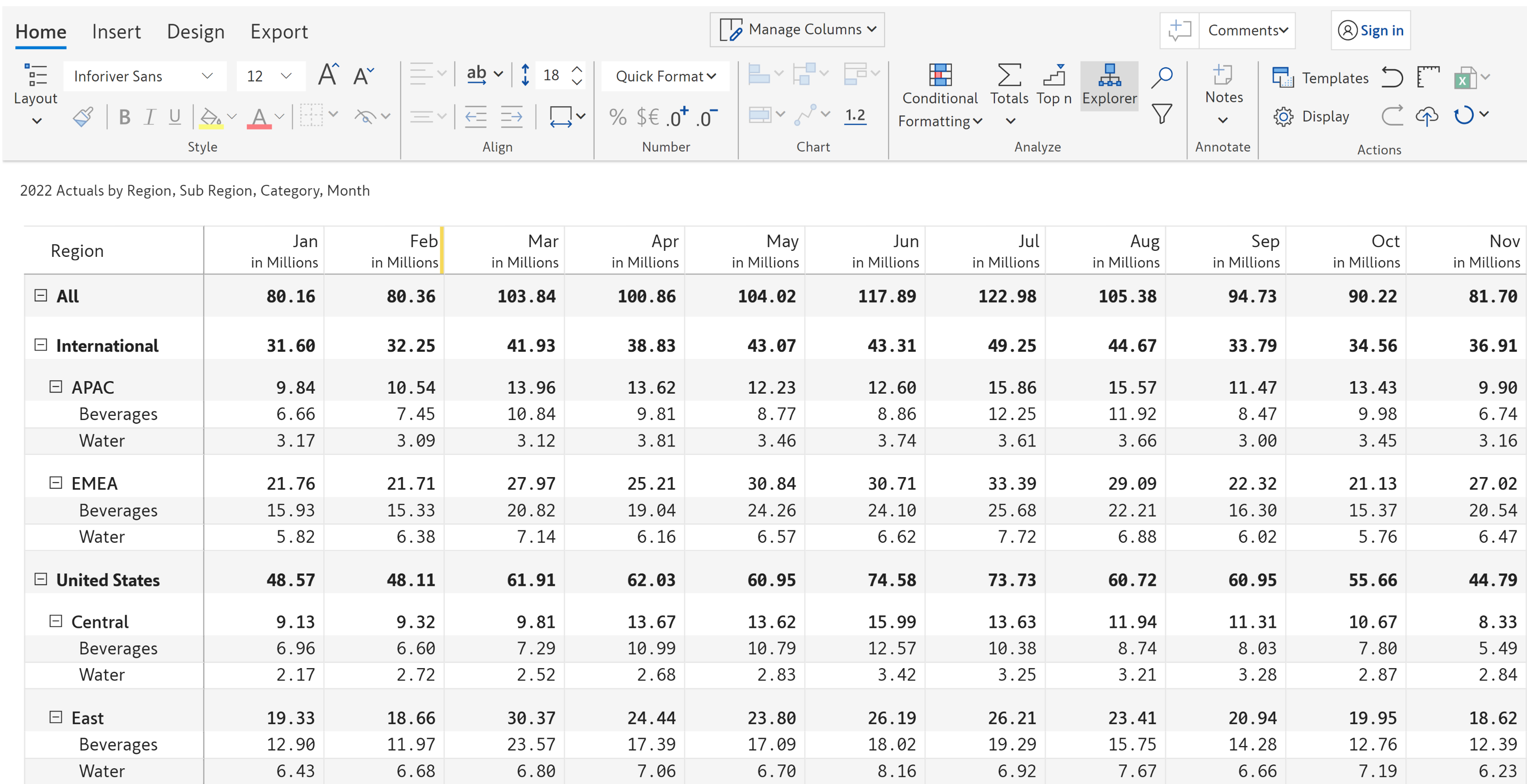
Clicking on the 'Remove sparkline' option removes the sparkline chart from the report and restores it to the original number format.

<figure><img src="https://3062809325-files.gitbook.io/~/files/v0/b/gitbook-x-prod.appspot.com/o/spaces%2FEbkCXCUXmtUq5tcnUtZE%2Fuploads%2FqRd3mVVCimt5EQktUxEm%2Fremove-sparkline.png?alt=media&amp;token=d5a81c76-1c65-40f8-9c3d-63c99f80a59a" alt=""><figcaption><p>Remove sparkline chart</p></figcaption></figure>

<figure><img src="https://3062809325-files.gitbook.io/~/files/v0/b/gitbook-x-prod.appspot.com/o/spaces%2FEbkCXCUXmtUq5tcnUtZE%2Fuploads%2Fxe9NwS1m5xsddLwhKXbR%2Fremove-chart.png?alt=media&amp;token=781d56f0-7e8e-4eb6-9530-6b0468ca129b" alt=""><figcaption><p>After chart removal</p></figcaption></figure>

In this section, we covered the sparkline charts. Navigate to the next section to learn more about [stacked charts](/~/changes/mS6jwvARNLHpKqBa4cT9/working-with-inforiver/6.-working-with-charts/stacked-charts.md).&#x20;


---

# Agent Instructions
This documentation is published with GitBook. GitBook is the documentation platform designed so that both humans and AI agents can read, navigate, and reason over technical content effectively. Learn more at gitbook.com.

## Querying This Documentation
If you need additional information that is not directly available in this page, you can query the documentation dynamically by asking a question.

Perform an HTTP GET request on the current page URL with the `ask` query parameter, and the optional `goal` query parameter:

```
GET https://docs.inforiver.com/~/changes/mS6jwvARNLHpKqBa4cT9/working-with-inforiver/6.-working-with-charts/sparkline-charts.md?ask=<question>&goal=<endgoal>
```

`ask` is the immediate question: it should be specific, self-contained, and written in natural language.
`goal` is optional and describes the broader end goal you are ultimately trying to accomplish on behalf of the user. GitBook uses it to tailor the answer towards what is most useful for that goal.

The response will contain a direct answer to the question and relevant excerpts and sources from the documentation.

Use this mechanism when the answer is not explicitly present in the current page, you need clarification or additional context, or you want to retrieve related documentation sections.