
Header & footer
The header and footer in business reports provide a consistent way to identify the content, promote the company's brand, and ensure that important information is easily accessible. Inforiver Premium table offers powerful header & footer customization capabilities and can be used to show charts, KPIs, images, and text.
Below is a sample report created using Premium Table. You can see a header with a KPI card, a report title, and an overlapping bar chart. The footer contains the company logo and page number.

Let's take a look at how to create a report like the one shown above. The header & footer module is organized as follows:
Overview of the header and footer, including options and presets - An overview of the toolbar, header and footer sections, presets, basic interactions, and basic customization options are explained in the section below.
Text - Adding formatted text to the header and footer and using presets like page number, date field, etc.
Images - Adding images from local files and organizational workspace.
Charts - Adding various types of charts and associated customization options.
KPI cards - Adding customizable KPI presets.
1. Header and Footer interface
Let's look at the header/footer interface. The table below has a default header added.

1.1. Editing a header
STEP 1: Click on Header & Footer in the Design tab. Alternatively, hover over the header and select Edit from the hamburger menu.

STEP 2: The header ribbon is enabled. You can see there is a default header that shows the fields added and the scaling.

The blue box is called the container. Currently, there is only one cell in the container with the default fields and scaling. Containers can be split into many sections and used to create elements like Text, Image, Chart, and KPI. We'll be covering container customizations in later sections.
1.2. Hiding the header
Select the Hide Header option from the context menu if you do not wish to display the header.

The header is now hidden as shown below. You can display it again at any time by selecting the Show Header option from the context menu.

1.3. Resetting the header
To remove any additional customizations and restore the default header, select the Reset option from the header context menu.

1.4. Editing a footer
To edit the footer, click on Edit from the footer menu.

The container for the footer opens as shown below. It has an empty container. A container can be divided into many sections, each of which can contain elements such as text, images, charts, and KPIs. We'll be covering container customizations in later sections.

1.5. Hiding the footer
To hide the footer, select the Hide Footer option from the context menu.

The footer is hidden. To display the footer, click on Show Footer from the header context menu.

1.6. Resetting the footer
Click on Reset to reset any added customizations to the footer.

2. Creating and customizing cells
The header/footer containers can be split into cells and customized further. Let's first look at creating and managing cells.
STEP 1: Let's edit the header by clicking the Edit in the context menu. You can also edit the header by clicking the Header & Footer button in the Design ribbon.
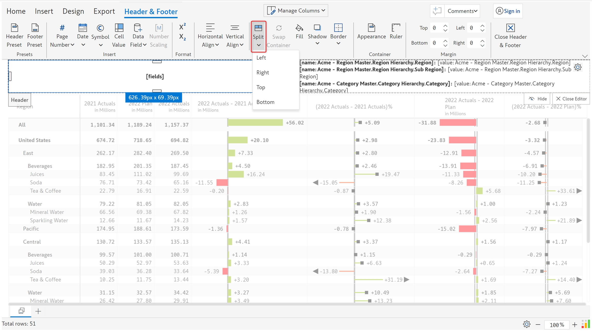
STEP 2: Click on the settings icon  . Then, choose Split. You can select the appropriate option to split the container.

The Split panel above option splits the container horizontally and adds a container at the top.

The Split panel below option splits the container horizontally and adds a container at the bottom.

The Split panel to the left option splits the container vertically and adds a container to the left.

The Split panel to the right option splits the container vertically and adds a container to the right.

STEP 3: The container height can be adjusted by hovering on the bottom border and dragging the handle. The width can be adjusted by dragging the handle that is enabled on hovering over the cell border.

STEP 4: Click the plus icon to insert elements like Text, Image, Chart, and KPI card, which are explained in subsequent sections.

STEP 5: When you click on any of the items—Text, Image, Chart, or KPI, you will be presented with a pop-up where you can choose to directly insert the selected element into the container or create a new container to include them.
Let's try with text.

If you choose the Replace the selected Container option, the chosen element (chart, text, KPI, images) will be inserted into that container.

You can also choose to add a new container to the right, left, above, or below the existing container. Let's add a chart element and choose to insert it above the selected container.

Click Apply. In the image below, notice how the chart is inserted in a new container above the currently selected container.

You can customize the chart data and style by clicking on the 'Settings' icon. This section explains them in detail.
STEP 6: After inserting an element, use the container controls to copy and paste its contents into another cell. You can also reset or delete a cell and its contents. This is demonstrated in the image below.

3. Inserting predefined text elements—date, page numbers, measure name, etc.
Use the Insert dropdown menu to add the predefined text elements to the header or footer, as listed below:
Page Numbers: Supported formats are 'Page X of Y', 'Page X/Y', 'Page X.' You can use the page numbers in the header or footer to traverse the report.

Date: Select from the different supported date formats to add to the header or footer.

Symbols: Insert symbols such as trademark or copyright, or choose an emoji.

Cell Value: Choose a cell value to be inserted after clicking this option. It will be included in the header/footer.

Variables: You can insert variables into the header/footer to include navigation and other functions that can be defined through scripting.

Data Field: Select any dimension or measure. The dimension values and measure totals are displayed in the header/footer.

Number scaling: When choosing the 'Uniform' format, you can display the number scaling applied to the measures in the header/footer for better comprehensibility.

The image below shows a sample of how various predefined text elements are inserted in the header and footer.

4. Presets
In addition to creating header/footer elements from scratch, we'll look at how to use pre-made presets to insert header/footer elements with just one click.
4.1. Header preset
STEP 1: In the Header & Footer tab, expand the Type dropdown menu and select Header from the Presets section.

A side panel opens up as shown below. Choose any of the presets and click Proceed in the warning message.

STEP 2: You can see that the header has been updated. These can be further customized as explained in the upcoming sections, but for now, let's go ahead with the preset. Close the side panel and click on Close Editor to apply the preset.

A customized header preset looks as shown below with all required details:

If you select a KPI preset, the filter choices will be reflected in the header. The table below represents only the 'Computers' and 'Cell Phones' categories, and the header KPIs reflect this.

4.2. Footer preset
The Premium Table also offers a number of footer presets with page numbers, report titles, logos, etc.
STEP 1: To display the footer, select Show Footer from the header context menu. The default footer displays the current date.

STEP 2: You can open footer presets either from the footer context menu or by navigating to the Header & Footer ribbon, expanding the Type dropdown, and selecting Footer from the Presets section. A side panel opens with a list of the available presets. Select a preset and click Proceed in the warning pop-up. Click Close Editor to apply the changes.
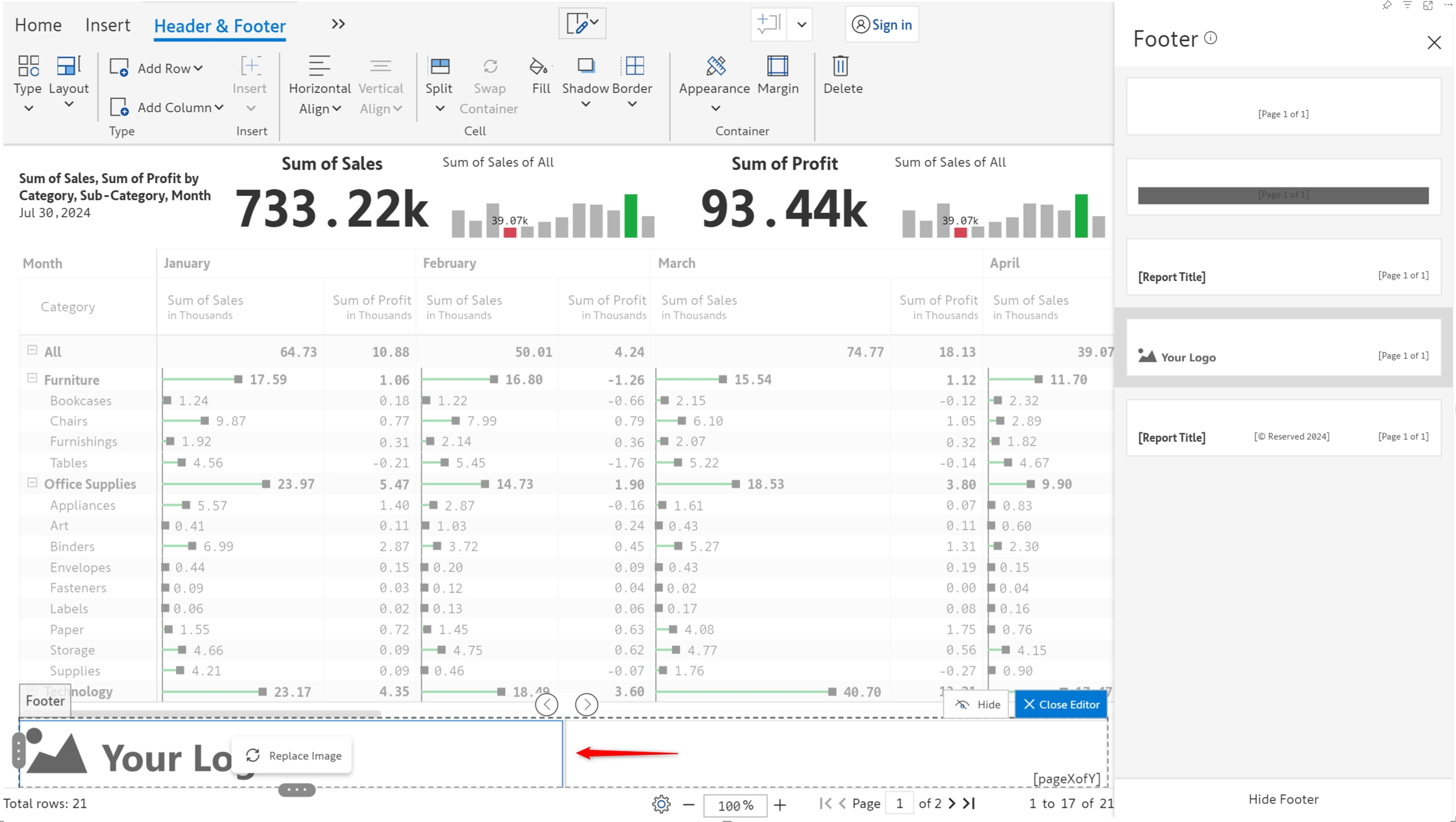
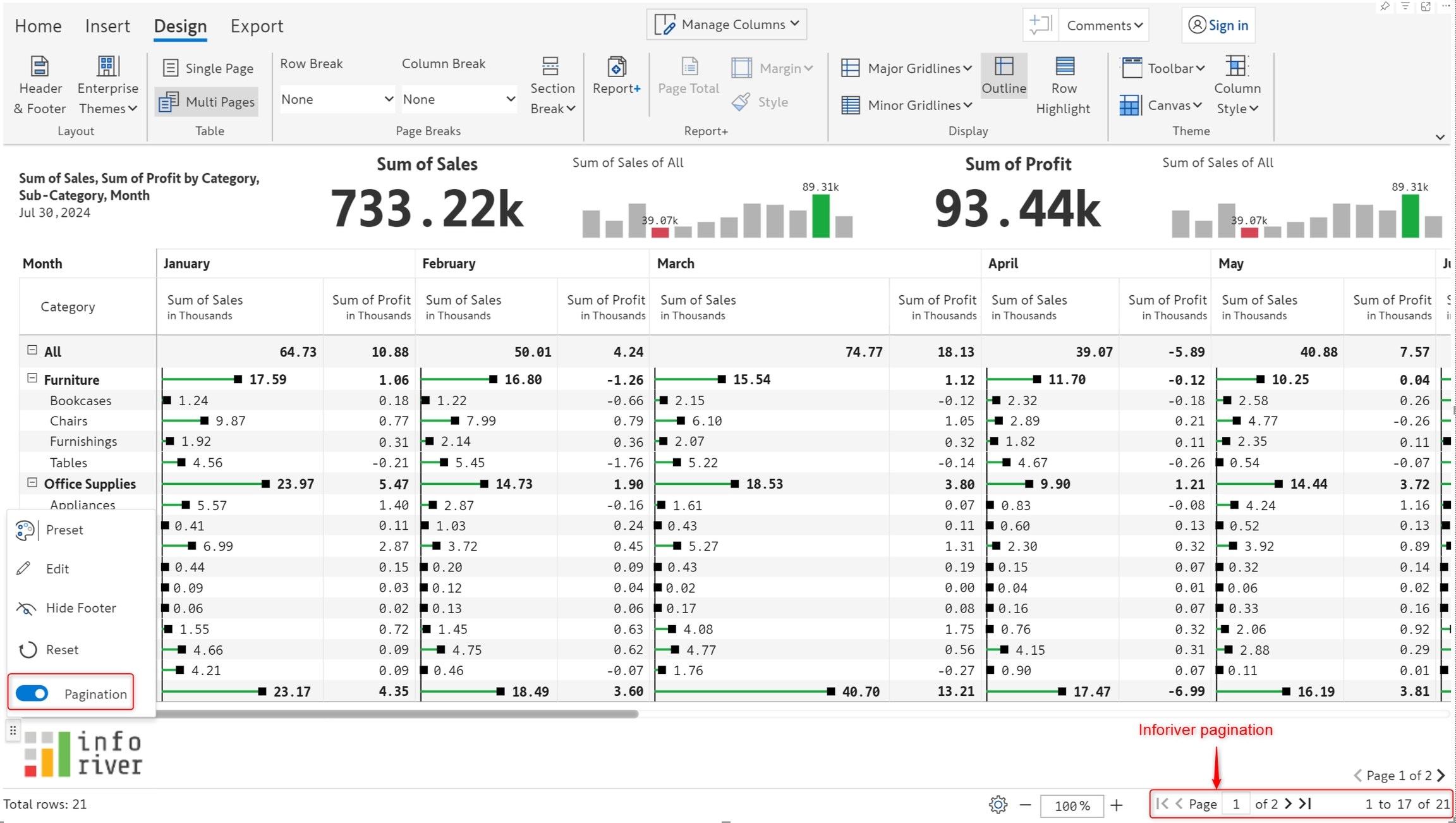
STEP 3: The footer displays the page number by default. You can disable the Inforiver pagination using the Pagination toggle from the context menu.
5. Cell and container customizations
All cells regardless of the type (Text, Image, etc.) can be formatted using the Cell and Margin sections of the Header & Footer toolbar. The header/footer containers can be formatted using the Container section.
5.1. Cell
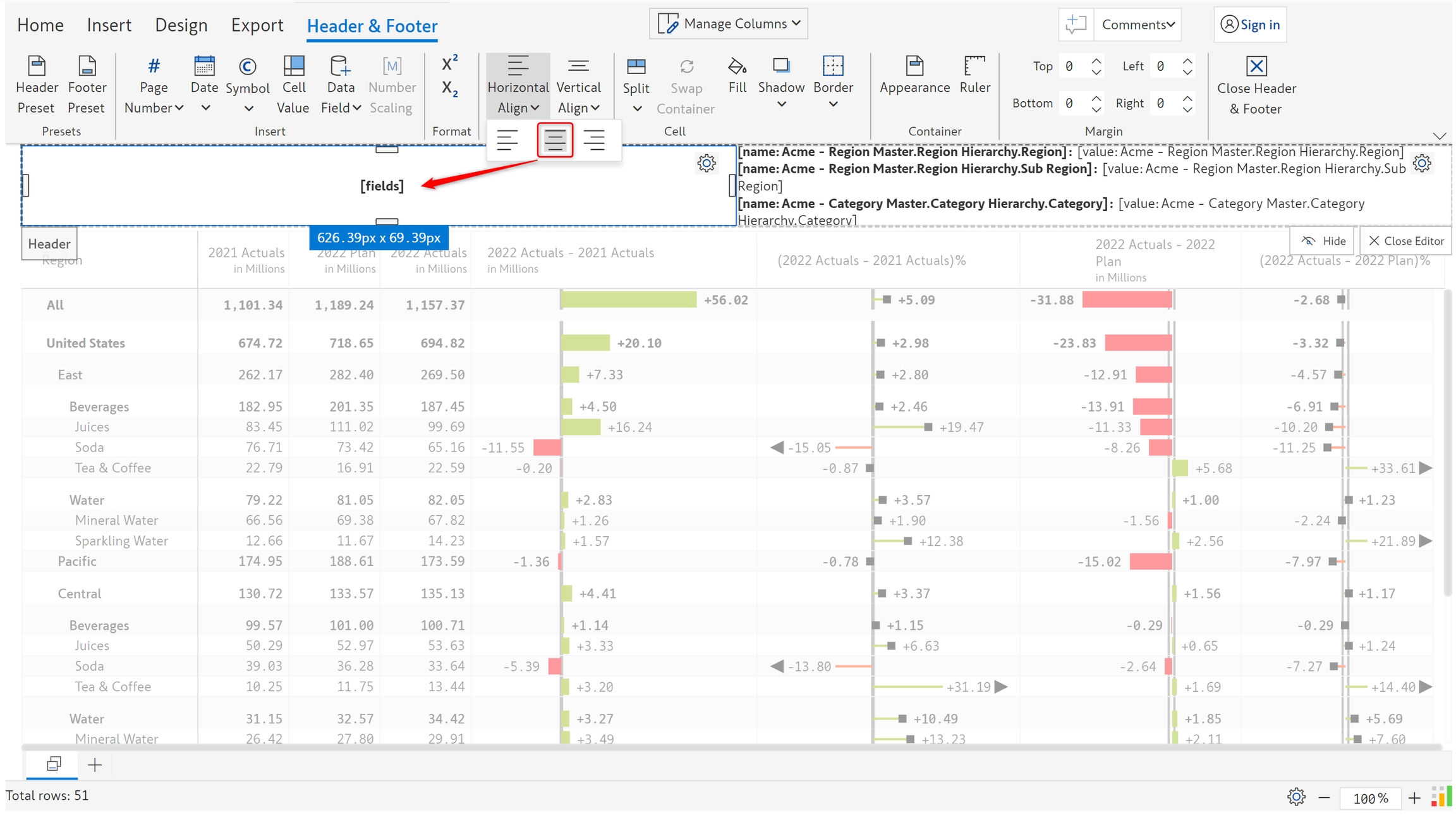
Using the options in this section, you can align the contents, apply fill, border or shadows, and more.
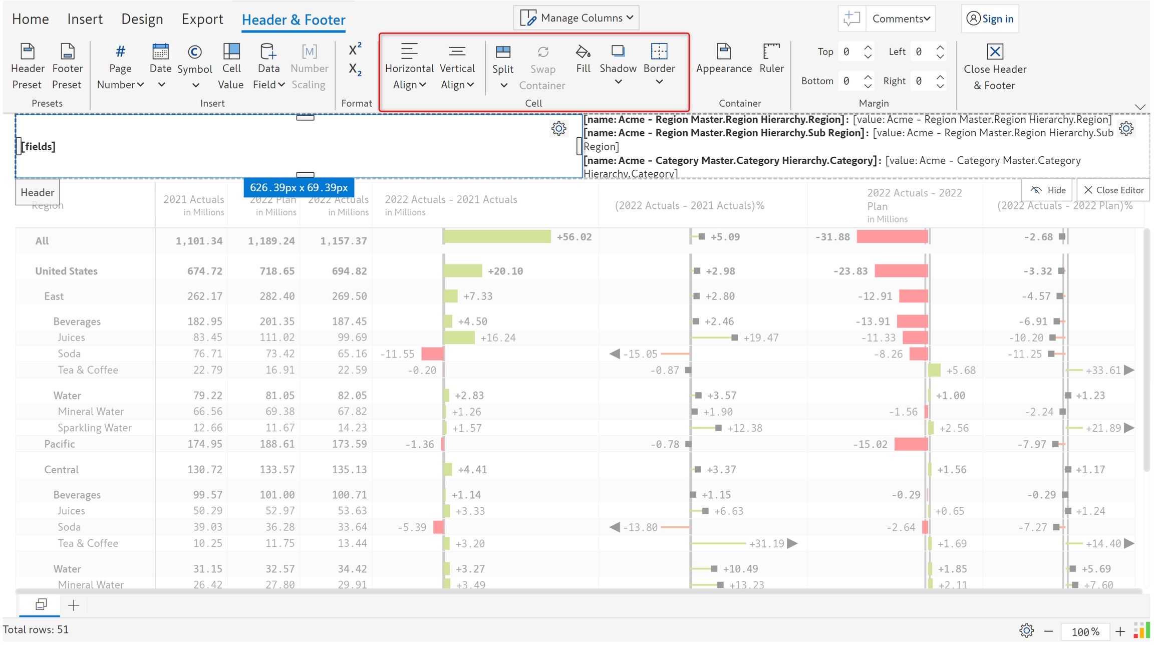
a) Horizontal/Vertical align - Contents in a cell can be aligned horizontally and vertically as shown below.
b) In addition to using the handles, you also have an option in the toolbar to split the container or cells.
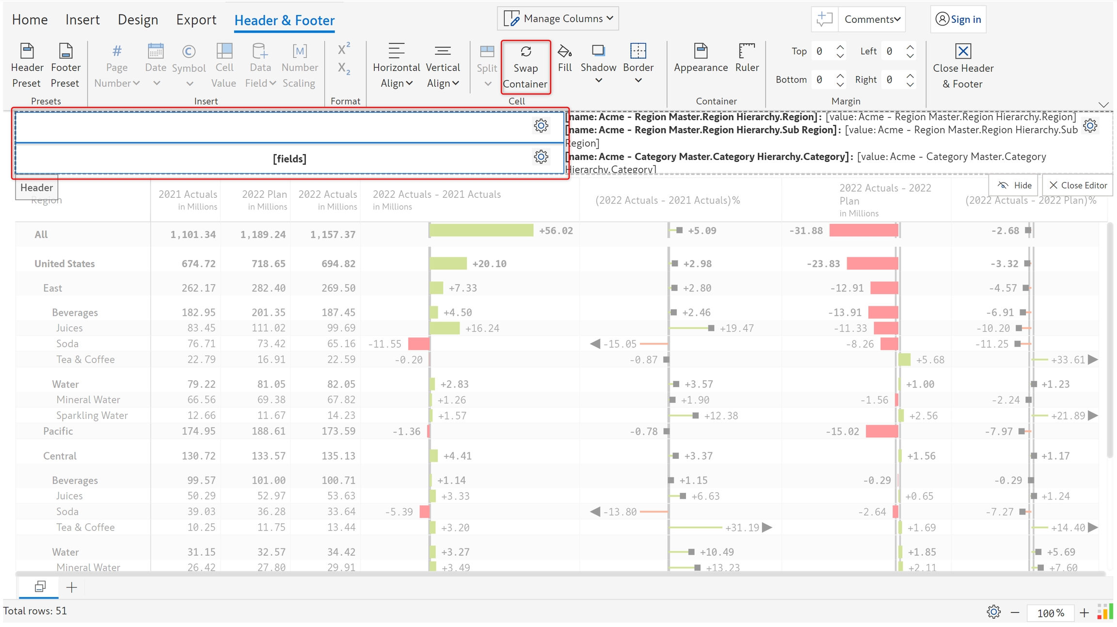
c) On selecting two cells, you can swap them by using the 'Swap container' option.
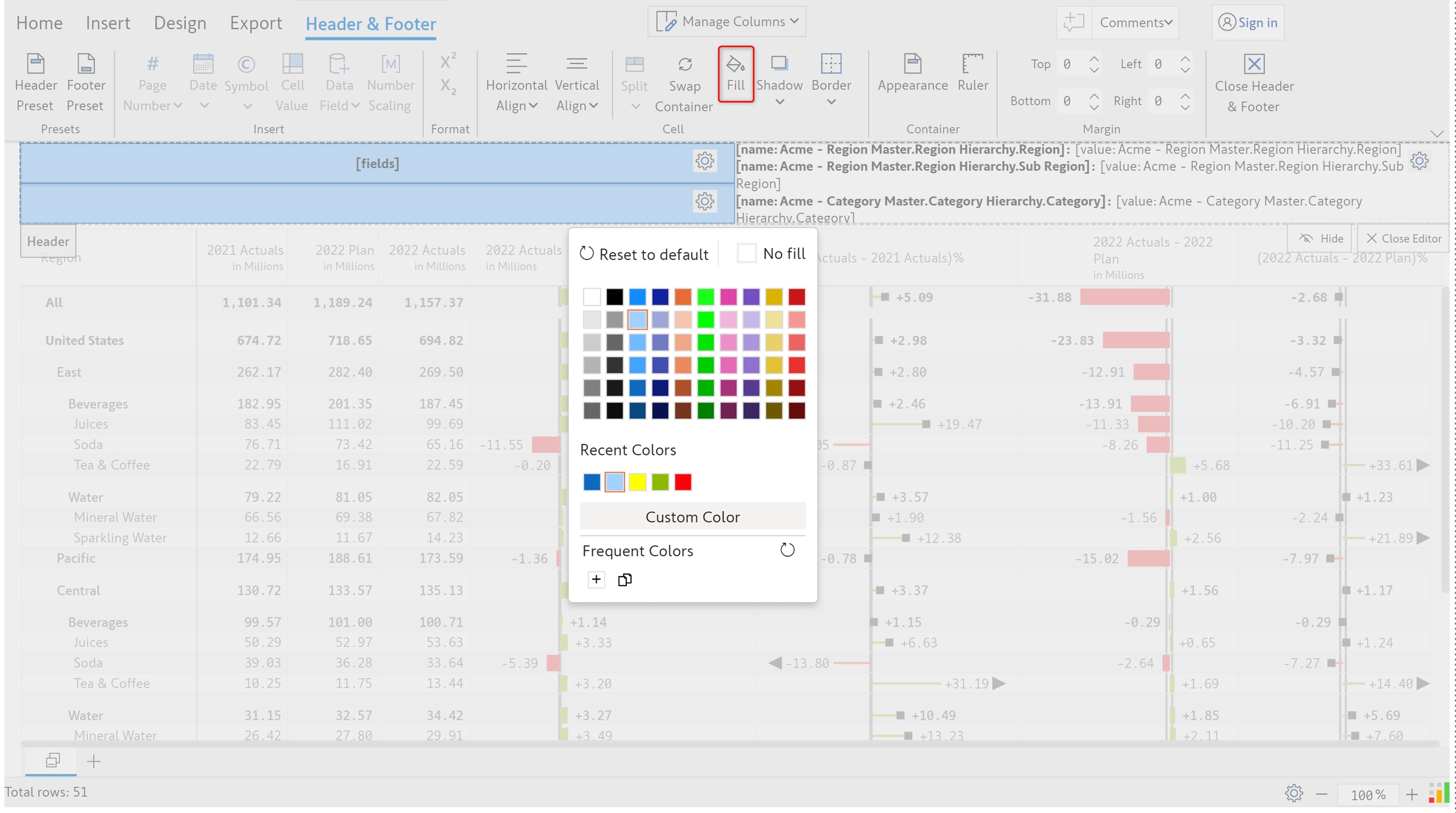
d) Fill - Fill color can be applied to one or more cells by using the color picker.
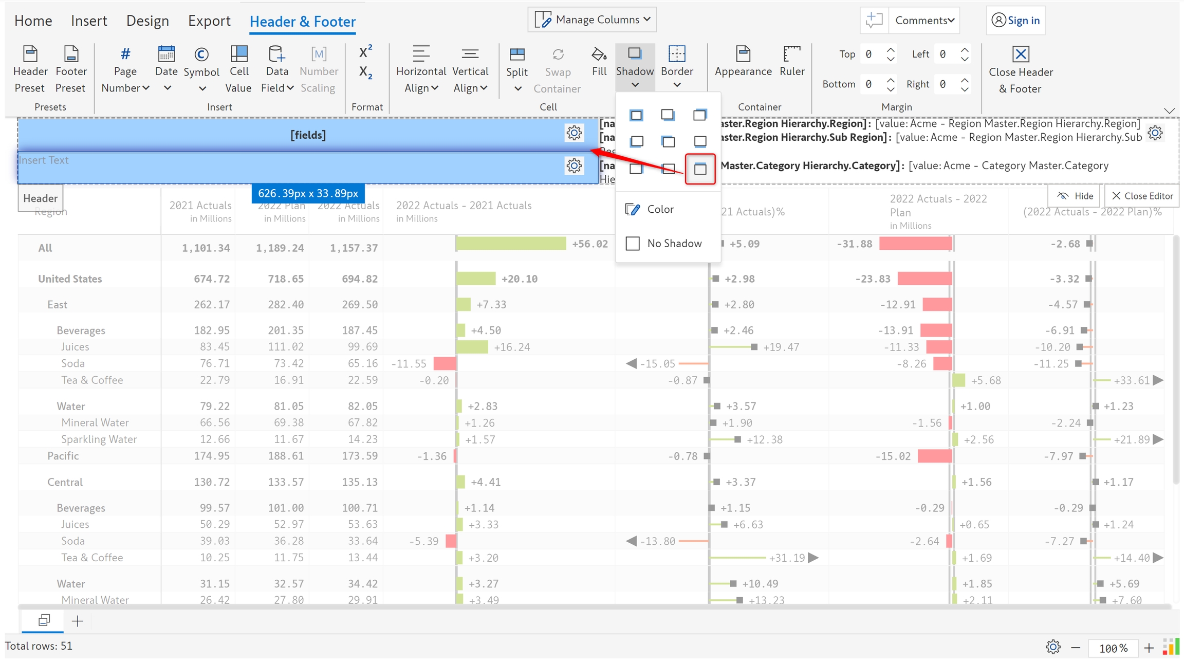
e) Shadows can be applied to cells as shown below.
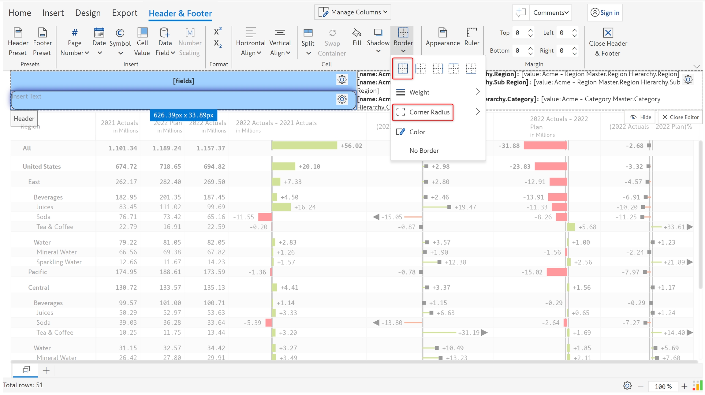
f) Borders - Borders can be applied for cells, you can set the weight, corner radius and choose a color.
5.2. Container
The following options are available for the header/footer containers - Appearance and Margin.
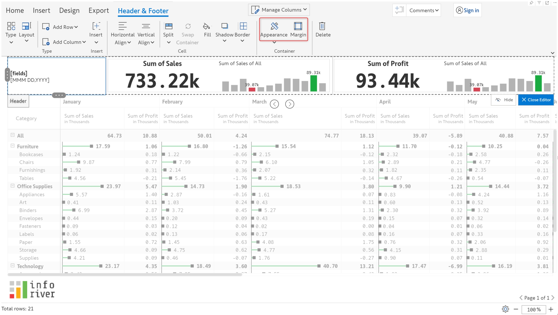
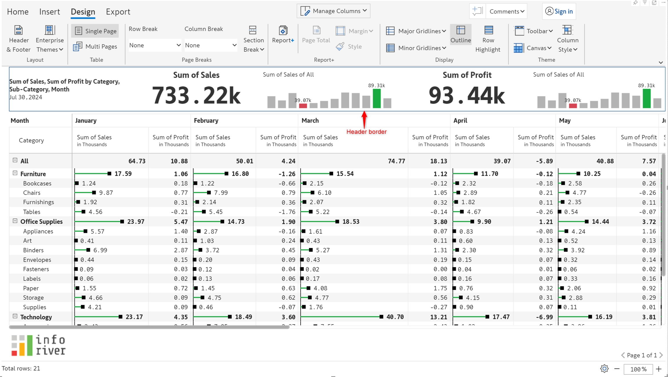
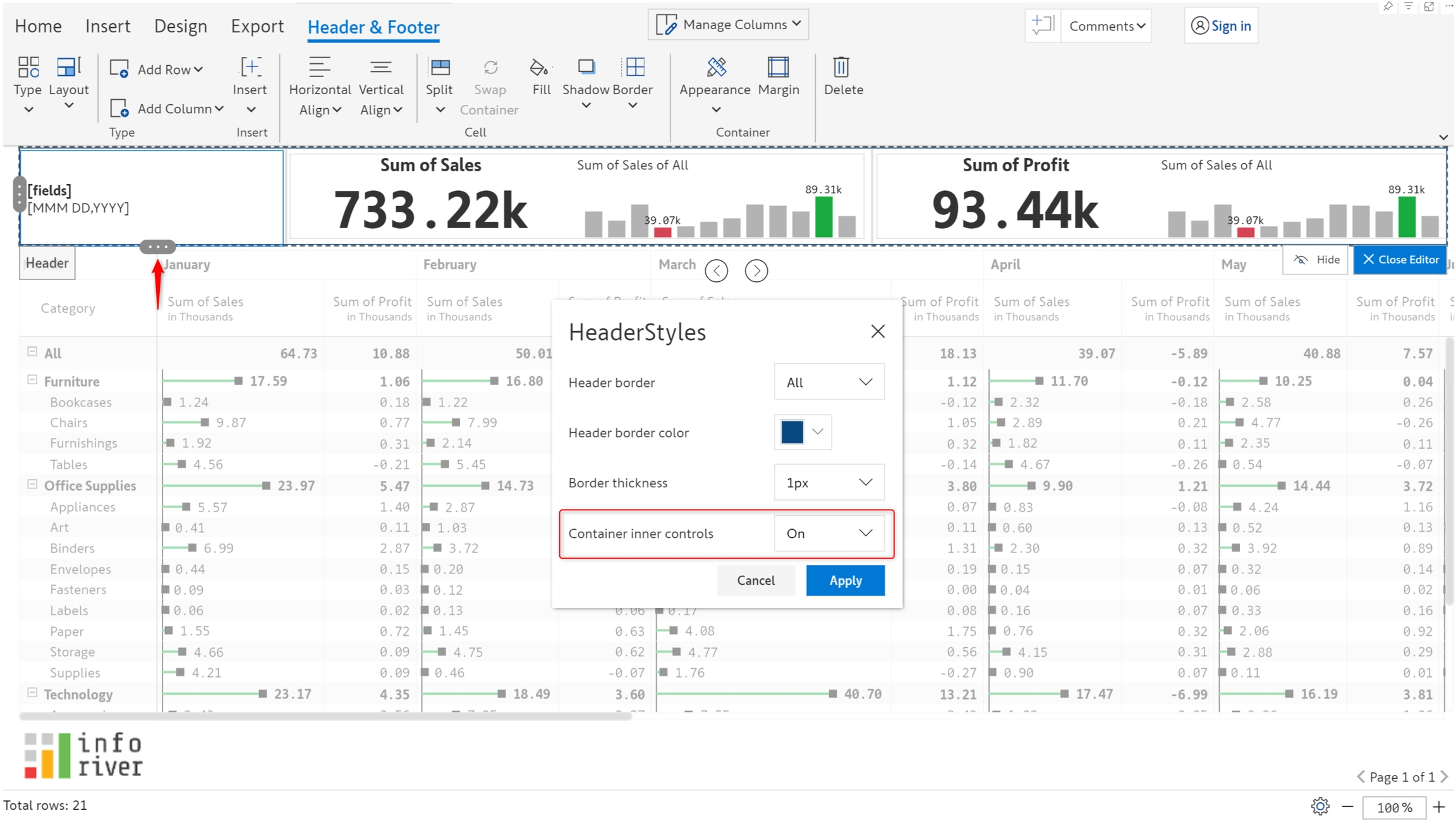
a) Styles: You can apply a border to the container by selecting the Appearance>Styles option. You can specify the border color and thickness from the Header Appearance dialog box.
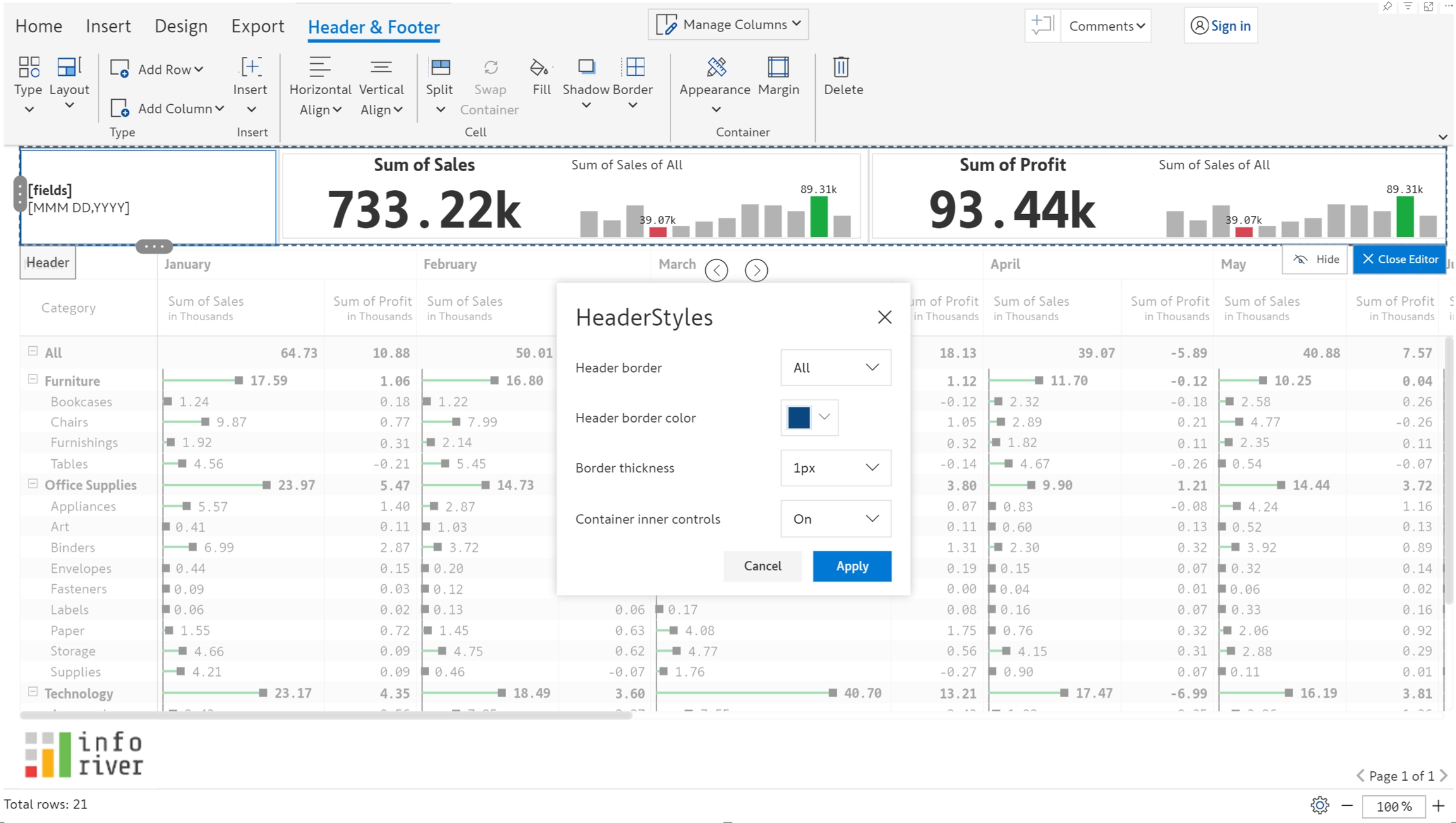
b) Container inner controls: The container controls are removed if this option is enabled.
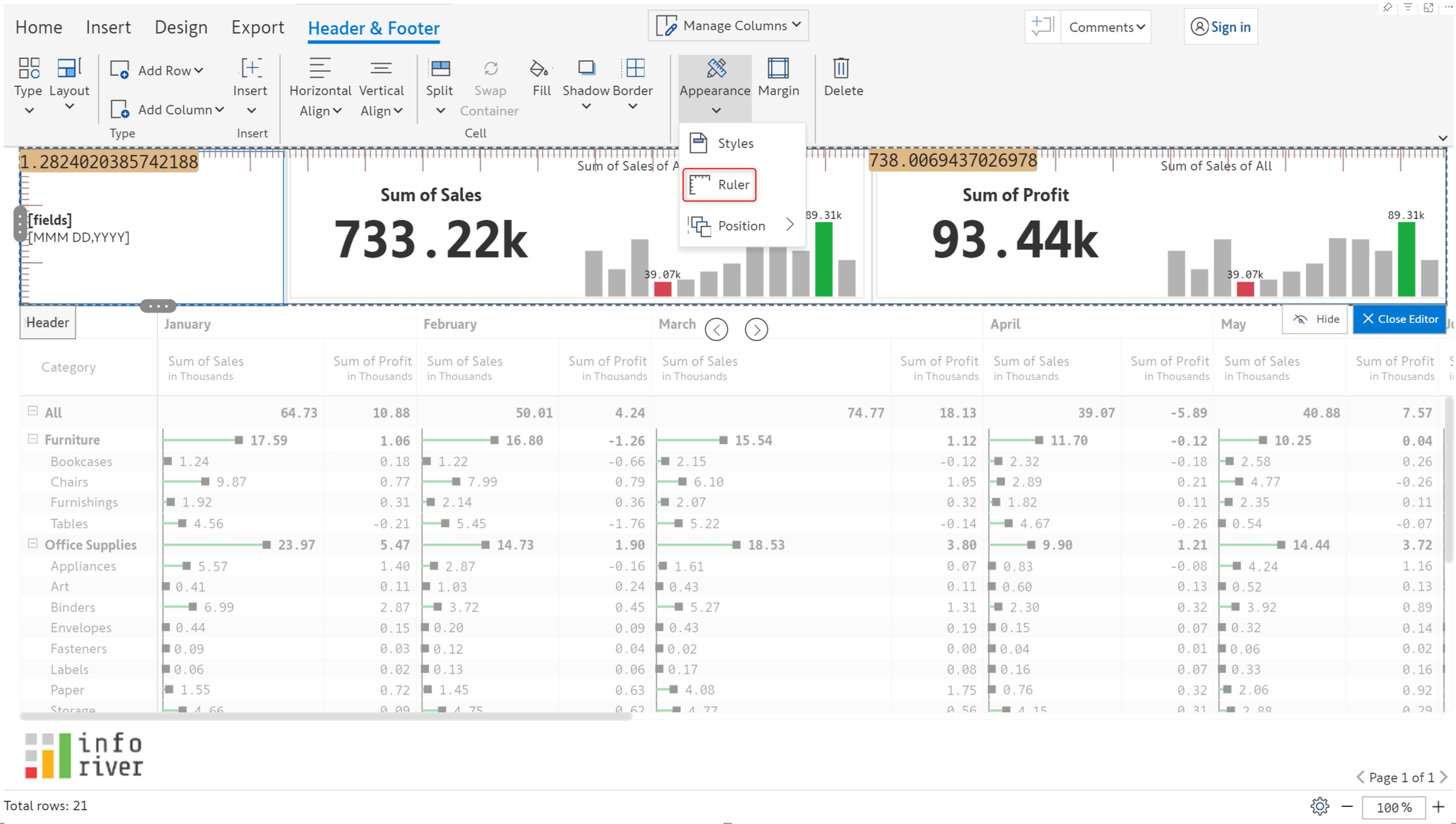
d) Ruler: You can see rulers on the top and left of the container. It shows the x and y coordinates for any point within the container.
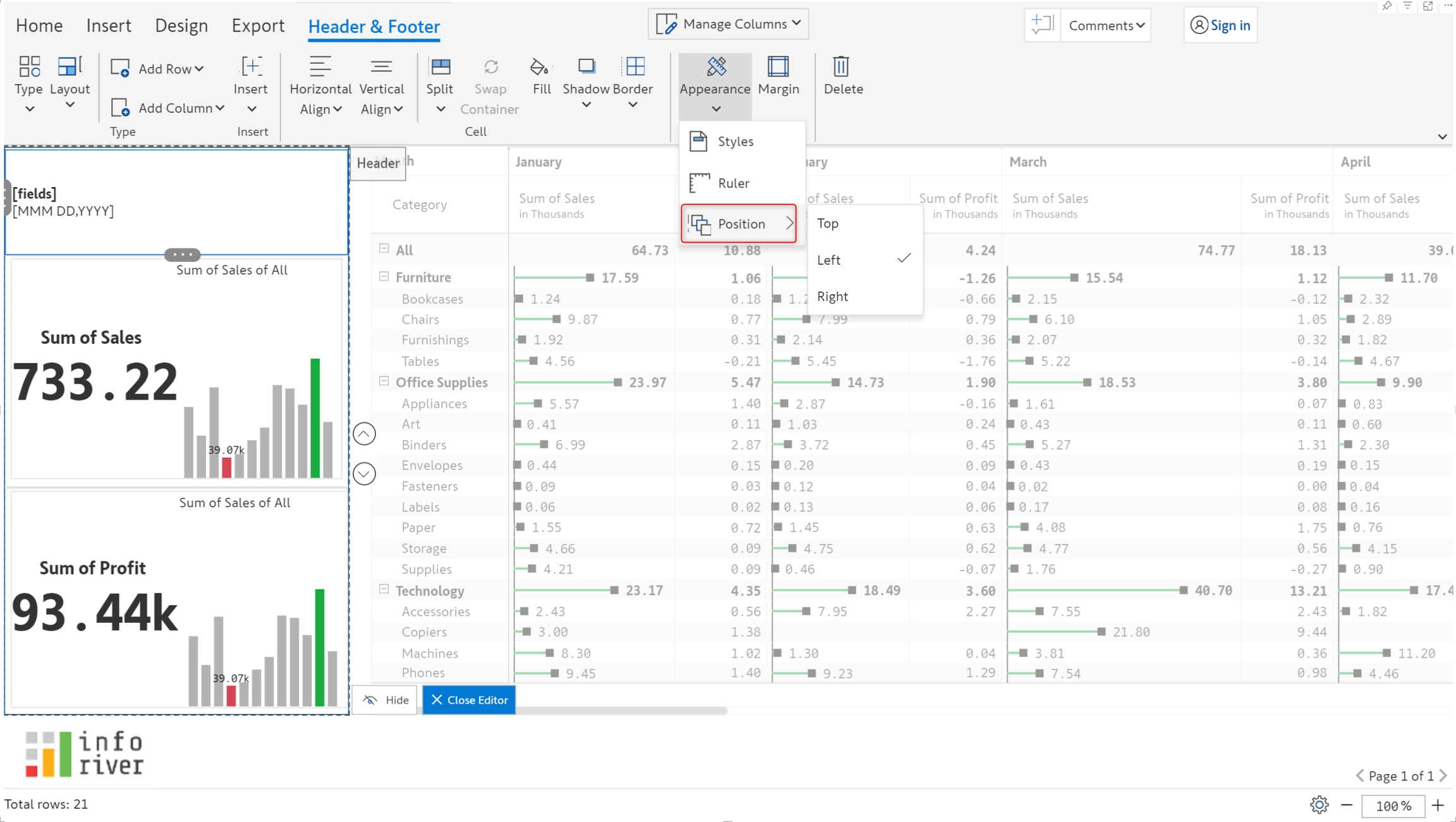
e) Position: You can change the position of the header and place it on the right or left side.
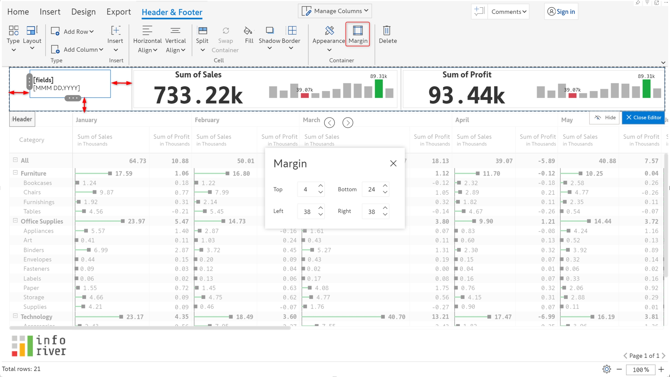
f) Margin: Top, bottom, right, and left margins can be applied to cells as shown in the below image.
In the next section, we'll be covering adding formatted text in the header/footer.
Last updated