Combo Charts
Combo charts let you visualize two related datasets in a single chart using different chart types, like column and line. They’re ideal for comparing metrics with different scales.
Column + line
Chart setup to build a column + line chart:
Axis
Drag the dimension to plot on the x-axis (e.g., Sub-Category).
Values parameter
Drag multiple measures to compare (e.g., Sales, Profit)
Chart type
Select the Column + line option from the Combo charts section of the Chart Type dropdown menu.
Use combo charts to compare different types of data with different value ranges. E.g., Sales in dollars and the quantity in units.

Column + area
To build a column + area chart:
Axis
- Drag the dimension to plot on the x-axis (e.g., Month).
Values parameter
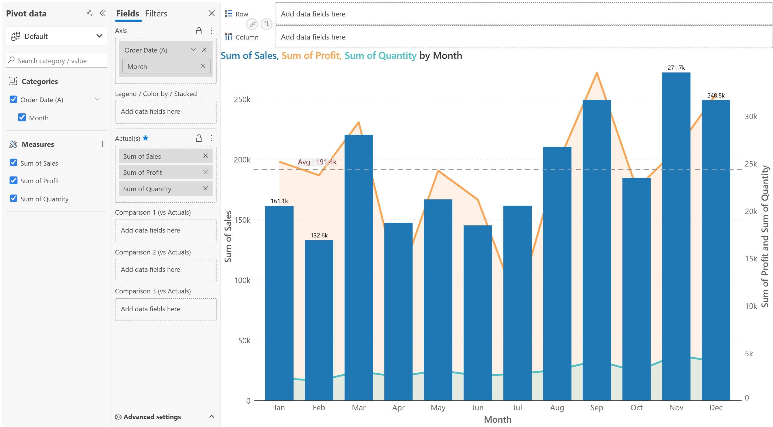
- Drag multiple measures to compare (e.g., Sales, Profit, Quantity)
Chart type
- Select the Column + area option from the Combo charts section of the Chart Type dropdown menu.
Compare individual values(column) with overall trends(area). The area can act as background context (e.g., market trend or capacity), while columns represent your data.

Column + column
To build a column + column chart:
Axis
- Drag the dimension to plot on the x-axis (e.g., Month).
Values parameter
- Drag multiple measures to compare (e.g., 2024 Plan, 2024 Actuals, 2023 Actuals)
Chart type
- Select the Column + column option from the Combo charts section of the Chart Type dropdown menu.
Compare multiple values side by side for the same categories. Choose Column+ column combo charts when your data has two or more series that belong to the same axis and share the same units or scale.

Multi axis chart
To build a multi axis chart chart:
Axis
- Drag the dimension to plot on the x-axis (e.g., Hour).
Values parameter
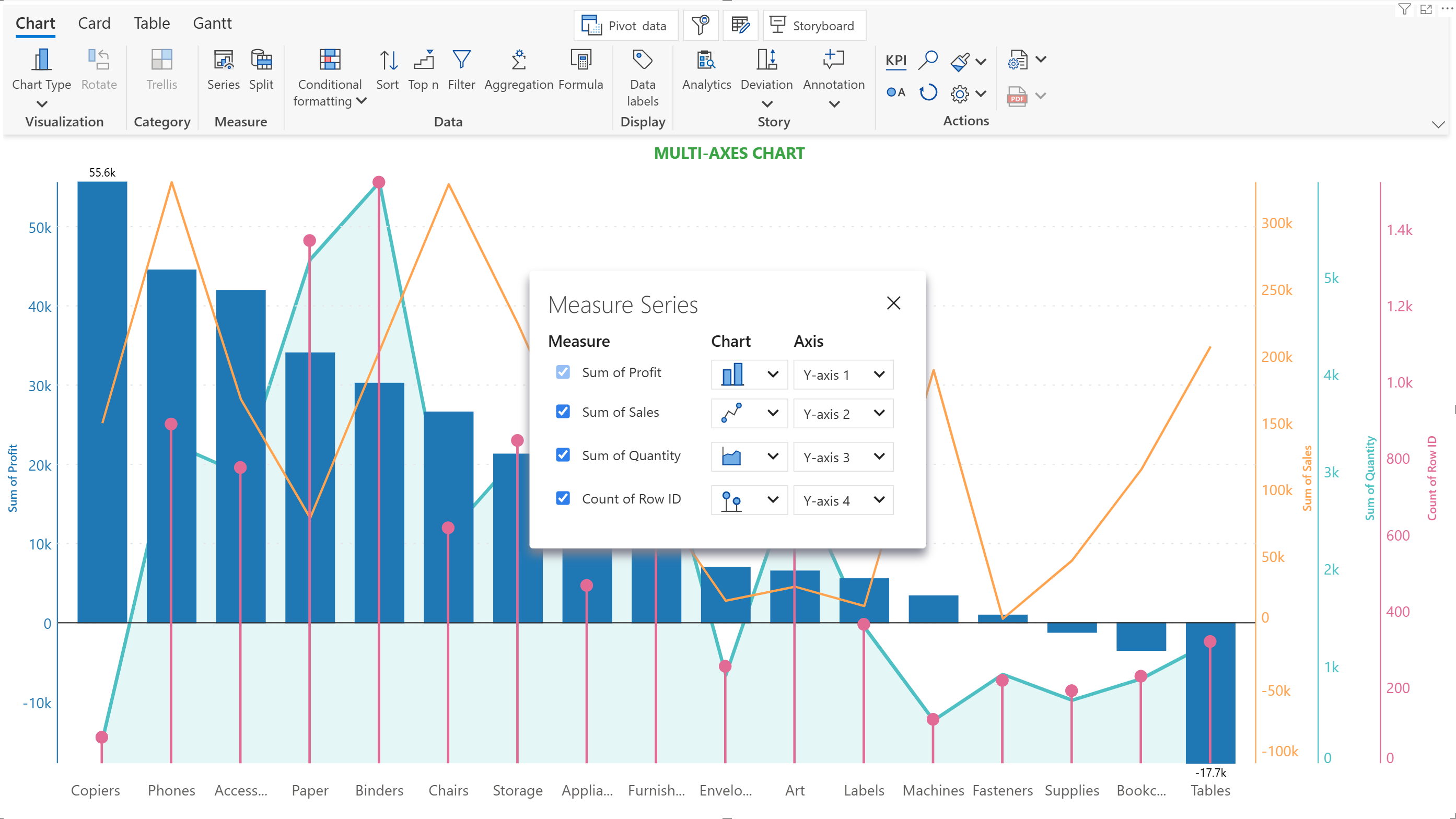
- Drag multiple measures to compare (e.g., Sales, Profit, QuantityError(%), Load, Power)
Chart type
- Select the Vertical Multi Axis Chart option from the Combo charts section of the Chart Type dropdown menu.
To visualize measures with mixed scaling, Analytics+ allows you to create a separate y-axis for each measure.

You can select a specific chart type for each measure from the series menu.

The y-axis and charts have focused settings for each measure.

Migrating from xViz Multi-axis charts to Analytics+
Download Guide and Demo
Access the detailed guide, which includes step-by-step settings paths and a PBIX demo report, for comprehensive configuration examples between xViz and Analytics+.
Download ↓
Stacked Column + line
Chart Setup
To build a stacked column + line chart:
Axis
- Drag the dimension to plot on the x-axis (e.g., Month).
Values parameter
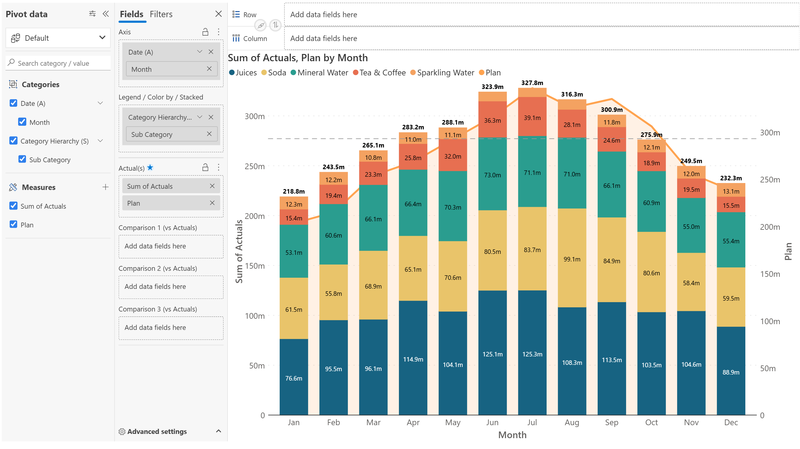
- Drag multiple measures to compare (e.g., Plan, Actuals)
Chart type
- Select the Stacked column + line option from the Combo charts section of the Chart Type dropdown menu.
Show part-to-whole relationships (stacked columns) and overlay a trend or target line for context. This chart type helps you analyze contributions to a total alongside a separate trend or benchmark.

Stacked Column + area
Chart Setup
To build a stacked column + line chart:
Axis
- Drag the dimension to plot on the x-axis (e.g., Month).
Values parameter
- Drag multiple measures to compare (e.g., Plan, Actuals)
Chart type
- Select the Stacked column + area option from the Combo charts section of the Chart Type dropdown menu.
Show part-to-whole relationships (stacked columns) with overall trends(area). Stacked columns display how different subcategories contribute to a total. The Area chart shows an independent or cumulative trend over time.

Additional formatting options
Here are the other settings that help you refine your combo chart.
Last updated
Was this helpful?