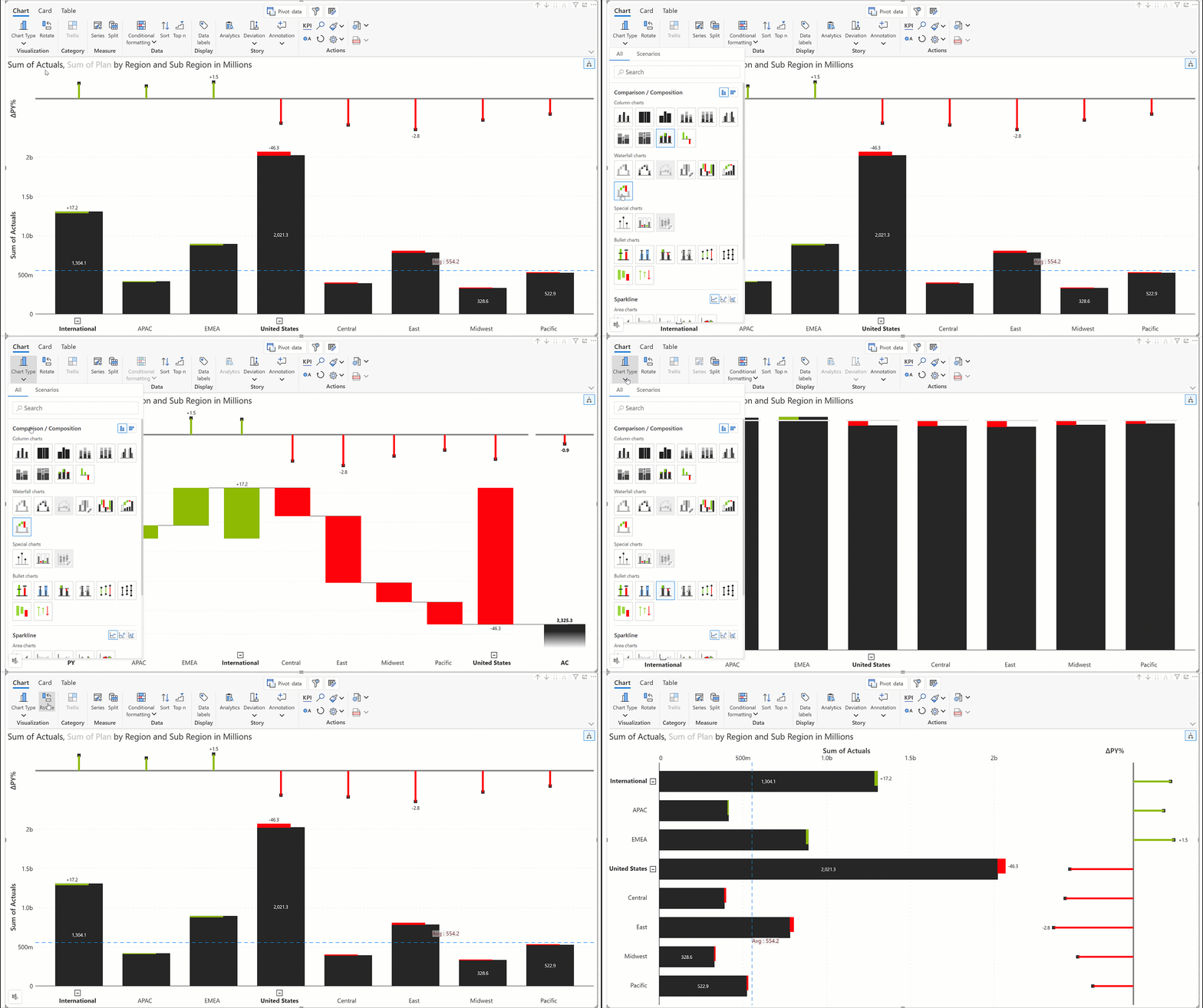
Chart toolbar
Last updated
Last updated
The chart ribbon is divided into 7 sections based on the functionality provided. Let’s explore each of them.
Chart type: Switch between chart types and choose from Inforiver's vast library of diverse charts.
Rotate: Change the orientation (horizontal to vertical or vice versa) of the chart by clicking on the button.
In small multiples mode, you can customize the trellis layout. Click on the dropdown icon to apply a layout.
You can also group measures by clicking on the dropdown icon. In this case, we have 2024 Actuals + Plan, 2023 Actuals + Plan, and 2022 Actuals + Plan and overall Actuals + Plan. You can group the 8 measures into 4 panels based on the year as shown below.
Filter: After assigning visual measures and dimensions, instead of using Power BI filters, you can apply filters on your data from within the Analytics+ visual. Click the filter icon at the top-right corner to view applied filters.
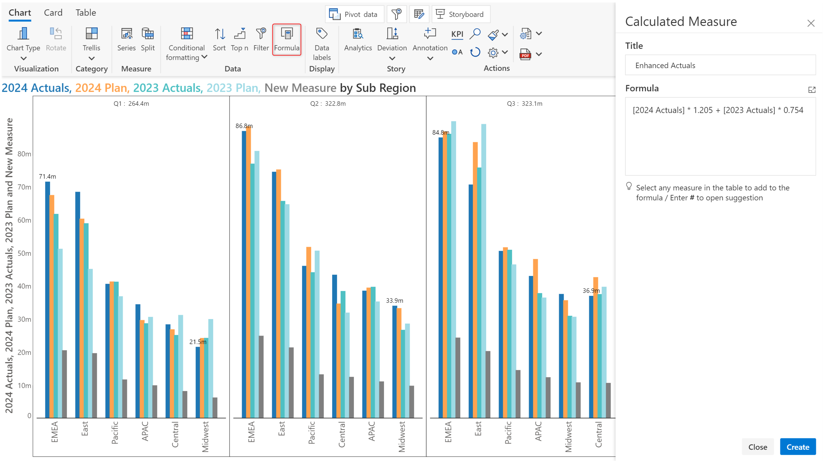
Formula: You can create visual-level measures within the Analytics+ visual, without having to modify your data source. Click on the formula button to open the Calculated Measure side pane.
Leverage the built-in Analytics, Annotation, and Deviation features to create charts that tell compelling stories.
The actions section provides single-click options like
Display KPI metrics
View shortcut keys and search for features
Apply themes
Navigate to legend settings
Reset all configurations to default settings
Open display settings.
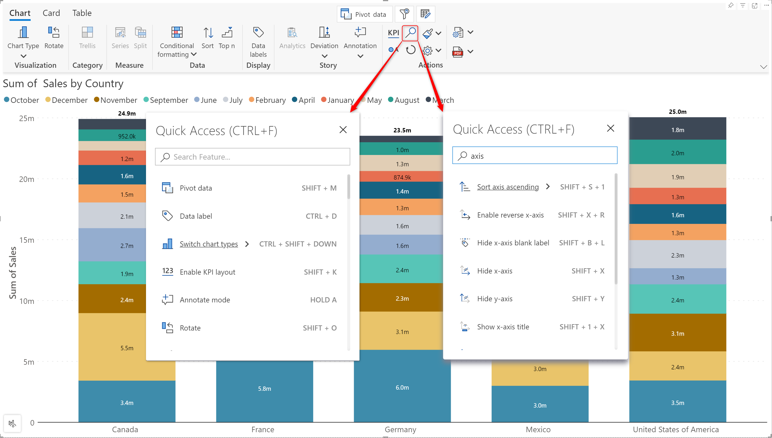
Click on the magnifying glass icon to view the keyboard shortcuts. You can use the search bar to locate a particular feature/option.
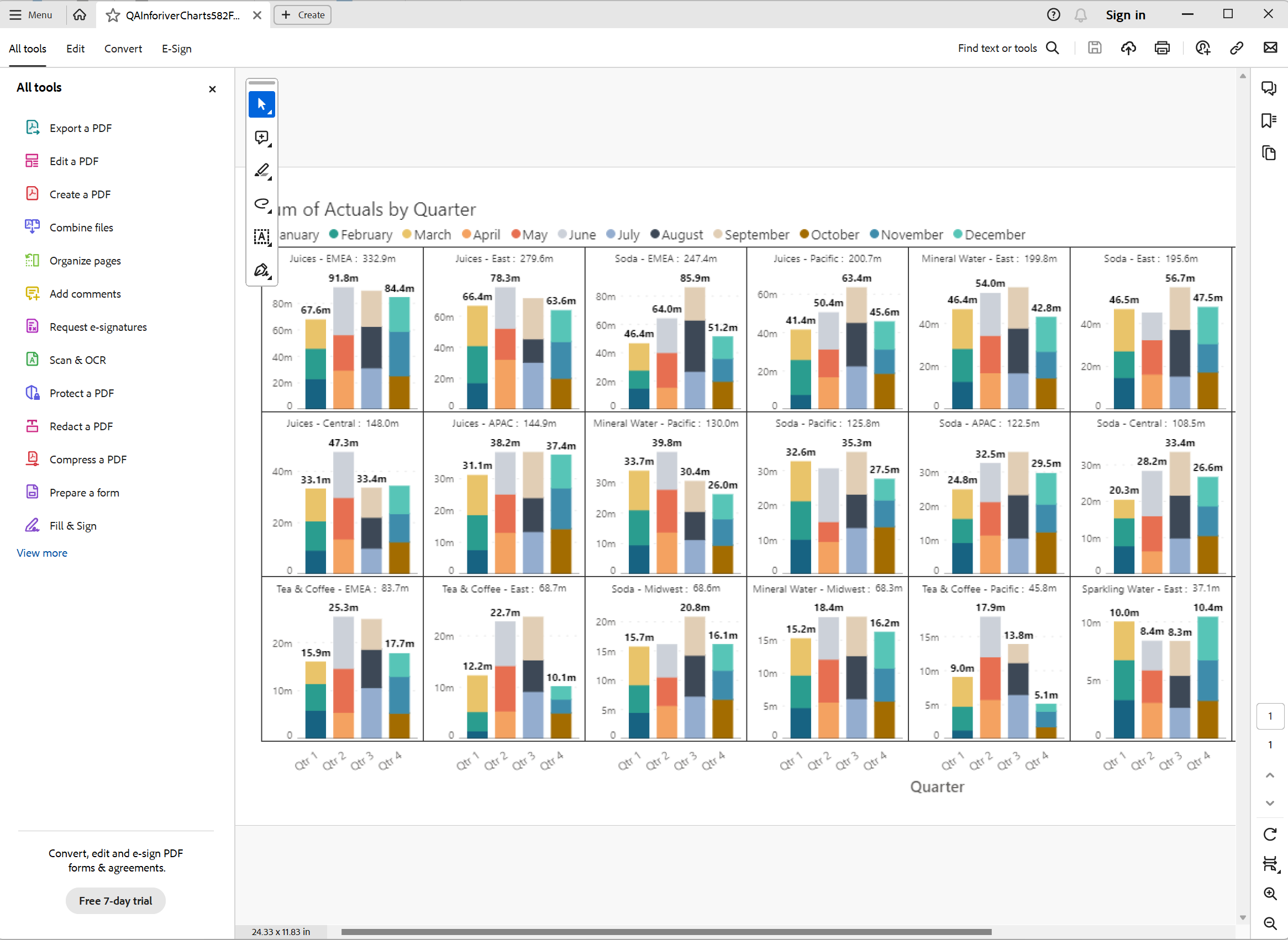
Analytics+ has been designed to generate fully formatted, high-resolution PDF extracts.
You can copy the JSON config to the clipboard or export it as a file.
If you need to apply detailed customizations, like configuring the number of rows and columns or setting a specific panel size, click the Trellis button to open the layout settings side pane.
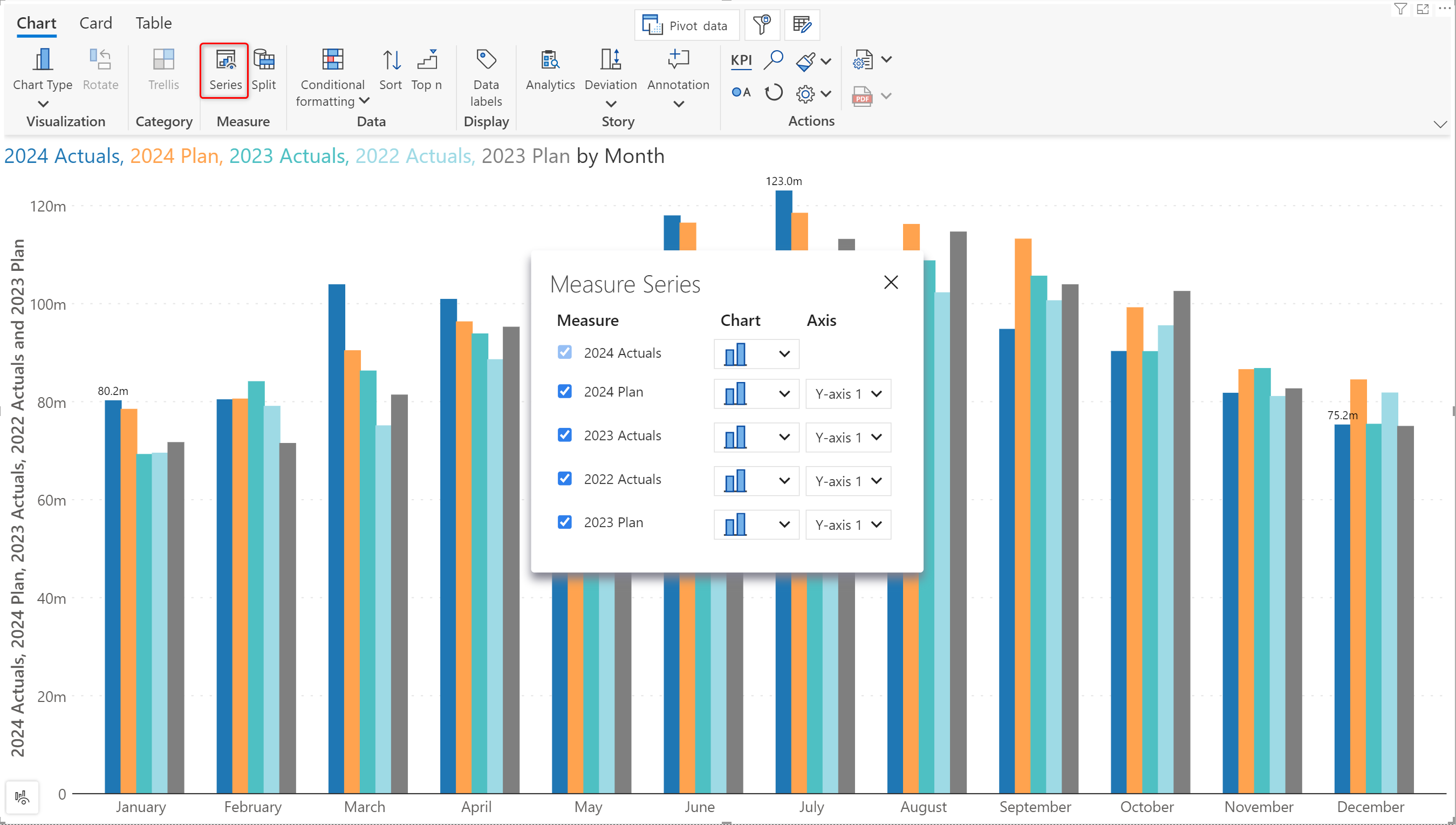
Series: Click on this button to open the measure series configuration window. You can set the chart type for each measure and control which y-axis the measure is plotted on.
Split: When your reports have multiple non-comparative measures, you can display each measure in a separate panel by clicking on the split button.
Conditional formatting: Highlight your data instantly using Inforiver's built-in conditional formatting options. You can also specify custom conditional formatting rules. .
Sorting: Apply nested sorting or custom excel-like sorting.
Ranking: Rank your data by applying TopN rules. When hierarchical datasets are involved, you can apply nested ranking. .
Click the icon to maximize the formula editor. The maximized view is useful for entering large, complex formulae.
Calculated measures can also be created from the window.
The new measure can then be assigned to the Actual or Comparison buckets and plotted like measures from the data source. Click on theicon from the pivot data window to modify the formula.
Analytics+ enables you to customize data labels. You can regulate the number of labels displayed with options like First + Last or Min + Max. You can also customize the font size, style, offset, color, and background color.
Analytics: Add trend lines, reference bands, or total/average bars to illustrate trends, correlations, or patterns in the data.
Annotation: Provide supplementary information about specific data points or add a report summary.
Deviation: Customize the deviation between individual data points with options like First to Last/ Min to Max or even create a custom deviation.
Analytics+ supports extensive customizations for every element. It also allows you to take a backup of the visual configuration and apply the same config to other visuals. You can import/export the visual configuration as a JSON file. The JSON file can be saved to your local system and shared with other users as well.